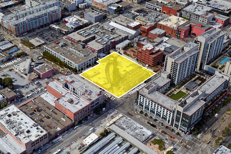
As we first reported in December of 2017, Tishman Speyer was pushing forward with their plans for two modern towers to rise up to 420 feet in height on the northeast corner of 4th and Townsend, stretching across seven Central SoMa parcels, including those currently occupied by The Creamery, Iron Cactus, Waterfall and HD Buttercup.
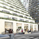
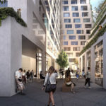
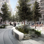
And as newly rendered above (and below) by Adamson Associates along with the Bjarke Ingels Group (BIG), the plans for the proposed development – which now include 960 condos, a 38-room boutique hotel and 24,500 square feet of commercial space over an underground garage for 276 cars and 18,500 square feet of ground floor retail space wrapped around a central courtyard – have since been refined and are now formally working their way through Planning for approval.
All that being said, keep in mind that the plans as proposed are dependent upon the City’s Central SoMa Plan, which has since been approved, but also challenged, being upheld. We’ll keep you posted and plugged-in.

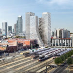
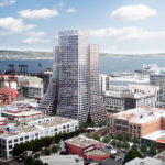
There is something really unpleasant about that massing.
Indeed: where are all the seismiphobes who’ve been hiding under the covers ever since Millennium began wandering around ?? Yes, it’s possible to construct a building like this – “Freakitecture” was what it was christened in the earlier post – to be quake-safe, but eccentric loadings, non-symmetric floorplans and discontinuous (structural) members certainly complicate things.
I like the curves & base, but the way the top of each building appears to be two buildings side-by-side is odd.
“There is something really unpleasant about that massing”
What most people say about interesting architecture before it gets built. It’s different, and I think it’s pretty cool.
I’m honestly in love with the way this looks. And speaking as someone who’s spent a lot of time around the Caltrain depot, this will be transformational in the best possible way.
3,000 people per hour cross the street at 4th & Townsend at peak hours, so that plaza will be well-used and a calmer refuge from street traffic. And then iconic towers to anchor the station and draw attention away from the hideous Beacon – I love everything about it. Build it!
I wish we had a real train station and not a depot.
we do, it just is broken due to construction issues, has no train tracks and needs a tunnel built to get trains to it.
And is about the size of a minor local hub in a country like Italy, that has a real train system.
Maybe Caltrain, the High Speed Rail Authority, and the Transbay Authority should get their act together and finalize their plans for the Downtown extension. They could exacavate the street at the same time this is going up if not before.
Would be nice but they don’t have funding yet for that billion dollar plus plan. They should have excavated at the same time as building out the T line. This intersection seems like it will have been and will continue to be under construction… forever.
No better place to build this. I like the signature look and the right amount of density at a parcel across the street from Caltrain and 1 block from T, N, 30, 45, 10, 47 and countless Megabus and other shuttles.
As an aside, once Central Subway opens and T gets routed there, do we think that either M, L or J will get extended to Caltrain and take over the freed up capacity?
I like. Build. But tell that woman on her phone to get out of the street!
I salute the realistic rendering. Bicyclist illegally riding on the sidewalk. Woman on her cellphone crossing the street, oblivious to traffic.
And the mostly empty tables in the lame-looking courtyard. I think the design of the towers is fine (will look silly in 20 years… whatevs), but is there really a market for the entire ground floor to be composed of Apple stores?
All joking aside, I think it is damning that the ground floor retail is rendered to look so much less interesting than the existing businesses. They are not even trying to pretend they care about the urban environment, or they are totally oblivious to it.
Where’e the top of it? It looks like a mid-construction tower.
The top rows of windows are open to the sky to create a transparent crown.
Eeew. Nope.
I live across the street and that intersection is already one of the worst in the city and won’t get better until the train is extended to downtown.
Locating housing near transit is great but how are the residents of this tower, the commercial tenants and hotel folk supposed to get near it in 24/7 gridlock?
I wouldn’t be surprised if this tower is bumped to the next cycle anyway. At this point they may be doing presales in the middle of a recession.
I’m not sure what you mean. Every pedestrian crosses at every Walk cycle – resident or not.
Have you witnessed a case where so many pedestrians try to cross that they need to wait for the next Walk signal?
weird looking. I like the ziggurat of the bottom floors but the top half is just half-assed looking.
BIG seems to be…well, big on zig buildings: witness what they proposed surrounding the A’s stadium.
Godawful ain’t it? Hope it never gets built.
I agree the top of the buildings look like a half-hearted, boilerplate, cubic building. It’s just table topping but disguising it with a curvy base in the first 4 or 5 floors.
So happy to see this back on the table. I had to go dig up my nickname from the prior article link: “Yes! Build this…yesterday please! I dub these beauties the twin nuclear reactor bizarro melt up metamorphing towers. Shake up the boxy skyline a bit more.” TNRBMUM tower!!
This is awful. SOMA does not need super-tall buildings. Building a bunch of 400′ towers will create wind tunnels and shading similar to downtown.
I’m pretty sure the proximity of the cold ocean to the warmer valleys creates the wind, and the potential tunnels are now studied and mitigated in detail before construction.
Also pretty sure that other Windy Cities have both wind and tall buildings and somehow the people living there survive.
Get some perspective! Towers under 40 stories are no where near “super tall”
Isn’t super tall over 80 floors. Isn’t the Salesforce tower the “only” supertower in SF
Yep. A “super tall” tower is defined as over 984 ft. in height by the Council on Tall Buildings and Urban Habitat, so as proposed for up to 420 feet in height, this project will be nowhere near “super tall”. That being said the comment was probably comparing this project to other towers in SF.
Um … Not Exactly Closer.
My god, this close to the train? This is where you build offices. Idiotic from a planning perspective to waste that last mile in a downtown on residences, and how many will be true city residents.
What does “true city residents” mean? Are you suggesting that those who live in San Francisco but commute to work outside the city are not true city residents?
I’ve lived here for 30 years and half that time worked elsewhere. By your implied definition, I guess I’m a true city resident some of the time (when I work within city limits) but not a true city resident the rest of the time.
As for living “this close to the train,” what’s the issue here? New Yorkers and Chicagoans (among many others) live adjacent to elevated railways by the tens of thousands and have done so for over a century.
San Franciscans live adjacent to freeways – you can look into the windows of private residences at 1 Rincon Hill, aka the “Ion Breeze,” when you drive on the elevated freeway a few feet away! – and to Caltrain tracks by the thousands. You may find this unthinkable (“My god!”) but evidently, many others do not.
The planning commission agrees with you, but Jane Kim and several of the groups suing over the plan want more housing built in this area, not less.
Huh? I have to walk a mile now to get to the train. Wouldn’t anyone want to cut 15 mins each way from their commute?
Furthermore, companies are likely to have shuttle timed with the train, but Muni isn’t timed and can’t realistically be timed due to traffic variability, so living close to the train greatly adds determinism to one’s commute.
Love it personally. One of the challenges for this area is that the retail components for most of the newer buildings are too large and wide, leading to poor pedestrian experience and just a few chain stores (same prob in Mission Bay). So I like their mix of retail slots and sizes and if they are realistic/clever with leasing, they might be able to provide some interesting draws for both residents and visitors. There are already lots of great bars and restaurants and cafes just north of King, and this might work to link King/Mission Bay to those funkier and interesting retail slots as well.
From a massing perspective I really like it. It’s all personal preference but I think it’s great.
Great location to walk to Transbay/Central SOMA jobs.
Think it’ll be next cycle though realistically.
I love this. Finally something unique. Please get it built, but cut the parking to under 150
Reduce it to 10 stories and we have a deal.
Though why would we want to reduce their size and build less housing?
Because we got ours and the rest be d*mned.
No. We’d want to do that because there’s no shortage of luxury housing choices for the haute and moyenne bourgeoisie in SF and there’s a shortage of housing for everybody else. There’s no need to be pointlessly obtuse.
There isa shortage of low income housing. What if they passed a law that new buildings have to also include lower income housing?
The nearly universal term “luxury housing,” concocted and disseminated by residential developers and brokers and taken up uncritically by nearly everyone else, is demonstrably, laughably inaccurate. Whatever the cost, most so-called luxury apartments and condos are cramped little cookie-cutter living units in which kitchen, living, and dining functions are mashed up in low-square-footage “areas” rather than rooms. Bedrooms are tiny to small, bathrooms windowless, closet space inadequate, design basic, and materials, with a few exceptions, quite basic. Granite counters, a stove with a nameplate attached, and even a decent view do not make for “luxury.” It’s a testament to the power of suggestion – i.e., advertising – and to the gullibility of the public that so much of it has been fooled by this transparently misleading term.
oh god is this ugly. And completely out of proportion for the area. Did they hire Albert Speer?
Hopefully, the area will grow to be in proportion to it.
Several posted notices on site show that the building is going before the planning commission on June 20.