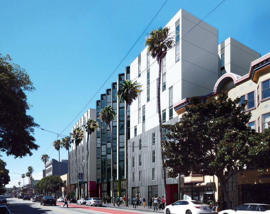
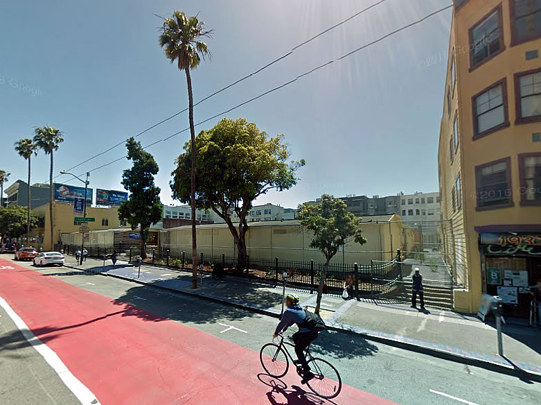
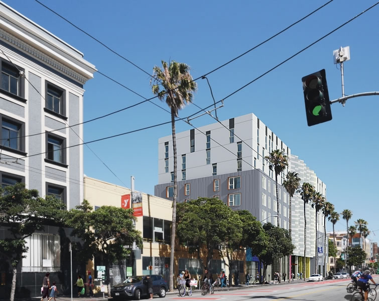
The proposed development of 157 below market rate apartments to rise up to nine stories in height at 1950 Mission Street, upon the former Phoenix Continuation High School site turned Navigation Center in the Mission, has been formally granted a streamlined environmental review.
As such, the development could theoretically break ground as soon as building permits are issued, an application for which is working its way through the Department of Building Inspection.
That being said, while the project as proposed does not require any other approvals from the City or San Francisco’s Planning Commission to proceed, a member of the public or neighborhood group could request a discretionary review (DR) or appeal the aforementioned streamlining.
But once the ground is broken, the 1950 Mission Street project – twenty percent of which will be set aside for formerly homeless families with the balance of the 157 units earmarked for families earning between 45% and 60% of the area median income (AMI) – should take around 20 month to complete, with an estimated budget of around $81 million, or roughly $490,000 per unit, which doesn’t include an accounting for the city-owned land.


it’s true, the development could be challenged by a DR — however, it’s possible that it submits an application to the newly-legislated 100% Affordable Housing Bonus Program, which, under Planning Code Sec 328, “No requests for discretionary review shall be accepted by the Planning Department or heard by the Planning Commission for projects subject to this Section.”
whether or not this specific project gets on board with the new 100% AHBP, rest assured that no affordable housing projects in the future will be stifled by the tyranny of the DR.
That’s amazing, I didn’t know about that provision!
Now let’s do that for all projects. I’m tired of delays over beer gardens and “aggressive” windows.
This will look great across the street from Maximus’ 1979 Mission project. Both beautifully designed.
A step in the right direction. More of this please!
The windows make it look kinda like the Hall of Justice? in Oakland. Just the opposite tack from the former proposal two lots down, where the big plates of glass were forced to tone down to 30×60″ peepers. Is this new look in keeping with the desire to ‘shut the world out’ that is epitomized by our new Tent culture, some of those inhabitants soon to occupy this space?
A very mediocre design typical of San Francisco in the first decades of the 21st century – as someone is wont to write in the latter part of the century trying to explain the architectural legacy left in the wake of the boom years early in the century.
Really, this could be a jail, cheap back office digs for a major corporation or a data center. There is nothing appealing about this building and it certainly does not bespeak of home. What’s up with those windows?! The mural feature can’t make up for the lack of engagement at the sidewalk level – so cleanly captured in the second rendering above.
Putting a navigation center in a proposed development site produces some very interesting incentives for local NIMBYs doesn’t it? You might reasonably expect some really…enthusiastic community support for getting approvals and hearings done as quickly as possible.
This is going to look like dilapidated junk within half a decade, with a “navigation center” beneath it to boot.
Jack, I’m not so sure. When the navigation center is closed and construction begins, where do you think its residents are going to go?
UPDATE: Navigation Center Site Development Permitted to Break Ground