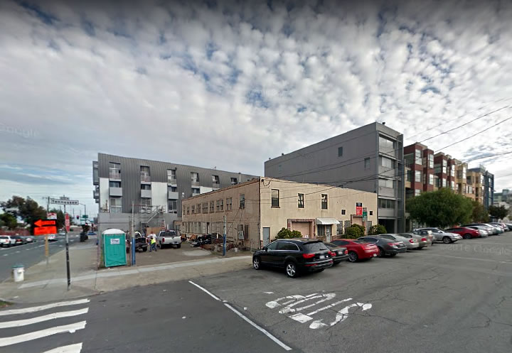
Plans to demolish the two-story, mixed-use building at 603 Tennessee Street and build up to six stories in height across the site on the border of Dogpatch and Mission Bay have just qualified for a streamlined environmental review based on the parameters of the decade-old Eastern Neighborhoods Plan.
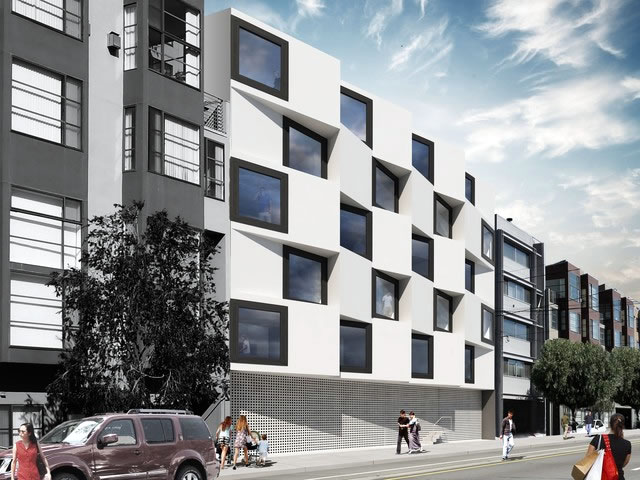
As designed by Natoma Architects and rendered with a placeholder building on the parking lot parcel next door, the proposed development would yield 24 condos, a mix of 7 one-bedrooms 16 two and one three, over a garage for 17 cars and 36 bikes and a 1,060-square-foot art studio with a perforated metal cladding on the ground floor.
We’ll keep you posted and plugged-in as the plans for 603 Tennessee progress.


Great looking building……might never work because the neighbors and planners decide that they need to design the place instead!
I think it’s pretty horrid and furthermore I believe Stanley and company put in that “placeholder building on the lot next door” in the rendering to say “whatever goes in there, our building will clash with it! They (Natoma Architects) just cannot grasp the concept of neighborhood context. They’ve been at it so long I have to believe it’s intentional.
Also, these condos aren’t going to be purchased by the people with an actual need for an on-site art studio, who are they trying to kid.
I enjoy the building, but i’d also be curious to see how an on-site art studio would really work. I’m envisioning some staged easels, crusty brushes, and a dirty sink covered in dried paint. Glamorous!
I disagree, think this is very forward looking and reminds me of a really cool parking garage just a couple of blocks from this site designed by WRNS Studio. The “art studio” is a bit ridiculous though, as much as I’d love to imagine an actual artist would be able to afford to utilize it.
Where did it say the art studio was an amenity for the residents? More likely the developer is an artist and plans to use it. Or lease it out separately. If it was office space would you assume all the residents are going to also work there?
It probably takes care of any PDR requirement for the neighborhood.
I like!
“Art studio” should be in quotes. Million $+ condos are not typical artist domiciles. Plus 1060 SF / 24 units = only 44 SF per unit. So maybe only “artists” painting miniatures. Or jewelers. Or tiny pixies decorating sugar plums….
The art studio space is not intended as an amenity for tenants but rather as a required replacement for existing PDR space on the site, as correctly surmised by others below.
Ahh. Thanks. Renting the whole art space out to a tenant makes a lot more sense than my assumption of splitting it 24 ways.
Too much parking and I’d rather see a ground floor retail space — this area desperately needs retail to activate it. Also, they should use the density bonus and build higher.
Retail is largely obsolete. If retail space in key commercial corridors is vacant (look at the Castro), then why would “retail space” in the middle of a block transitioning to residential do all that well.
Yeah the streetscape is terrible. Doesn’t have to be literally retail, coffee shops, bars, delis, etc. are not obsolete.
On the other hand, a half block of residential garages were converted to very popular retail/cafes in the Castro, so there’s clearly demand there too.
It’s pretty close to the corner and one block from Mariposa Park which has zero retail/cafe/restaurant within a three block radius right now. If nothing else I’m sure people would like to get a coffee or sandwich and take it to the park. Comparing the Castro which has retail space all over to a retail desert makes no sense.
Also, this is one block from a T stop on 3rd Street.
There are 2 Peet’s coffee shops on the first floor of the hospital right across the street….
Totally agree about the ground floor. This is really, really disrespectful to the street, and should have some active use with transparent windows and permeable (with doors).
Cool windows but what’s going on with the ground floor?
Ground floor and sidewalk are abysmal…
More Prison Chic from Stanley. Can we please let him put his designs someplace else? This is going to look like that bunker on Divisadero in a few years. And talk about absolutely no connection with the street! A nearly featureless wall with steps more akin to a construction trailer than a residential building. No. Stop.
Absolutely awful. The building is a sterile 6 story box which will be complemented by equally sterile 6 story boxes on either side. The streetscape is non-existent. The building is built to the sidewalk which is narrow as it is – so much so they aren’t even putting trees in the rendering. The blank wall at the ground floor level should be disallowed by code. There is no effort to enliven the pedestrian experience. If not retail, then how about stoops for ground floor units?
This will be a sidewalk that passersby’s traverse quickly to get to wherever they are going. No need to linger – if anything one wants to get away from the dystopian like street level experience.
The PC simply does not get it or, they can’t be that blind can they, simply don’t care. Let the developers build over this area and Central SOMA (a looming disaster) no matter the cost to the physical environment.
“This will be a sidewalk that passersby’s traverse quickly to get to wherever they are going.”
Good. Isn’t that what sidewalks are primarily for? Although I realize it’s bad for panhandling business.
Sidewalks: like freeways, but for pedestrians!
I don’t think this particular block warrants such angst, but they must take to avoid replicating that dreadful stretch of Berry St west of 4th in North MB. What were they thinking when completely failed to make any provision for bars, restaurants, cafes or retail the entire long 2 blocks of residential buildings?
There’s a nice promenade half a block over if you’re in that location looking for a pleasant stroll. Bars and restaurants are on 4th and on King. Not every stretch of pavement needs to be an event. Better to have some concentration than a cafe on every block.
I guess you’re referring to King Street. Really?!?!?!
It amounts to no more than two suburb strip malls abutting a coursing highway.
Berry Street could have been such a great place to live in its own right and in a great location. A sorrowfully missed opportunity.
I love it. I imagine the ‘art studio’ will have glass hidden behind the perforated curtain? Either way excellent addition to the neighborhood so long as the outspoken few don’t force the architects to revise it to death.
Also, aren’t there approved designs / renderings up for the adjacent property?
As usual – as always – opinions vary. Some love it, some hate it, some fall in between. I can’t say I love the building, but I like it.
Contemporary? Yes, but that’s fine if distinctive and refined, as I believe this proposal is. With one big exception: The ground floor. I agree with Dave above, “The blank wall at the ground floor level should be disallowed by code.” Blank walls along the sidewalk are like strokes in people – they kill the living tissue of street and sidewalk. They’re inert at best and ominous at worst.
Whatever one may think of the building itself, due to its dead wall at ground level, the Natoma Architects building on Divisadero, referenced by Metroliner above, is no friend to pedestrians, neighbors, or neighborhood. Ground floors like this – whether for residential residential, commercial, or civic buildings – are like the dementors in the Harry Potter books: They suck life out of sidewalk, street, and city.
I believe they are disallowed by code, no? Many -many- buildings in the 60’s and 70’s have these blank walls and I thought that the planning code was modified to outlaw this type of design.
This riff on traditional Bay Area bays is being done elsewhere, most successfully IMO opinion in the proposal for Parcel T on Octavia Blvd.
I’m pretty sure the blank wall in the drawing above is the garage. I dislike the blank wall, too, but I think it’s vastly preferable to those 50s – 60s style carports under apartment buildings that better belong at cheap motels.
But if they got rid of the garage and activated the streetfront with ground floor unit stoops or retail, the naysayers would be screaming “where will everyone park?? It’s going to ruin neighborhood parking!!”. You can’t win with these people..
The garage space is actually located at the rear of the building. And in addition to the entrance to the garage, the perforated metal screen is intended to shield the art studio space, building lobby and other entrances as rendered (and reported) above.
another cheese-grater concept, how many of these buildings do we really want… reminds me of the BofA building only in white…. How about some variation, take one side up another 3-4 floors, and get a roof plinth level, and maybe a set back on a portion of the frontage, possibly some landscape street-scape elements, and than nix the lower floor mesh and do something with some slender columns and a bench and planter in the front… get a little human scale in their, its not downtown SF….