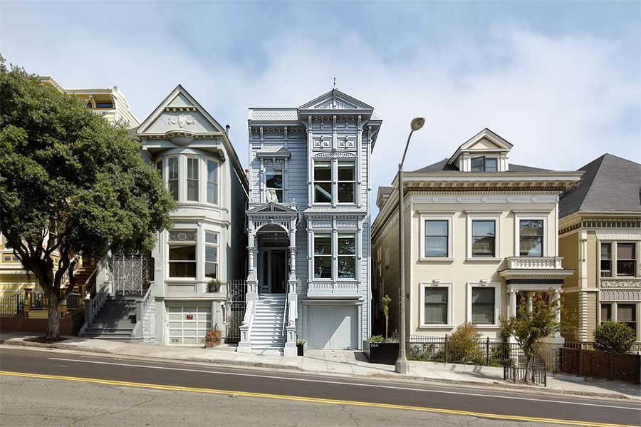
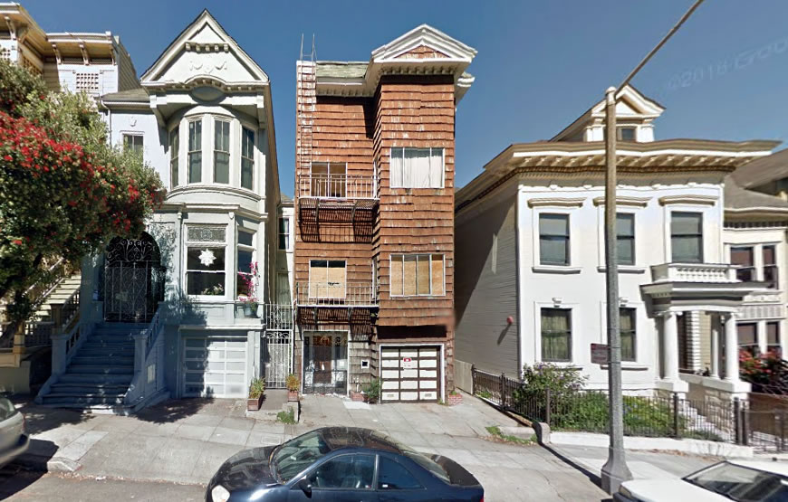
Purchased as a dilapidated four-unit building which had been completely stripped of its architectural integrity for $975,000 back in 2012, the complete transformation of the historic Alamo Square home at 1164 Fulton Street has been completed, as plugged-in people knew to expect.
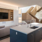
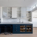
Behind the home’s new façade, which was restored based on historic photographs taken in the 1920’s, a high-end contemporary interior by Jensen Architects is now hidden in plain sight.
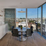
While the clean living room overlooks Alamo Square Park, the rear of the home now offers panoramic views of the city, especially from the new pentroom and roof deck.
And with four bedrooms, four and one half baths, two parking spaces and approximately 4,640 square feet of rebuilt space, 1164 Fulton Street is now back on the market, but not yet listed nor official inventory, for $7.3 million.


just stunning. had the pleasure of visiting the house a few months ago, truly a masterpiece both inside and out.
Agreed. Great to see attention to detail and overall design come together. Well done!
Interior looks great. The restoration was well done but for… the muted paint job. There is a reason they call them the painted ladies. The baby blue façade highlighted by while trim does not pop. A third accent color is needed to really define the façade. Good news is that, at this price, whomever purchases the home will have the money to re-paint the front.
The muted paint job is historically accurate. The ornately painted ladies are not.
“The muted paint job is historically accurate.” That’s just something SFists like to tell tourists to convince them of their superior intellect. Victorian era homes were usually painted one bold color, but the wealthy tended to do extravagant multi-color schemes -some even painted patterns into the cedar roof shingles. My 1885 Queen Anne started out bright white with blood red window sashes.
A quick Google search didn’t give a definitive answer to this – from one source the 1880’s interior colors were bolder and lighting after dark was very muted, but repainting in 1930’s were more muted. Didn’t find a good article for exterior colors – Is there a good source for what the original colors were?
once again you show your lack of knowledge
Lawl. Exterior color selected by Holly Hulburd of Hulburd Design.
I live a few houses down and watched them rebuild this one. I think they did an excellent job except with the paint color. I thought it was primer and then realized – no, that’s the color they chose. It’s off. Otherwise, beautiful remodel.
wow. Just wow. Off to buy a LOTTO ticket…
Wow. I hope the developer is rewarded well for this project.
I’d buy this in a minute….if I had the money. Good job combining the old and the new. I might go for a brighter paint job, however – historical accuracy be damned!
Totally agree. Even if you insist on a monochrome paint job, that color just looks weathered and cheap. But it doesn’t have to be a kolaidoscope to emphasize some of the detail with a contrasting color and use something brighter but more neitral for the background.
Addendum–Look at the house on the corner for a tasteful 2-color paint job.
I don’t think I have seen a glassed-in elevator like that in an SF house before now- interesting choice to make it double as a light well.
[Editor’s Note: Traditional Thanksgiving Thoughts With An Untraditional Floor Plan.]
Didn’t even notice that at first. Neat, but also very… commercial office-like.
The restoration of period detail on the exterior is stunning but then covering it all in dull baby blue monochrome paint is a sin. I am also left to wonder how much of the interior detail remained to be stripped for this redecoration of which I am not a big fan personally. If you are buying a Victorian house, I prefer Victoriana inside and out when possible though, of course, some modification may be required to make it livable in modern times.
To be fair, Victorian homes like these did not have the bright and vibrant color schemes we see around the City now. At the time they were generally grey and fairly muted in tones. This exterior is quite period appropriate. Either way, hats off to the developer for doing a stunning job on the facade.
*generally pastel and fairly muted in tones
Did they historically contain glass elevators?
With wavy glass and an elevator attendant, of course.
White washed Apple store décor ruins it for me. Hate the leftover bathroom white subway tile on the fireplace too…. marble would have been better to match kitchen, especially for this price point.
The interior is definitely not winning any prizes nor does it at harken to the facade, but judging by the way the property looked before, there was very little to salvage. Still, given how the developer did such an incredible job on the exterior, it would have been great to see the interior match it even in the smallest amount.
This house is like an inside-out Trump Tower. Ornate exterior, smooth modern interior. Weird.
Whilst everyone is either praising the restoration or arguing over the paint job, am I correct that they’re overlooking that this went from being a 4 unit building to a SFR? Where is the “density” crowd today, or is the area zoned for tech dorms?
I may be wrong, but are mergers allowed if the rent is greater than a certain amount? For instance, the [7] unit building in Presidio Heights that is being merged is likely to have met that criteria.
Yes, but was a permit for a dwelling unit merger issued in this instance?
propertymap dot sfplanning dot org
Has your answer.
They were permitted to go from 4 to 2 units. But developer went 4 to 1 at the end of the day. It’s being advertised as a SFR with an “in-law suite.” But permitted to be two distinct units. I have done all of the research on this property. He pulled a fast one on the planning people.
I live a couple doors down and have done the research on this one. The developer kind of played fast and loose with the planning people. He claimed in his permit application that he was taking it from four to two units, and that he and his family would live in one unit, and his mother in law in the other unit. The planning commission is more likely to allows you to merge units if you say you’re going to live the place. When it was all said and done, there were no separate units but rather a SFR with a downstairs that he calls an “in-law” suite. But the building permits say two units. And his family and mother-in-law never moved in. He did get away with something here.
actually not true, he and his family did move in and currently live there. this house wasn’t done by a developer to flip, it was done by the end user who is in the construction industry and they have just decided to go in a different direction housing wise as things have changed.
pics don’t do the house justice and for those who are bitching about the interiors please remember this wasn’t like he took one of the painted ladies and gutted the interiors, he took a decrepit hell hole with no design value or merit and created a gorgeous facade and decided to do something different inside.
He moved in for five minutes and then sold the SFH for $7.6 million. So it was definitely a flip. Sorry, Blake.
Love it or hate it, its not “baby blue” on the exterior…that is a fault of the photo. Its a luminous silver.
Might this be be Jim Jennings?
Beautiful home but it seems overpriced to me. Building the nicest home on the block means you’re always pulled down by neighboring comps. You’re not that far from the Western Addition Projects and Alamo Square has a different visitor profile than Alta Plaza. I would have guessed more like $5.5mm.
Good luck to the developers, it’s a beautiful project.
$5.5M? So you’re comparing it to the run of the mill developer condo projects that regularly sell in the $1,100 – $1,200 per sq.ft. range?
Was the developer forced to recreate a Victorian facade? If not, I don’t know what the point was of doing that, given that it doesn’t have anything to do with the interior (which I do like) or the back exterior. If you are completely remaking the house itself, why not completely remake the front facade too? (I am assuming this was misguided historical “preservation” rules despite there being nothing left to preserve.)
Alamo Square is known for its beautiful period homes, and because historical photos and existing detail offered evidence of what the home had looked like, this was an opportunity to restore the building to its former glory, at least on the outside. They probably didn’t have to do so, so they get extra points in my book.
There is an Alamo Square Historical District in the City’s planning code. I’m sure restoring the facade made getting through planning review substantially easier.
agreed. kudos should be given. the double standard is absurd. do a nice victorian exterior and modern interior and you’re a monster but if he built a modern exterior to match the interior everyone would cry foul saying modern has no place on alamo square. seriously people
Wow!
This place was on the AIA tour last year. It photographs much better than it is in real life. You enter into an odd dark hallway that terminates at the elevator shaft; jogging around the elevator shaft you get to that huge chunky staircase in an atrium without windows (so they had some random illuminated panels on the wall to make it less gloomy). The staircase itself is an engineering accomplishment — it is mostly freestanding, and very strong. Overall the interior is cold, blocky, and the flow discomforting and inelegant. It was the talk of the AIA tour….. for all the wrong reasons.
The exterior facade construction is first rate — this isn’t just random bits of trim tacked together — a lot of thought went into making sure that this facade will endure weather and time. A lot of the trim details and proportions are off, however — too chunky, or oddly detailed. Still, the overall effect is successful.
I thought it was a recreation to old photos: are you saying the original builders erred, or that it was merely “inspired” by the photo(s)?
[Editor’s Note: What’s it say here, as linked above?]
Thank you editor! It would appear to have edged slightly into the “inspired zone”: the second floor windows in the bay – for example – appear to be somewhat shorter (square over square vs. rectangle over rectangle) and the porch seems narrower (though it’s hard to tell due to the angle of the shot) I guess that’s what’s meant by “chunky”
Related mystery: if that’s the same house two doors down – and it looks like it – why is so much shorter today? Aren’t houses normally raised rather than lowered?
Related Mystery answer: I think it is the same house and the same height – the angle makes it look shorter because it is slightly more back on the lot compared to the other 2…
I think you’re right – well, you sorta hafta be ‘cuz who would lower their house by a foot or two? the setback isn’t very apparent on any of the (orthogonal) distance shots, but very much so on the overhead.
I feel like Chef Ramsey just came by to critique my home-cooked Christmas dinner – but at 7.3 million the bar should be set high…
Lovely job, and I wish them the best of luck, but $7.3M is going to be challenging.
All that money and the flat screen TV is still too damn high. Unbelievable. And why is it shoe-horned into the kitchen?
The home site video is worth a watch. I hope the developer is rewarded here but have to question the level of investment in this project. Normally I subscribe to the theory that your can’t over invest in SF but this seems like a questionable site, narrow lot / home and an over reach of design at the expense of practicality. BBQ on roof will not be used and out door space generally not optimized. Indoor space compromised by the narrow width of the home and design compromises everywhere to attempt to accommodate. Narrow sinks and awkward rooms. Builtins that try to make up for lack of width. The staircase is a work of art and really a show stopper. But it’s too chunky IMO for this house. Fleetwood doors and an elevator. Custom retrctable shades. What’s with the subway tiles everywhere and the glass accented bathroom that looks like it’s from Scandinavia?
I actually really like the house and it works despite my criticisms. This is a case where I thinks they may have been better served with clean under designed dwell box rather than what was delivered. Or maybe some slightly more period correct touches throughout. A few hanging lights would add some dimension here.
The ask seems high. Curious to see how this plays out. A sell anywhere near asking would be a home run.
You know what realtors say about paint. I say it’s gorgeous though a little too modern inside for my taste. But that’s just me.
I do like the security sliding panels on the lower floors…
UPDATE: Modern Alamo Square Renovation Fetches $7.35 Million