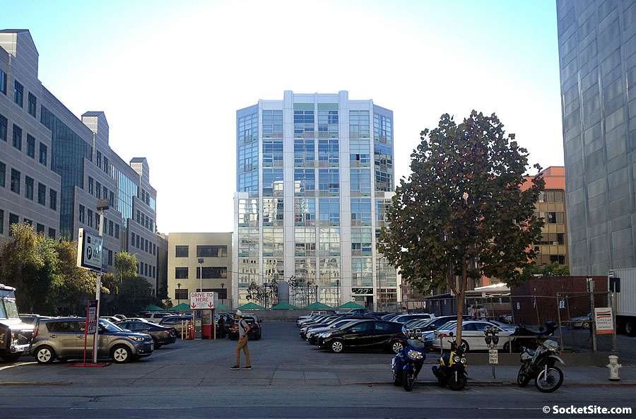
As we first reported last year, “have no fear, unless you happen to rely on the [130-space] parking lot at 350 Second Street or own a condo at 77 Dow Place that currently overlooks the parcel, an architect has been engaged to start working on plans for a new building to rise upon this lot.”
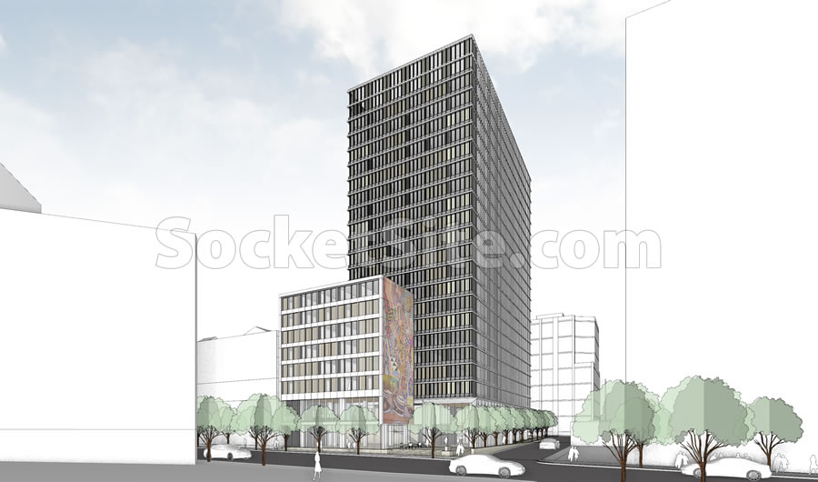
And the plans for a 21-story hotel with 480 rooms to rise up to 200 feet in height across the Central SoMa site have now been drafted and were just submitted to the city for review:
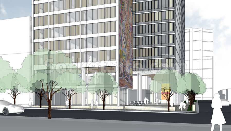
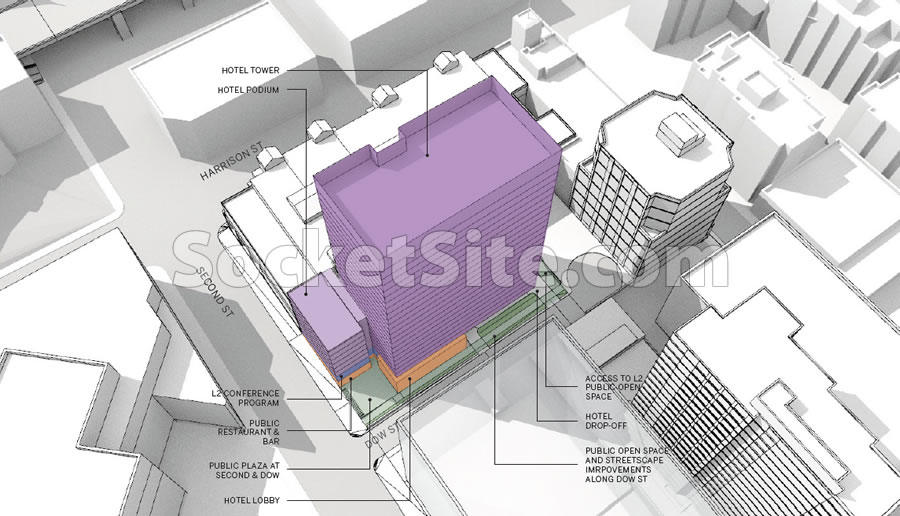
As designed by Skidmore, Owings & Merrill (SOM), the proposed development includes an 8-story podium building along Second Street with a 21-story tower behind and a privately-owned, public plaza (POPOS) at the corner of Second and Dow Place.
In addition to the 480 hotel rooms, the 350 Second Street project includes a 4,600 square foot restaurant and bar fronting Second Street and a 30-space garage with its entrance and hotel drop-off down Dow.
And while the site is currently only zoned for development up to 130 feet in height, it’s slated to be up-zoned to 200 feet if San Francisco’s Central SoMa Plan is adopted as proposed.


Did an actual architect design that? Are we in a time warp? 1965 maybe?
I believe (OK, hope) that what we see here will be refined. If not, based on the B&W sketch only which is all we have, I share your reaction.
Agreed. Pretty uninspiring.
Also, public plaza on the corner like that no es bueno. It too feels like an idea from 65 (see 4/5 of the towers built at the foot of Chinatown).
Agreed, totally boring. BUT better than a parking lot.
This is a SCHEMATIC DESIGN to show the genral contect. It’s not supposed to be the final design, they haven’t done the CD’s (Construction Documents) yet!
It’s probably not SocketSite’s job to give you an architectural education, but I’m sure there are plenty of architects who know what they’re looking at when they see this, and this is one of the problems w/ public opinion, it’s often uninformed. These renderings are produced to give a general feel for the scale. San Franciscans’ are too quick to judge w/ then don’t have any architectural background i.e. design can start w/ massing, as it get’s approved more details appear. it’s not all there from day one.
The typical 5 phases of design that a project goes thru with an architectural firm:
1. Programming: establishing in written and graphic form the scope of the project, parameters, goals of the client, cost projections and time frame.
2. Schematic Design: beginning conceptual design of the building, showing massing, forms, basic floor plan layouts, circulation, systems, structural concepts, exterior images, perspectives and site concepts, input by various consultants, Preliminary submittals to the appropriate governmental agencies, outline specs of materials.
3. Design Development: further development of the APPROVED Schematic design solutions, refinement of materials, forms, overall floor plans, exterior materials, budget clarifications and alternate materials, revised and refined specifications, contractor input, revisions by the agencies.
4. Construction Documents: final drawings, details, specifications based on approved Design Development phase, ready for bidding and final permit submittals, detailed cost analysis, drawings and details by structural, mechanical, civil, electrical, site and landscape consultants.
5. Construction Administration/Observation: Construction of the project with the full team on board. Observation and administration by the architects to review the adherence of the project to the construction documents, change orders, revisions, cost revisions, review and approvals of payments to contractors, coordination with Owner for changes/approvals, working with governmental agencies and building code officials.
A totally banal design. Perfect for SF. Not a surprise it’s a SOM design.
This is what you get with tall-ish mid-rise neighborhoods. Developers will keep it as boxy and bland as possible to maximize profits. Everything built 200-400 ft in Central SoMa will be dull. Think Wilshire st in Los Angeles.
It’s clear that architects have no respect for San Francisco and city planning has no respect for the people who have to look at these buildings everyday.
“Architects have no respect for San Francisco.”
Really? So when a client says “Maximize the square footage of my project” they should give them the double-bird and say “No. I respect San Francisco too much to make use of all the area the planning code allows, deal with it.”
Is there more detail on what appears to be a giant mural?
Bob, don’t waste your time. It’s concept only……
Podium ???
I realize the use of the phrase here didn’t seemingly didn’t originate w/ SS – though by repeating it in the text it’s perpetuating the usage – but can someone explain how an 8 story wing, appendage, or whatever in front of the larger bulk of the building is a “podium” ??
Is it going to be flush against the office building between it and Harrison? I see the one pic with a wall of windows! Or is the rendering off?
@donjuan You nailed it. The up-zoning of the Central SOMA will result in a dull and, I’d add, not resident friendly streetscape. Boxy buildings such as this one with no redeeming qualities.
I was recently in Charlotte and, though not a big fan of modern architecture per se, its downtown hi-rise buildings pop and make you shed a tear when you think of how mediocre SF’s downtown buildings are in comparison. How little our planning commission demands of developers/architects and how little we demand of our planning commission.
There are those who feel leaving the Central SOMA zoning as is would be the best course of action. Forcing a more modest template on the area. Resulting in re-use of some buildings and preventing the blocking out of the sky from street level. Which would still allow for a major increase in housing units in the area.
The up-zoning will be approved, but hopefully some of the Supervisors will ask that it be put to a vote of the residents of SF.
What are you talking about? Getting a building through planning in Charlotte is a breeze compared to SF. SF planning creates this problem with it’s strict rules. Instead of design that is innovative or eye catching the intent here is to create design that doesn’t catch the eye of planning and is non-offensive to everyone in the process. Hence you get weak designs like these, but sure… what we really need is more oversight to stimulate creativity from our evil architects…
I feel that is an excuse that developers are happy to use in order to get away with building bland, uninspiring and downright, at times, unattractive boxes.
One of the “pops” in Charlotte are some of the building tops. Upper floors with nice setbacks and caps. There is almost a latter day art deco look to some of the structures.
These things would not be against the code here but it would cut down on the developer squeezing every cubic foot of vertical space possible out of the project site and/or cut back on the last penny of profit by adding some nice detailed touches to the external façade of the structure.
We could have nice setbacks too with the higher height limits in this area that downtown Charlotte has.
Most of San Francisco’s ugliest buildings are the result of forced setbacks (Lowes nee Mandarin Oriental, EC West, 100 First)
So what you “feel” its an excuse. That “fact” of the matter is SF developers can’t build those interesting setbacks due to our height limits.
Charlotte’s tallest buildings are mostly boooring and mostly built by boooring companies with SF origins in their distant halcyon days: Bo’a (constrictor), Wells Fargone, Hearse(t).
Dave@ all you have to do is look at this coming election to see why the voters should not have a say. There are over thirty propositions and measures on the State and Local issues. Rediculous.
Looks great. Boring buildings are the best buildings.
I’ll say it again! Sadly going 20+ stories will shade the public space across the street @ 303 Second St., making it a wind tunnel and shading the grassy area deeming it useless in the afternoon. Very short sided of the people in planning! Shame on you!!!
I don’t get all the complaining. It’s a handsome, albeit retro, building. It’s a hotel buried mid-block in a sea of other buildings. It’s not like they’re sticking it on Telegraph Hill. Give it some space age lights and Scandinavian furniture and build it!
I agree completely. This new building has some of the elegant, understated elements and fenestration of the Lever House in Manhattan, designed in 1952 by SOM: some of the great modern buildings of the International Style.
Most of the above comments simply do not have a clue about architecture and what “modernism” really means. There is this constant harp on SS by readers that every new building is horrible, bland and boxy and the only acceptable kind of new architecture must be wild, out of control, screaming to “look at me”, and attention grabbing.
They don’t have a clue. This new building, from my initial impressions of the Schematic design concept images, promises to be understated, elegant and well designed and detailed by SOM.
Lever House and Crown Zellerbach were the first things that jumped to my mind when I saw this. If this is indeed the way the building is going to proceed, there’s something to be said for a tightly controlled image being presented to the world. Whether it’s a hotel, office or a condo building, nothing (IMHO) looks better than identical window treatments, as shown here. Many office buildings downtown have strict guidelines on what can be shown through the windows and it looks magnificent from the street.
You don’t need an architect’s education to see its two boring boxes
Unfortunately, the “man on the street” does not seem to care to take the time to understand anything about timeless, modern design that is free of clichés and trendy, superficial tricks.
By simply referring to this as “two boring boxes”, you have dismissed any inkling of your understanding of good urban design.
Well, frankly sometimes you DO need to be an architect.
We are the ones who go through the full process.
After ten to twenty years developers spend fighting for the right to build something in SF, there can be no money left to design and build anything attractive, let alone distinctive. (Full disclosure: I’m not a developer, I work in government).
UPDATE: Refined Designs for a Downsized Central SoMa Hotel on Second