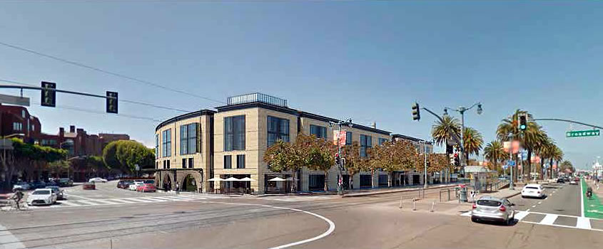
While the issue of whether Teatro ZinZanni’s proposed 180-room hotel and theater development to rise up to four stories in height along the Embarcadero, between Broadway and Vallejo, will be allowed to block the Vallejo Street right-of-way and view corridor has yet to be formally resolved, the design for the development has been refined to be more in character with the existing architecture of the city’s Northeast Waterfront Landmark District.
The window openings are now recessed and feature less glazing and more fenestration, while the ground floor openings have been enlarged to be more warehouse-y.
And the proposed glass gazebo under which ZinZanni’s historic Spiegeltent would be permanently erected has been replaced by a brick clad enclosure.
A potential alternative for the tent enclosure to the north of the hotel – adjacent to which a 7,500-square-foot, privately owned, publicly accessible open space (POPOS) would be maintained – would incorporate a glass roof to purposely differentiate the theater as new construction.
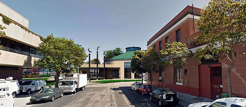
Regardless, the aforementioned Vallejo Street view corridor would be blocked by the building as designed.
The refined designs for the proposed development will be presented to San Francisco’s Architectural Review Committee (ARC) next week for their review and feedback to the development team.


So am I correct in thinking that they responded to one of the major complaints – that the “tent” blocked a view corridor (and public ROW BTW) – by altering it from a glass enclosure to a solid-roofed brick one?
If they really want to say “$%^& you!!” to design guidelines why not just go all the way and propose a 30 story building across the entire site?
If the rich people who will have their views blocked have such a big problem with a four story building in a city maybe they should pool their money together and turn this into a park. That or they can go buy a second home away from the tough burden of living on the SF waterfront.
You realize, I assume, that the issue is a view corridor down a public street – not over the roof of the building – and (part of) the building is being placed over that public ROW – notice repeated use of the word “public” here…as in “they already own it” – so yours is just a general complaint against people who don’t fall for the argument that SF will turn into a sandtrap if it doesn’t roll-over, beg and fetch for every development proposal that comes along ??
Yes, the many dozens of people who traverse that 2-block stub of Vallejo Street will now not be able to look at an unkempt parking lot. So sad.
I traverse that area all the time. At least with the parking lot I can easily look through and past it and see the beautiful bay and hills beyond. Soon I will have to look at a building that looks like a insurance company in Fresno.
Which insurance company are you referring to? The previous design looked like a now defunct furniture store in Fresno… 🙂
You can see the bay from dozens of “view corridors” on the various streets in the area. For this one, if it was really important to you, all you’d have to do is walk a couple blocks back and you’d get your view. The “view corridor” affects is only two or three blocks long and is composed of mostly blank walls on short office buildings and an occasional residential project.
Sit back an wait for the definitely real comments that don’t have any interest in pumping TZ to explain the reasoning behind that. It probably has to do with the wonder of the circus.
There is no “view” to speak of. Today the pier already blocks the view.
According to the original item upon unveiling the design for this building, Planning believes the pier bulkhead IS the view.
Then build a nicer looking wall. Put some art there. There is no reason to insist one must look at one wall instead of another.
This is clearly designed to appeal to crotchety NIMBYs. All it needs is an Olive Garden and a Pier One Imports to match the style…
You mean the non-chain equivalents of Olive Garden and Pier One.
No Teatro on the waterfront!
ughhhhh original design was so much better and more interesting.
I like the original much more. The glass covered”tent” is more transparent and playful.
I like the revised building, but the original tent (or at least the glass-covered “tent”) was much better.
I liked the original design better with the arches and glass enclosure for the tent. Revised is boring.
Teatro ZinZanni’s magical tent always delighted my friends. Every few months I would fly my astrologer, cat psychiatrist, Citroen mechanic along with their entourages for an evening of whimsical food and spontaneous happenings under the big tent. The last time Secret Agent 666 even shook hands with the Barbie doll at the bottom of the well. Bring the Teatro back, let it flourish, catalyze, and dissolve into the imaginations of the next generation!
BRAVO ! BRAVO!! ENCORE !!!
(But only ONE mechanic….surely a Citroen would have deux ou trois ??)
Right you are Notcom. Thierry and Jean-Marc hail from Clermont-Ferrand (and that’s where the Citroen is garaged while I’m not on the Continent). Alas Thierry has a dreadful fear of flying so his ZinZanni experience is limited to my extensive collection of VHS tapes. He retrofitted the DS with a nice color CRT, tape player in the boot. The three of us have jolly adventures roaming the countryside for spontaneously required parts, the cavernous interior of the DS making a fine place to sup on local cheeses while waiting. Did you know that there’s an auto dismantler in Picardy who can flip cups while balancing on a ladder?
Speaking of which do join us during opening week, whenever that is. We normally sit at Zestine’s table because she’s the most inspired cup flipper on the planet, maybe even the solar system. It will be an effervescent, spleen tingling experience. Teatro ZinZanni accedes to cynosure.
This is just…amazing. MOD Amazing.
Indeed she is impressive Brian. Teatro ZinZanni isn’t some droll dinner murder mystery theater where a B grade actor from the community stage down the street dines in period costume at your table, trying insincerely to convince you he didn’t do it. You won’t be eating rubber chicken followed by a slice of frozen Boston cream pie. The bartender won’t give you a puzzled look when you request a sazerac.
Instead you’ll be delighted by Dmitri who knows how to pair his tricks and illusions with the course being served. There will be no beautiful assistant being sawed in half while you saw through your steak. Those delicate hoops that engage and disengage at Dmitri’s will are on stage instead.
Yes, there’s excellent entertainment to be had elsewhere but none paired with food so well. Cavalia’s Odesseo is fantastic, but truffle scented popcorn is the finest gastronomy on offer.
At a Teatro ZinZanni show the sugar glazed ice over your delicately lavender infused creme brulee will shatter in ecstasy as Maria belts out Midnight at the Oasis. Write your congressmember now and bring Teatro ZinZanni back to the waterfront.
That is one pathetically squat, boring building. The hotel component should be at least 8 floors freeing up space for a less awkward treatment of the theater.
Once you’ve enclosed the tent in a building, it seems pretty stupid.
It went from an intriguing circus tent on the waterfront, to a high school.
Why don’t they take the development money & buy & improve existing, dilapidated Waterfront properties instead of obscuring / taking away new areas? Perfect would be the two adjacent to the ferry building (former Sinbad’s & other defunct restaurant behind ferry the ticket offices. Hello! Need help. Already there. No takeaways; just upside. And, at most, just a crosswalk away from public transportation Or, the closer to proposed site: the Waterfront Restaurant. It has great architecture for a theater/hotel combo, room for expansion, and has never gotten the service to cuisine basics working. No locals ever go there, it seems to ratrly be full, and honestly, I don’t see how it makes it legitimately.
It looks like half the lost view is the brick-sided approach to the tent. And the other half is the brick-sided enclosure for the tent. Even with the initial glass cover for the tent, the architect used a brick-sided approach. I suppose there might be utility rooms built into that wall, but you’d think it would be worth making it a glass wall just to get on with it already…
The glass tent was fun. This looks like “Anywhere in the Suburbs, USA”.
Is there a law against arched windows in this town?
UPDATE: Waylaid Waterfront Hotel and Theater Development Closer to Reality