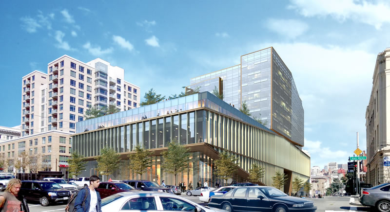
The bold plans for a modern 265,000-square-foot building to rise up to thirteen stories at 1200 Van Ness Avenue, the corridor parcel upon which the former Circuit City building and 24 Hour Fitness currently stand, elicited a wide range of reactions from the community when the plans were revealed earlier this year.
The reaction from San Francisco’s Planning Department to the design for the proposed development, which includes an eight-story tower with 84 condos over a five-story Medical Office Building (podium) and five levels of parking for 339 cars, was less than enthusiastic and decidedly subdued:
“Both the City’s General Plan and the Van Ness Avenue Area Plan call for new architecture that is complementary to the existing building pattern in terms of scale and rhythm and architectural expression.
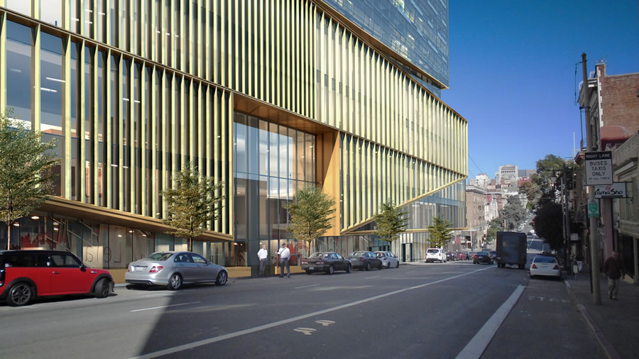
The proposed treatment to the podium portion of the building feels massive and horizontal in relationship to the rest of the neighborhood. The overall massing should more appropriately respond to the massing, scale, and modulation of the context on Van Ness.
To address this, the Planning Department supports retention and adaptive re-use of the existing building on Van Ness. This would help break-up the apparent size of the podium portion of the project, avoid demolishing a possible historic resource, and would help retain the existing character of Van Ness Avenue built environment, which the Area Plan encourages.
Staff is also concerned with the siting and size of the proposed tower. While the Planning Code enables exceptions to the bulk controls, which the project would be required to seek, the design must meet five design criteria and eleven sub-criteria that, in total, assure the tower design performs aesthetically as a tower that meets the bulk limits. Staff is concerned that these criteria have not been sufficiently met, particularly on the southern side of the tower, where there is no beak or relief along its width. Staff encourages you to reconsider the design of the tower and to either reduce its bulk or find other design interventions to reduce its apparent bulk.
Unless the original portion of the building is retained, staff also recommends that the tower be moved closer to Van Ness Avenue (with at least a 20-foot setback as required by Section 253.2) to reinforce and define this major street. Finally, the Planning Department recommends lower massing on Hemlock Street and recommends that the massing be further modulated to step up with the grade.”
Last week, the development team and architects from Woods Bagot met with San Francisco’s Planning Department to discuss a revised design for the development which would address Planning’s comments and code issues above. We’ll keep you posted and plugged-in.
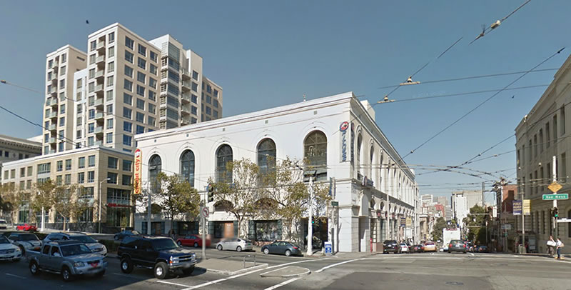
As the 1200 Van Ness building, which could be incorporated into the development, currently appears:
I don’t love the new design, but please don’t make them keep the old facade. That plan is growing very tired.
I don’t understand the anti preservation commentary in this forum, this city owes its charm and economy as a tourist attraction in part because people in the 50s, 60s & 70s had the foresight to save old buildings and street cars while others wanted to tear down as much as possible to build highrises and bus systems in the name of urban renewal, profit, density & “progress”. Yet today that lesson is totally lost on some who don’t understand that facades like this are made of high quality materials that were often fashioned by skilled craftsman and could not be reproduced with today’s building budgets. And even when something cheap and bad like this is proposed, there are still some who think we should tear down something good for something they admit is bad because they are “tired” of seeing facades being saved and reused.
I don’t agree with the city on a lot but thank god the planning department is staffed with professionals that have an education and understand the value of preservation.
“fashioned by skilled craftsman”
It’s not marble, just concrete done in the 60s or 70s..
And either preserve the building or don’t. This screwy ‘destroy the building and keep the facade’ is silly. We don’t live in a movie set.
The movie set/Disneyland comparison used is not entirely accurate. most commercial structures are and were designed to be built out with most of the design going into the facade and maybe the lobby knowing that everything else would be changed and adapted over the years to suite the use, just as has been done for centuries around the world as building uses change. Rebuilding everything behind the facade and making it part of a larger structure is really no different than completely gutting the interior and rebuilding except that the facade is now part of a larger structure. If done well, no passer by or building user will ever know that the facade is anything more than an old building that has been restored and renovated for modern use which most people appreciate.
And for the exterior elements, they are not hand carved, few are, but the molds to make it were and the designs for the detailing were designed by someone with architectural training and historic knowledge of classical detailing, a dying art. In contrast, what we see by most SF developers are buildings designed with the bottom line as the main design driver, no attention payed to detail, scale, or proportion and those structures will age very poorly. Now if something actually good was proposed here, then perhaps there would be reason for creating something new but replacing good with cheap and big doesn’t make any sense to me when you can keep some of the good.
TBH I think that a lot of the success of preservation (and I agree that it’s been pretty successful) has less to do with the quality of the materials, and more to do with the functional design of the buildings. When old buildings were replaced in the 70s, the differences weren’t limited to materials, but often involved what I’d call “suburban” designs: multistory parking garages, long empty walls facing the street with a few scraggly bushes in front, punctuated by huge garage doors, and so on. We like the old buildings because they were built with people in mind, so they often seem more pleasant and interesting to walk past.
Preserving the facade is a sort of shortcut– we’ve lost faith in modern designers’ ability to do a good job, so we tell them to just keep the old stuff instead. Ideally, new designs would be improvements on the old, in which case there would be no great need for historic preservation, except in exceptional circumstances. And I do think things have improved on that front. Maybe, in time, people will grow to like the buildings being built today, and will accept more “creative destruction”.
The old facade has a hell of a lot more character – and staying power – than the completely out-of-place neo-modernist glass wall.
While I agree, the present facade is actually something that was added later. The building originally looked quite a bit different.
Here is a link to photos of the dealership (H.O. Harrison) that built the property. It is was an Art Deco style building.
The first image and last few images are of the building.
Interesting. Thanks for the link!
Thanks Serge for posting the link, I knew the building had vastly been changed back in the 70’s, but the current staff at the planning commission as usual don’t have a clue. I often think there should be a review of who are these people and what their credentials/backgrounds are, especially when they are coming up with new street design.
I kinda like it
Very little character to this plan.
Really? We want to “retain the existing character of Van Ness Avenue built environment.” Okay, if you say so. But I’d say it’s not something we’d exactly want to preserve. It’s not a street that most people would want to use other than for just getting from point A to point B.
I disagree. There are a lot of really amazing buildings along Van Ness. The city would do well to highlight those and focus on replacing under-built parcels (which is already happening).
Agree. This could be a mini-Westwood or Mid-Wilshire, with enough effort. We should demand first-class architecture on this main thoroughfare.
Also agree – the AMC building (former Cadillac dealership) is an good example of this adaptive reuse when it is done right. Though they need to get a great lobby tenant to liven up that space.
They could just keep the old building and increase the height on the portion of the lot that’s just past it (before the corner lot). Let ’em go up 30 stories.
Hrm…seems “complementary in terms of scale and rhythm and architectural expression” to the CPMC/Sutter hospital being built across the street?
The little balcony thing overlooking Van Ness where the rendering shows people hanging out is a little funny.
we need the ability to develop “as of right” in SF.
YES! A thousand times yes.
Agreed! Apparently it works well in New York City.
Except no such thing exits in NYC and for good reason. It would be civic self-mutilation.
why is planning so afraid of big buildings? why can’t it just BE a big building? all this mish-mash of facades and attempts to make buildings look smaller are cheap tricks. just embrace that the building is large and give it a nice, consistent skin.
If it’s going to be that massive of a base, I’d rather see it be much taller. And I agree with planning that the set-back is extreme — they should be using way more of that vertical space. This strikes me as very suburban design. (That said, I prefer the design of this podium to the terrible neo-classical (or whatever style that’s supposed to be) that’s there now.)
I also rather like the original proposal and have little appreciation for the bastardized “classical” design there now.
I agree!!!
(to the original post… “why is planning so afraid of big buildings? why can’t it just BE a big building? all this mish-mash of facades and attempts to make buildings look smaller are cheap tricks. just embrace that the building is large and give it a nice, consistent skin.”)
I’ve asked this before, but would you please post the cross streets when listing addresses of sites?
I doubt many people know where 1200 Van Ness is off the top of their head. Van Ness and O’Farrell or Van Ness and Jackson would be helpful.
There’s a map in the top right corner (if you’re not on a phone or tablet).
[Editor’s Note: And coming soon to those devices as well.]
An elegant solution as-is, and yet another disappointing intervention from Planning. Nobody will be fooled by the inevitable NYNY fakery.
As Van Ness gets more dense and more built in the coming years, as it inevitably will, it would be nice if these new developments would have a front set back, even if its only 15′ and heavily landscaped (to avoid homeless camps, if that’s the fear). The idea of building large glass walls to the lot line and having a large amount of open space 3 floors above grade level that pedestrians and 99.9% of the population will never see or experience (let alone use) seems a little selfish/ developer driven and not in the spirit of good city planning.
most of those open spaces are public and you can go and enjoy your lunch on them! look up POPOS in SF (privately owned public open spaces).
Yet they’re only open during weekday business hours, which means most of us neighbors who have jobs don’t actually benefit from them.
What’s so enjoyable about heavily landscaped setbacks? When I think about places in the city which are pleasant to walk, setbacks are only a positive if the thing behind them is ugly. Better to make the buildings themselves nice to walk past (mostly by having activity on the ground floor).
This “old facade” is one of the few along Van Ness that I like and, for once (trust me, it’s rare) I agree with almost everything the Planning Dept. is saying. This building is perfect for “adaptive re-use” and the tower definitely should be close to Van Ness (with a modest set-back), not the alley. Got get ’em city planners but then get out of the way once they meet your demands!
PS: I completely HATE the first try at this building. The podium looks utterly 1960s and looks more like those buildings where they slap a cheap sheet metal recladding on something than anything new.
I cant believe the existing building is historic. I had always assumed that it was built in the 80’s to parrot some of the actual historic buildings in the area. Either way, the existing version looks cheap and is not worth “preserving”
The building itself was built in the 1910s I believe and was art deco. The current facade was added in the 80s or 90s. Under that facade it should have more style (think: the current restoration of the Cliff House).
The existing building looks nice to me. Nicer than the podium in the rendering. So incorporating the old building into the new design sounds like a good idea.
That’s one of the busiest 24 hour fitness locations, any idea if they will relocate somewhere in the vicinity?
With all the new buildings, the next big quake will show SF as a big pile of shards of glass… possbly with lots of bloody edges. (I hope not)
Yes, I’m sure the engineers have not planned for an earthquake.
Make it just like this with the tower 20 stories taller, and the whole scale of the thing would pop into focus and make sense.
We need to stop messing around. There is a serious shortage of housing going on, and it would be great to have 200 rich 29 year olds living in this building instead of the Tenderloin or the Mission.
UPDATE: Don’t Get Too Attached (Or Worked Up If You Don’t Like It)
o, but i think the new design is too square or too round, maybe too blue or too green…
all i have to say is, ONE RINCON!
i would love to be the politician who recieved the payment for the approval of this hideous abomination, that has ZERO precedence in downtown…
grease the right palmZ and you can build the uglyest 40 story monstrosity amongst 5 story simpletons…
UPDATE: Proposed Van Ness Development Adds A Possible Grocery And 60 Percent More Condos.