
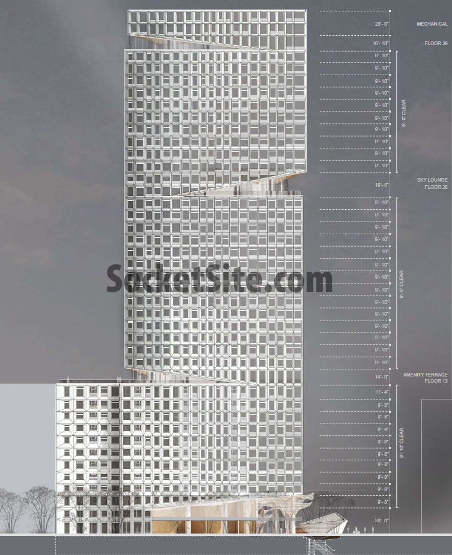
High above the proposed plaza to transform the intersection of Market and Van Ness, the “skylounge” on the 28th floor of the proposed One Oak tower would offer some rather spectacular views for the building’s residents and guests, as would the private balcony for the Grand Penthouse A on the building’s 39th floor.
And then there’s the landscaped terrace on the 13th floor, which would include 3 BBQ areas and a fireplace, with a 6-foot windscreen and canopy to protect it from the elements.
From the architects of the project, SCB (the tower) and Snohetta (the plaza below):
Seen as continuous zone, the entire ground floor and mezzanine have been designed to integrate the indoor and outdoor spaces through a series of design elements. The notion of shared/communal space is carried vertically through the building with amenity spaces for residents located at two additional levels; a large Amenity Terrace at the required 120’ setback level, and an iconic “Skylounge” at the 28th Floor with views down Market St.
The tower form has been shaped by wind mitigation efforts in addition to zoning requirements and a desire for an iconic sculptural, yet simple form. The focus of the tower is on the diagonal “cuts” at the base, amenity, and penthouse levels. These cuts are designed to reflect the residential character of the tower both in scale and materiality, with reference to the history of the Northern California residential vernacular, from Bernard Maybeck and the Arts and Crafts movement, to the wood structures at The Sea Ranch.
The body of the tower is meant to provide a quiet and elegant background “tapestry” with materiality reminiscent of older residential towers and the historic masonry buildings along both Market and Van Ness, particularly the adjacent 25 Van Ness building (a historic former Masonic Temple). The size and layout of the openings varies in relation to site factors (wind, sun, and views), interior layout and unit value, and formal requirements including a response to the tower shape and the “cuts.”
A tip of the hat to our tipster who delivered the renderings, and to the architects for their work.
Xcellente!!! now let’s build it already!!!
Looks pretty great for an architectural rendering (where artistic license typically blends seamlessly with outright lying) and I hope it gets built. But “reference to the history of the Northern California residential vernacular, from Bernard Maybeck and the Arts and Crafts movement, to the wood structures at The Sea Ranch”? Really? I wish I’d been at the charrette where that mouthful got assembled.
Really? Cuz when I first glanced at the photo, the first word to come into my head was “driftwood”.
Hmmm. Since I like the rendering (and like it a whole lot more than the icy-cold Richard Meier design) I will try to adjust my vision and see driftwood. But since I never saw driftwood in Maybeck or even Sea Ranch, I don’t know if I’ll get anywhere. I just want that upper terrace facing the Ferry Building to be a public bar. We are woefully bereft of high cocktail lounges.
Also to whoever down thread was bitching about this being “out of scale” with the short building across the street: get a grip. It’s also “in scale” with more than one tall building nearby. And in any case, San Francisco grows or it stays in scale with a bunch of relatively tiny buildings built nearly a century ago (that were at the time out of scale with their surroundings.) I’d say “you choose” but I don’t actually want you to. Because you’re wrong. I just cleaned house and put a tall candlestick next to a short vintage globe, and they look great together.
Yes, “out of scale” has already lost here. Two other corners of the intersection are also zoned for 400′ with projects in the planning stages. The Civic Center / Van Ness skyscraper cluster is already happening.
I agree with the public cocktail lounge idea. At least one building in this area really should have one. This city should give whichever developer agrees to build it in an additional few floors so they can have bragging rights to being the tallest building in the neighborhood. Otherwise we’re going to have 5-6 buildings down there of exactly the same height. How boring.
..and YES! much better than the first pass at the design.
That looks amazing.
Nice work. Can the window be opened?
I have high expectation for the Oak St plaza.
I like the attention to pedestrian experience Snøhetta is assuring at the plaza level, and the fact the soffits at the several cutbacks in the tower match that detail (soffits similar to canopies on the street). I think I like this more than the Meier proposal of yore.
Completely agree. I was really disapointed when they dropped Meier and wasn’t sold when the first rendering for the SCB/Snohetta design came out, but the more I see, the more I like it. A lot.
This reminds me of the bar/balcony outside of the Pure Fitness at 2 IFC in Hong Kong. Removed from the hoi polloi. Except that it will never be hot enough in our city to give a cold beer the same allure, a great place nonetheless.
I was parked in the White Zone at Fox Plaza, waiting for somebody, when a woman was blown off her balcony onto Polk Street. What kind of wind will this building generate?
This building breaks the wind.
Completely agree. This proposed tower will exacerbate an already windy intersection. In addition, it is completely out of scale with the lovely Florentine-style building next door. The proposal needs a radical rethink
there are 2 other towers going in on the intersection (replacing the walgreens and the honda dealership). All the sites are zoned at 400′. They have been required to do extensive wind analysis, and this building was specificaly designed to change the wind patterns.
Is there a rendering of the intersection with all three towers? I suspect the Walgreens one is going to block the views of downtown, and the Honda one will block most of the views from the south face of this wedge. Pity they’re going to be so close together.
No pity required. This intersection is going to be the locus of the city’s densest concentration of public transit options and should be its densest neighborhood.
As transit rich as it may seem, this intersection is a 0.4 mile walk to BART, 1.7 miles to Caltrain and the Transbay Terminal, and 2 miles to the ferry. Eastern SoMa is the transit center of SF, not here. Per Caltrans count (Route 101), about 100,000 cars per day cross Market on Van Ness. There is a reason Van Ness has been the center of the new car business in SF.
I just meant it’s a pity about the views from some of the units. Normally, being 30 floors up, you’d get a great view. Some folks aren’t going to.
Thank you. I don’t think people realize just how devastating the wind might be.
That’s why Windy Cities don’t build skyscrapers.
Good thing Chicago doesn’t have skyscrapers!
LOL
Chicago got the name “windy city” for the verbosity of its politicians, not its meteorological conditions.
it is crazy windy though… like all the time. in winter it’s like someone is stabbing you in the face.
I’m pretty sure people do realize how the wind will be, because they have actually studied the wind conditions as part of the design & planning process.
She wasn’t “blown off her balcony”.
She was just pining for the fjords.
Will these apartments be for sale or rental?
Unquietly engaging. Love the public parkets high up.
they aren’t public, just FYI
I simply can’t get behind the shape of this building. Nor am I a fan of the notches. It’s too simple considering it’s at the very edge of the skyline. I feel like there should be a gentle taper as opposed to this…box.
Is it true that this will be the tallest building in the city coming from the west?
I think Tony Soprano was the last person I heard say “Frisco,” and that was on fictional TV. Anyway this building is yet another atrocity courtesy of the “sell every square inch of San Francisco including your grandmother’s grave to make a buck” crowd, of which Ed Lee appears to be the face, and this here web thingy the voice.
hyperbole and emotionally fueled inaccuracies
Yes, definitely better to preserve the city in amber.
I walk past the current condition every day and that is the only thing atrocious about this project. Do you even know what it’s like to step over human feces and vomit on this corner, or are you just making another blanket statement about how change is destroying San Francisco “character?”
Does anyone complaining about the wind factor actually read the article? Please read content, inform yourself, then make an opinion.
“The tower form has been shaped by wind mitigation efforts in addition to zoning requirements and a desire for an iconic sculptural, yet simple form.”
The gradient of masonry to glass (from western part of podium towards Van Ness) is really beautiful. I wonder if they can play that up a bit more to really make the tower feel very light compared to the base?
LOVE IT. BUILD IT.