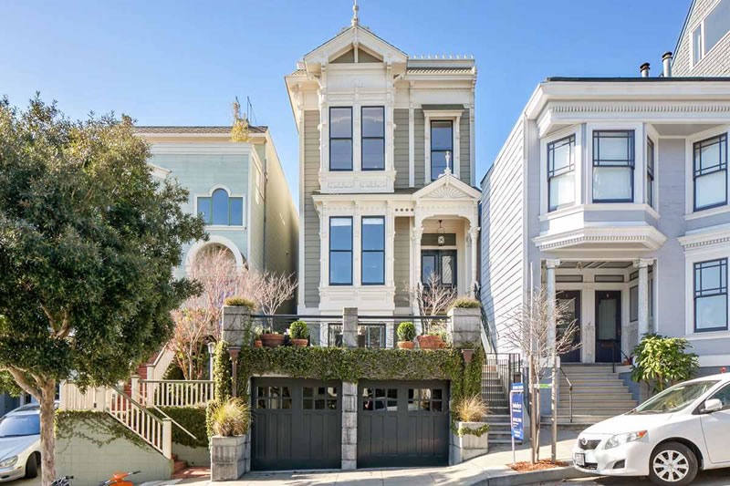
The facade has been rebuilt, the garage recently added, and the kitchen has been featured in Dwell. And while the rest of the 1880s-era Italianate at 50 Buena Vista Terrace has been remodeled and “modernized” as well, it hasn’t been stripped of its original character and class.


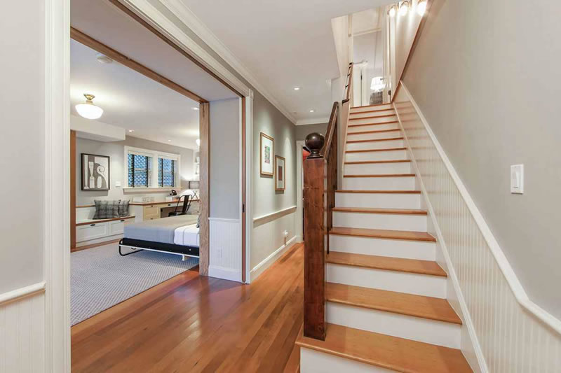
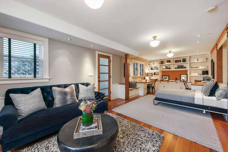
Even the lower-level expansion and new guest suite fit right in.
And with 2,820 square feet of living space across its three levels, the Buena Vista Heights home is now on the market and listed for $3,650,000. Credit Ross Levy Art & Architecture and Schwartz Architecture for the redesign, and De Sousa Hughes for the interior.
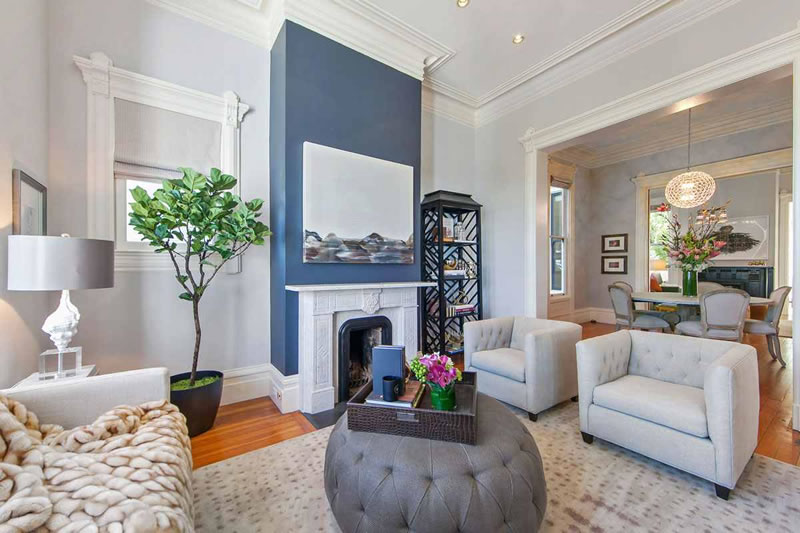
A thoughtful renovation/restoration with a stunning finished product. There is nothing about this that I don’t like. One of the best solutions I have ever seen on this site to the often controversial subject of updating a narrow Victorian. Some people may not like the modern touches in the kitchen but I think this provides a nicer counterbalance versus a contemporary kitchen made to look a century old
I’ll sign off on this one. The new kitchen addition is subtle enough and will allow for unobtrusive, future updating without impacting the original structure. It’s a nice balance. You clearly can have traditional details blend with a modern aesthetic without resorting to the SOMAfication of every Victorian.
Very tastefully done. Interesting to see can lights with some standard ceiling lights thrown into the mix.
Handsome remodel with fascinating light fixtures. Only problem that would make one thing think hard before buying is the limited closet space. No entry area coat closet, tiny bedroom closets and where does one keep the everyday needs like the vacuum cleaner etc.?
From the drawings, it looks like the intent is to use the lower level as part of the home — there’s more storage down there. And the owners made the (I hope) conscious choice to pick interior access to the garage over storage needs. The vac might fit in the W/D closet on the upper floor, it looks big enough. But there’s no way of getting around the fact that Vics have limited closet space.
Upon seeing the photos, I retract my vac-in-the-w/d-closet comment.
I remember seeing the facade restored a few years ago – asbestos shingles stripped off, Victorian detail restored. What a transformation – a real painted lady!
Beautiful, job well done!
I love this one! Great job all around adding modern elements yet retaining the original charm. As long as they don’t mind driving everywhere or mountain climbing when they go out for a walk this will make somebody very happy!
There’s a great deal of stuff within walking distance. The Divisadero corridor is a 10-15 minute walk (downhill), Lower Haight is the same. The Mission is 15-20. I do it all the time, as I live across the street.
Downhill…on the way there. 🙂
What’s wrong with walking uphill? I enjoy it.
Nothing, just saying that not everyone likes to walk up hills that steep every time they leave the house. That’s all.
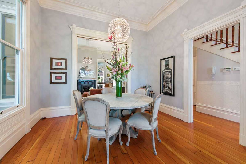
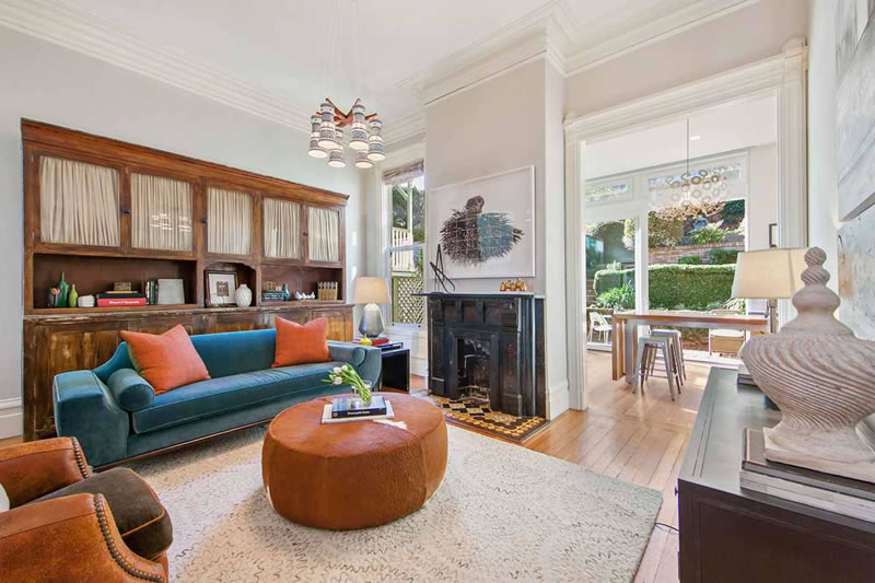
Now *that’s* the way to renovate a Victorian. Stunning. (Except for the 1990s sponge-paint job in the dining room. Whew.)
Is it sponge-paint? I couldn’t quite tell. Looks like there might be a complex shadow pattern from the light. Either way, like the house overall.
it’s not spongepaint! it’s the shadows from the fixture! these people obviously have taste, i don’t think they’d use spongepaint.
If that’s the case, it makes a lot more sense, considering how tasteful the rest of the house is. They should have photographed it differently, though. As is, it looks very Forum Shops at Caesar’s Palace.
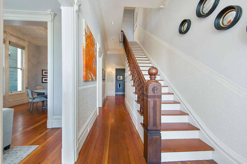
I’ve seen much worse on these pages. At least they left in some natural-stained wood and the beaded wainscoting on the stairs. I hope the exterior looks as good from the rear of the building as it does from the street.
I still don’t understand this fetish for designing the personality out of living spaces. I prefer that my kitchen and bathrooms not resemble a jet-propulsion laboratory. And the furniture looks like it came from a stager’s warehouse, not collected over a lifetime by real people. I am hopeful that the purchasers will fix that.
I didn’t see the “before”, so I can’t say whether any crimes were committed in the course of this remodel.
I also appreciate that this remodel kept some distinct rooms, as is appropriate in a Victorian. The Great Room does not belong in homes of this type.
Lovely inside! But what are the rules governing putting these ugly snub-nosed garages in front of a Victorian. I thought they’d been limited. They make the street so unfriendly for pedestrians.
I love the houses with the garages out front, just a personal preference I guess. Also makes a ton of sense in earthquake country – many of them don’t go under the house, so no soft story.
They are no longer allowed. But the garage was added way back in 2000-2002, when it was allowed to do this. In this case, given how high above the street the property sits, it doesn’t really detract as much as it might in more typical instances.
Very nice home.
I am coming out of lurker mode to add some balance to this discussion.
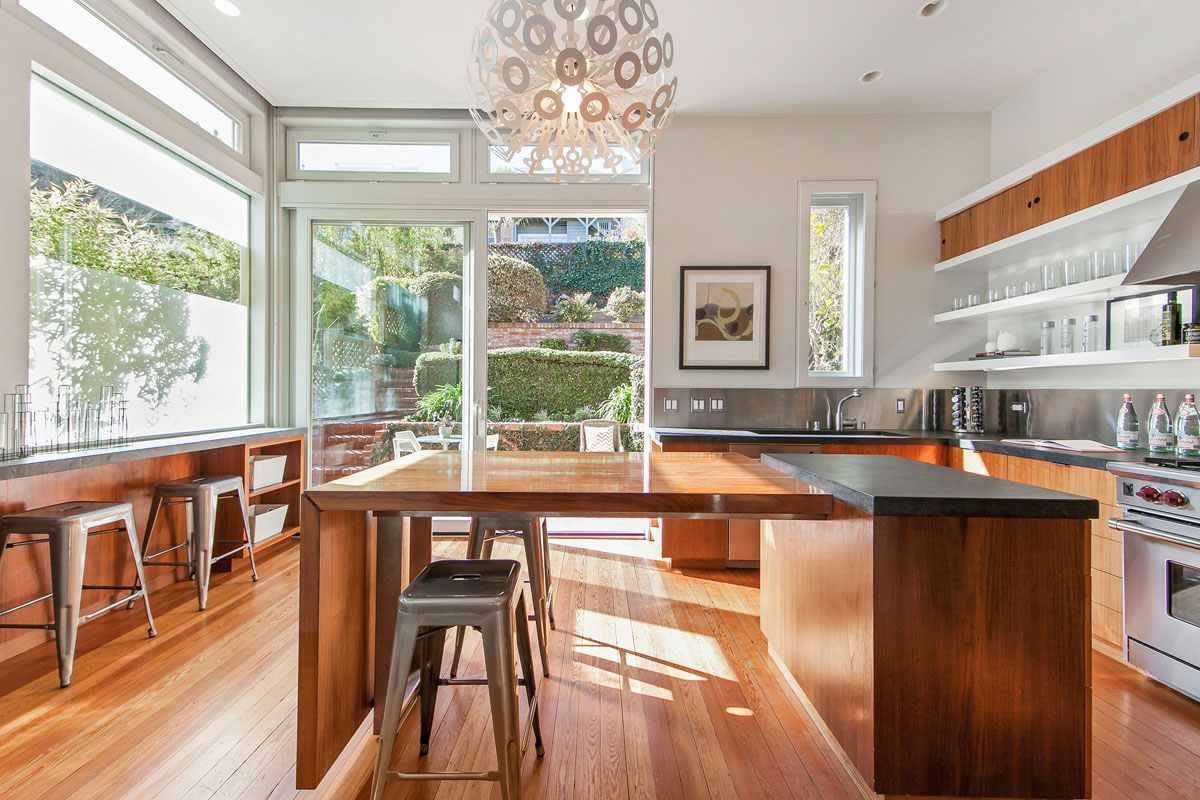
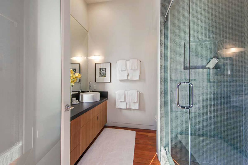
Is no one else bothered by the location of the refrigerator? Such a nice, bright room, but then so difficult to actually cook in.
I suspect that the dining room is not smudge-painted, but rather that this is the shadow put off by the light fixture. Regardless, the overall effect isn’t great.
The fridge location is the worst part of the kitchen. That nook should be a pantry, with the fridge… elsewhere. Also, personally, not a big fan of the open upper shelving… for dust reasons. But it does have glorious light. (I walked through on Sunday.)
I agree on the upper shelving, although clearly some people like this look and are ok with the dust. I wouldn’t ever do it myself. The fridge doesn’t bother me at all, though. I actually like it! As far as I’m concerned, it can be out of the way, tucked in the corner. Overall, the kitchen in this space is great. Lots of counter space, lots of natural light and the island converts to a 10 person dining table. Very cool, not at all cookie cutter and a big selling point in my mind.
Surprised at the comments and willingness to overlook obvious flaws in the name of historic preservation. My guess is that it would sell for more if it was fully dwellified. Lots of little nitpiks for me on this one and overall, while I love the effort, I’m not a fan of the current home. All the charm of the Victorian, and little of the luxury most buyers would want today. Gas fireplaces may be over-rated but but they get used a lot more than traditional ones. I have both and use both quite a bit; but the gas goes on all the time. And little things like the phone plug in pic #14. Makes me wonder why they wouldn’t have eliminated the ma-bell box and put a proper outlet. Baseboards have a major gap to the floors. Did they paint the garage doors and railings cause they are green at twilight and black during the day. GFI outlet in one of the baths has a wall gap exposed. Folded cardboard to hold open the basement door, Toilet paper holder sticking out from the wall in the bathroom with the tub that could use updating. This is like a Where’s Waldo? of problems in every pic. Looks like the result of HGTV decorators challenge or something.
I’ll probably get flamed for posting but I just think this place has too many surface fixes and lacks a lot of the modernizations that could have been easily achieved. Again, I love the effort I just think this falls short.
Not flaming you, however it is often said on this thread that many are tired of the fully dwellified interior. I can’t argue that there are some small issues, but this isn’t a flip/spec house. People actually lived here and remodeled it to fit their needs/wants. And they did it with style, without a complete “one size fits all, whitewash” of the place. Most of the obvious flaws are pretty easy fixes. For me (aside from the lack of closet space) it feels much more like a home than you often find in this city. I do understand your point – it’s a lot of money for for these details to be missed. But perhaps we are spoiled by the designer flip….
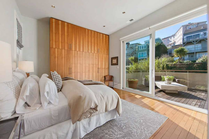
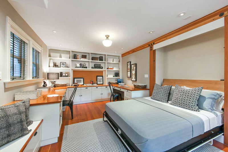
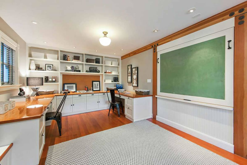
One of the cleverest Murphy bed enclosures that I have seen. Turns into a blackboard. Nice idea!
Clever, I guess, but not particularly useful. If they didn’t just want art there, a dry-erase board would be better than a dusty chalkboard that will never be used; but I guess that wouldn’t be Victorian enough.
Is this house really Italianate? Seems more Stick/Eastlake to me.
Terrible street-face, though. Like much of SF, looks pretty from afar but for the pedestrian it’s just another garage door.
They should have converted at least one of those garage spots to an accessory dwelling unit.
Also, doing that puts some more ‘eyes on the street’ which can help reduce petty crimes.
Sold 4.65. One million over asking. $1650 per foot… gah..
UPDATE: Inspired Italianate Dwell-ing Returns