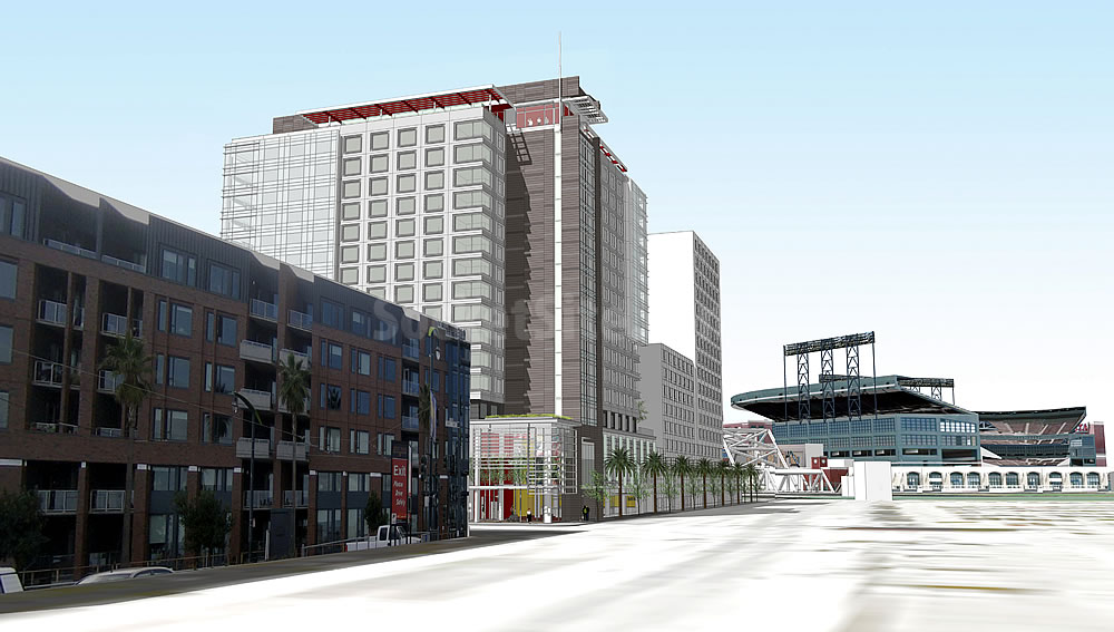
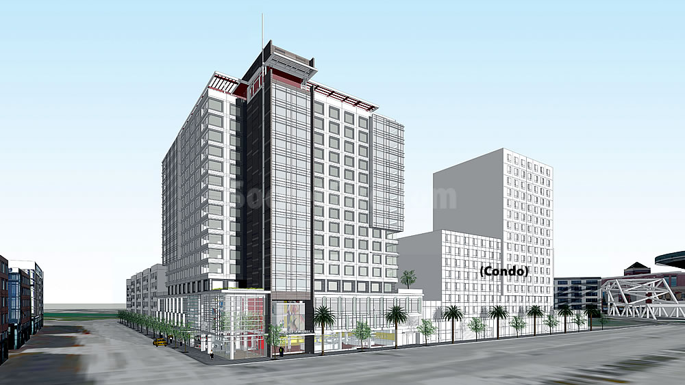
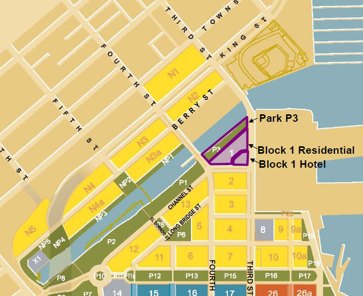
The designs for the 250-room SoMa Mission Bay Hotel to rise on the northwest corner of Third and Channel Streets have been refined and the developer is now planning to start construction in the fourth quarter of 2015.
The project includes a 40-foot podium that defines the street edge along Third and Channel Streets…and a taller tower element (159 feet at the rooftop, with mechanical screening that brings the total height to 173 feet) containing guest rooms and suites.
At the Third and Channel Street corner, the podium is enclosed by transparent glass and is activated by the hotel lobby, public gathering space…and a market-place café. The main public entrances for the hotel and the café are located along Third Street, while the Channel Street elevation is the location of the port-cochere, elevator access to the rooftop community space, and loading dock.
The Mission Bay Hotel will abut the 350-unit residential development that’s to rise on the remainder of the Mission Bay Block 1 site to the north, a development which was just sold to CIM Group as reported by the Business Times.
The hotel development will include a total of 4,000 square feet of ground floor retail space and valet parking for 24 cars. And in response to concerns raised by the the Mission Bay Citizens Advisory Committee, 10 secured bicycle parking spaces have also been added to the project and Hornberger + Worstell Architects will be tasked with integrating “additional color” into the design as a condition of the development’s final approval.
If all goes as planned, the SoMa Mission Bay Hotel will open for business in 2017.


I really dig the open space along the waterfront. I hope the pathway extends around to the pathway along the other side of the channel. This would make for an outstanding running loop and really draw the community out.
totally agree– the renderings in the CIM Group Biz Times article show what looks like a great open space/trail along the water, so it seems like it’ll be well connected.
[Editor’s Note: Keep in mind those are the old renderings with respect to the buildings and open space, but the park along the water (“P3”) will remain a feature of the development.]
Any word on the planned bridge across the channel at 5th Street?
Been wondering the same thing myself.
I’ve been hearing that this is probably a no-go. The design would have to allow for the sailboats owned by the houseboat residents to pass under it (creating too steep of a pitch for pedestrians to cross), or it would have to pivot in the middle so that the sailboats could get through (a very expensive design and with added operation costs).
Totally unimpressive. What mediocrity – what a tragic missed opportunity Mission Bay has turned into. But what the hay, this is SF and what more can we expect.
some people just love to hate.
I don’t get this. It’s a common theme here, the Mission Bay Hate. It’s a little sterile, but it’s also brand new. The blocks are a little big, but due to modern patterns of financing development, most developers are larger scale and serving larger instutitutional clients like UC or biotech companies.
But overall…compare Mission Bay not to North Beach or the Mission, but to Sand Hill Road or Bishop Ranch or to Sunnyvale. heck, look at the dismal block long collections of townhouses in downtown San Jose from a few years ago!
In comparison to modern, large scale, corporate developments in the suburbs and many cities, Mission Bay looks damn nice, if one accepts the reality of brownfield redevelopment on a large scale. There could be more variation, punctuating the neighborhood with more towers and the like, but the verdict is not in on how effective forests of towers are at creating neighborhoods.
On another site, a self-impressed Mission district resident burbled that Mission Bay was a failure because it had not “generated spontaneous cultural events”
All good points. And it’s a helluva lot better than what was there 10 or 15 years ago!
Of course, it could be better. And it is not a baid thing necessarily to complain about bad and bland design. Maybe property owners CAN be shamed into better design? (Although REITS are the BORG and have no human shame! (LOL))>
For an interesting alternative perspective, drag the little man on Google Maps over the Parque das Nacoes neighborhood in Lisbon, Portugal. Much bolder architecture, but I am not sure it hangs together that well as a NEIGHBORHOOD? Still, some fun buildings!
Mission Bay should have been designed as a neighborhood, but instead it is an office park and bedroom community for people working on the Peninsula. The entire area is dead when there is not a baseball game. Only one bar, stays open past 10 pm. No schools. No community center. Watch [this video] to see what it should have been.
I live in the city and work just outside of Mission Bay. For some reason people think engineers want to commute into or out of the city (depending on who is making the point), but most of us love living and working here.
So not true. I’ve been living in Mission Bay for over 2.5 years now. I love being close to the bay, it’s great parks for walking my dog, I can walk to my office job in SOMA/South Park, I can walk to my grocery store, the T-line Muni drops off right outside my apartment building, the list goes on. Most of the residential is still under construction and once they are all full of tenants and ground floor retail fill in, it’s going to be great. Not to mention I love being by all the Giants excitement.
Heaven forbid we actually hear from a resident!
You must not be a REAL San Franciscan! Have you organized a Tuvan Transgendered Throat Singing Festival yet? Nooooo? then you are the problem and Mission Bay has no culture! Off to Fremont with you, good sir!
Wow! JB’s linked video is astonishing. While Vancouver goes forward, we go backward. I think the point about the inclusion of children is fascinating. If this city spent half the energy and time it does worrying about bikes on children, we would all be enjoying a better place. Would “naked men” be allowed in a neighborhood with children? Would aggressive “outdoor people” (the new p,c, term for homeless) be allowed to control public space if children were present? Mission Bay is worse than the suburban office park in Irvine where I had my first job out of college. At least down in Irvine I had landscaped pedestrian only spaces, restaurants and shops, and dedicated bike lanes. I escaped Orange County so I could live in a city like San Francisco, only to find they are building a worse version of Orange County down in Mission Bay. (BTW- the skyline and buildings in Vancouver looks amazing)
I too was amazed, but am willing to cut us a bit of slack. The Vancouver neighborhood is finished, while MIssion Bay is still a work in progress. There are plans for parks and open spaces, and there is space set aside for a school. A cash-strapped school district like SFUSD is not in a position to build and fill a school on the hope there will be enough students. I know the state funding formula for schools is based on actual butts in chairs, so it’s very hard to build for prospective students. That said, my cousin lives in a new development in San Ramon and they had to build 3 new schools as part of the development, so I’m not sure why we couldn’t have made the developers pay for the school. Anyone else know?
Wow, this video should be sent to John King @ the comical or to our sad planning dept.
Beyond pointing out the failure of Mission Bay regarding families, it inadvertantly shows the good design of Vancouver’s redevelopment with midrise towers and the utter blandness of the box squats of Mission Bay (guessing to preserve the views of Potrero Hill)
That Vancouver vs. San Francisco video really shows how poorly served we are both by developers and planners in this city. Did you see the waterfront parks they had? The landscaped pedestrian walkways! And those buildings and skyline are gorgeous . There’s something about the Vacouver skyline that is so attractive. I guess being a “world class” city, we only needed to build a low rise office park.
I guess you can say it appears to meet the street well and the glass corner looks nice. But yeah, everything above that? Yuck. The placeholder renders that are on the Business Journal look 10 times better than this.
The prior conceptual designs were far better. What a step back from what was initially proposed!! I’d rather wait for something better than to have this crap piece of crap pair of blase blocks go up.
yawn
It matches the rest of the development , and that has been the core of the over all project for years ,
I have little issue with the design , but if locals wanted something more signature they would have allowed higher building heights
Height does not correlate with good design. The two are independent.
This Fresno-by-the-Bay design will be built, while the elegant Richard Meier tower at Market and VanNess will be rejected. This is San Francisco after all. The most tragic part of this drab design is the lost opportunity to have the condo part be twice as tall and, thereby, provide more urgently needed market rate housing. Only in SF.
I’m sorry Have you really been to Fresno? This comment is just silly.
I am also guessing that the Richard Meier tower will be “rejected” because it is too expensive to build and the property owners don’t want to pony up the additional costs.
Think of all the innovative, elegant, interesting architecture around the world. And Mission Bay is getting none of it.
Think of all the utterly dreary suburban junk in the Bay Area itself. And in 90% of the United States.
The perfect is the enemy of the good.
And, my various comments aside, I don’t even like this building. But, except for a few trophy projects which are few and far between, the reality is that modern hotel architecture is UNIVERSALLY awful. Jukebox, anyone? Look at other relatively recent hotels in the City. None of thse hotels are particularly interesting or elegant. The W Hotel on Third? Most modern Union Square hotels? And we won’t even talk about The Jukebox
The Giants wanted to develop their parking lot with a few 30 story towers which would be a relief from the boxy buildings of Mission Bay but thanks to Jack Davis and others like him the monotony will probably continue.
Terrible designs for the hotel. It’s such a downgrade from the last renderings when the supes approved it.
At this rate, I wouldn’t be surprised if the condo will actually be a white block with no windows on the south side.