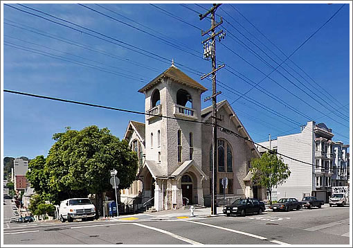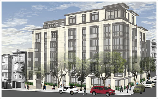
As we first reported in January, while San Francisco’s Planning Commission blocked the proposed demolition of the dilapidated church at 1601 Larking Street and development of a modern Stanley Saitowitz designed building in its place, Ian Birchall was quietly engaged to redesign the project as “a contemporary interpretation of a European city apartment building” in an attempt to appease the Commission and neighbors.
With San Francisco’s Planning Commission continuing to meet behind closed doors to discuss litigation and consider settlement proposals with respect to the development of 1601 Larkin Street, next week the project sponsors will informally present the revised revised design and state of the existing church (it’s bad) to the Commission.

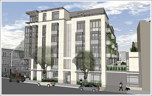
The current iteration of the project proposes the same program as the previous project, involving the demolition of the existing church and the construction of a six-story building containing 27 dwelling units and 29 off-street parking spaces. However, the design of the project has been substantially revised in terms of massing, architectural language, and finish materials.
Specifically, the current design incorporates setbacks above the fourth story along the Clay Street elevation such that the building appears to step with the sloping topography of the block, creating a more suitable transition to the adjacent lower buildings to the west. The sixth level incorporates various setbacks from the roofline, lessening the apparent height of the project by making the uppermost story visually subservient to the remainder of the building. Deep voids have been added at the center of both the Clay and Larkin Street elevations to break the massing of the project into a rhythm of discrete, vertically-oriented modules.
Compared to the previous project, the current design proposes a much higher proportion of solid wall planes versus glazing, and would be finished in a light-colored limestone plaster material.

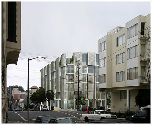
As always, we’ll keep you posted and plugged-in to what’s happening behind the scenes. And once again, the Saitowitz design which was rejected:

∙ An Attempt To Settle For With San Francisco’s Planning Commission? [SocketSite]
∙ Development Of 1601 Larkin Disapproved By Planning Commission [SocketSite]
∙ 1601 Larkin: Comments, Responses And Latest Renderings [SocketSite]
∙ Behind Closed Doors: 1601 Larkin Settlement Discussions This Week [SocketSite]
This does my head in.
I used to live at Sac and Larkin (a block away), it’s not a bad area, but it’s not super nice either.
A shiny new building would only improve the neighborhood.
Why the neighbors would want to keep the rundown church is beyond me. At least at the time lived there the church was used as a homeless camp.
Well, this is a subtle interpretation of a European-style apartment and the fake limestone plaster deferentially blendszzzzzzzzzzzzzzzzzzzz…
That’s a lie. The EIR for demolition was turned down. It had nothing to do with the previous design. This new design is really boring. I second the ZZZZZZZZZZZZZ. Let’s hope the commission will be smart enough to ask for the original scheme.
I was sad to see Saitowitz’ plans for 1600 Market shelved. That would have been a great project.
This one? not so much. Both SS’s and IB’s designs are underwhelming – just egg-crate boxes with generic apartments stuffed in. No spatial glory or compelling street frontage.
That said, either design is better than the church and adds to the housing stock.
UPDATE: A sneak peek of the very latest renderings for the proposed 1601 Larkin Street project which will be presented to the Planning Commission next week have been uploaded above.
I still live in the area. Tear this church down already! If you don’t understand our animosity towards it, walk by there any day from 10am-4pm and 10pm onwards.
This building really would improve the rest of an otherwise dilapidated stretch of Larkin.
wow, the saitowitz one is at least 100x better, way to outsmart yourselves, nimby brainiacs. is it impossible that the original design returns?
I live within two, count em two, Saitowitz residential projects just around the corner. They, and nearly all his stuff look the SAME, exteriors and interiors. With the exception of the Synagogue he did, his stuff is getting tired, dull, tedious, and repetitious. His stuff now lacks variety and interest…and believe me I TRY TO KEEP OPEN TO CUTTING EDGE ARCH.
[Editor’s Note: Saitowitz Scores With The Critics (But Not With Those Next Door).]
I also live near this church. I see it often because it’s on the #1 line heading downtown. ANY residential building at this point would be better than this abandoned, deterioriating church. It has turned into a homeless and pigeon camp and it’s disgusting. Tear it down and put up condos, apartments, I don’t care, just do something with it and clean up this corner.
That is exceptionally unremarkable.
for the love of all that is good tear this f*cking thing down! it’s only use is as a bum hostel and open air bathroom. Seriously, it reeks of urine and feces every time I walk by.
I was all for the Saitowitz version, because at this point ANYTHING will be better than what is there. I’m not psyched about the new design, but I wholeheartedly support it just to get SOMETHING built here. It’s truly a blight on the neighborhood.
UPDATE: 1601 Larkin Street Design Sneak Peek Take Three (Or Four).
This trend of tall, boxy bay windows reminds me most of Egyptian mashrabiyas… which I think is cool, but I doubt it’s the architect’s intent.
The fourth design reminds me of the condo building at Landers and 15th in the Castro. Overall the design is a little pedestrian, but I think it has more curb appeal compare to some of the other generic condo-boxes popping up in the Mission and Soma.
I think it’s a travesty to tear down this building, why not challenge the designers to come up with something working around the original design? I’ve seen numerous churches in London converted into luxury apartments, condos etc. without effecting the exterior. I’ll wager that half the people commenting are transient residents-not unlike the people sleeping outside the church- and won’t be here in 5-10 years so don’t really care what it looks like as long as there are no dirty people ruining their shallow lives. I’ve lived 1 block from this place for 35 years and I don’t see it being that big of a issue.
This new design is boooring. More stucco and bay windows and in this case the stucco is even beige.
I would prefer anything more exciting for this corner.
I don’t have any attachment to the existing church.
I respectfully submit that the new design is much more aesthetically appealing than the brutal Stanley Saitowitz special that could have been built here and I’m kinda glad in a schadenfreude way that he got a smackdown on this one.
This thing is a monster. 27 units (24 2 bedroom) and only 29 parking spaces? There’s already no parking in this neighborhood! That ratio needs to change dramatically!
You want more parking spaces? 29 are not enough? Have you not heard about “transit first” especially in “transit rich” areas? The only things more evil than parking spaces are the cars that might go in them, reducing the time people spend circling the block. There is no chance that our prudent, wise and thoughtful Planning Commission will allow more parking.