To quote Roseanne Roseannadanna Emily Litella…never mind. Apparently the Planning Department’s just published compendium of comments and responses to the proposed 1601 Larkin project contains outdated renderings for the project. Whoops.
Ironically, the images had been added to the document in response to community comments that the most recent renderings had not been made available for review.
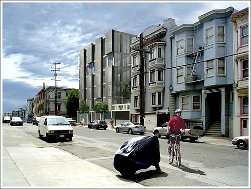
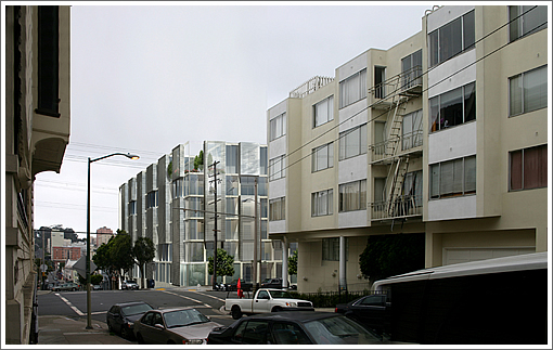
The renderings now above and below (not including the “alternative”) are in fact the most current by way of Stanley Saitowitz | Natoma Architects. Cheers.
As proposed, the building would rise 63 feet and yield 27 units over 30 parking spaces.
The ground floor would have three residential units, the second floor would have seven residential units, and floors three and four would contain 12 units. The fifth floor would have four residential units and the sixth floor would be a penthouse. Of the total 27 units, there would be 1 junior one-bedroom unit, 1 one-bedroom unit, 4 one-bedroom-plus units, 20 two-bedroom units, and 1 three-bedroom unit (the penthouse).
The main entrance to the residences and the driveway to the ground-floor garage containing nine spaces would be from Larkin Street. Vehicular access to the below-grade parking garage containing 21 spaces would be from Clay Street.
Comments run the regular gamut of concerns regarding visual impact, views, parking, shadows, air quality and the likes. And yes, the birds:
We also remind you that small animals such as pigeons and other birds make their home in this area which would be significantly disrupted, if not destroyed, by this new structure.
Disrupting pigeons? We’re not sure if that’s more of an argument for rather than against.
UPDATE: Oh, and did we mention a onetime “alternative” design for the preservationists?
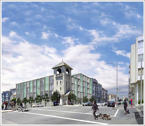
And no, that’s no May Fools or photoshop savvy reader simply having a goof.
∙ 1601–1603 Larkin Street: Comments And Responses | EIR
∙ 1601 Larkin Reignites An Architects Versus Planning Design Debate [SocketSite]
ugh, I liked the other one a lot more.
The geometry and color scheme is reminiscent of the CSAA building on Hayes.
Def ess enthused but serviceable. Looks slightly like any modernish 1990s dorm built on a Canadian college in the 1990s. But, I still like the jolt of new energy and materials on a dreary block of Larkin.
UPDATE: Oh, and did we mention the “alternative” rendering aimed at appeasing the preservationists? It’s been added above. And no, it’s no May Fools or photoshop savvy reader simply having a goof.
Can real cars be photoshopped out of existence too? I love the pleasantly spaced parking in the pics.
“Oh, and did we mention the “alternative” rendering aimed at appeasing the preservationists? It’s been added above.”
Great guns, that is the worst choice of all. Just abandon the project rather than create this mishmash solution.
CSAA Jr. is the best of the bunch.
One aspect that I cannot understand from the renderings is what the street level will contain. Is it commercial ? I hope it isn’t a blank wall.
I do appreciate Saitowitz style, but there is absolutely zero context for this type of architecture in this neighborhood. One of the first things you learn in design studio is context. Seems like this key principal was just tossed out his green frosted glass window. It looks horrid.
I realize that we’re not supposed to say anything bad about Stanley Saitowitz because that firm is successful and local, but I think TheRealScoop nails it: there’s nothing wrong with Saitowitz-esque “channels and green glass slabs” design in general, but in this neighborhood it just looks jarring and out of place.
You know, I honestly think that Saitowitz gives a damn about context..I think he should, but he doesn’t.
He’s off in his own little world. There are some architects today who are into “re-discovering” 60’s architecture, like the CSAA building..and they think that style is “cool and retro”..and then they want to duplicate that style in a new interpretation. Not all 60’s modern was good.
I think he’s trying to do that. Not so good, in this instance.
Don’t build it. It’s too good a building for this dreary stretch of Upper Polk.
Save the Pigeons!
Maybe when some people get hurt or killed by falling rocks from the preserved element during the next big quake then there will be a legal and moral basis for reigning in the authority of planners in San Francisco.
UPDATE: To quote
Roseanne RoseannadannaEmily Litella..never mind. Apparently the Planning Department’s just published compendium of comments and responses to the proposed 1601 Larkin project contains outdated renderings for the project. Whoops.Ironically, the images had been added to the document in response to community comments that the most recent renderings had not been made available for review. The renderings now above are in fact the most current (not including that onetime “alternative”) by way of Stanley Saitowitz | Natoma Architects.
You have to admit that there’s a lot more context in the second render, i.e. when you juxtapose it against those 60s stucco block (and single-pane aluminum window) apartments.
I agree with RealScoop. It’s horrid and ugly and totally out of context. If I were the developer and paid some famous architect a lot of money for a design and that’s what he came up with, I’d be appalled.
“…never mind. Apparently the just published compendium of comments and responses to the proposed 1601 Larkin project contains the old old renderings for the project. Whoops.”
What ??!! Am I going crazy ? When I look at http://www.sf-planning.org/Modules/ShowDocument.aspx?documentid=8157 I see the renderings of the version with the blue tinted glass, not the gray glass. I like the blue tint better.
On further inspection I see that this is living space on top of garage. That indicates that the street level facade will be a bleak garage wall, which is pretty lame for an area with this density. There should at least be a commercial space on the corner.
Commenting now on the most current renderings the socketsite editor posted at 10:33 AM, I have to say that the proposal doesn’t look quite as out of place. I still like the “channels and glass slabs” design for 555 Fulton St., placed in that part of town more, though.
noearch wrote:
Is Saitowitz trying to bring back brutalism?:
I admit I don’t have near enough knowledge of architectural history to make the case that this proposal or the design for 555 Fulton St is brutalist, but that sentence is what jumped out at me when I was reading the entry from wikipedia (yes, all usual caveats about wikipedia’s reliability as a source apply) and thinking about the previously posted pictures for the 1601 Larkin proposal.
It was Emily Litella who said “never mind”.
Roseanne Rosannadanna’s line was “it’s always something…”. Which I suppose also applies in this case.
[Editor’s Note: Well, to quote Roseanne Rosannadanna…it’s always something. Since corrected. And cheers.]
Why is being out of context necessarily a bad thing? Now, I understand that plonking a skyscraper in the middle of a neighborhood full of 2-3 story houses is a bad thing, but why not enjoy the diversity of a Victorian next to a brutalist building next to a glass-walled building? After all, this is San Francisco, and we like diversity when it comes to people and cultures, so why not also diversity in buildings?
This has been pending in Planning for 6 years, and the Methodist Church has a judgment against the City to demolish the building. Let’s join arms with MPN loons, stretch this process for another 6 years, and really create some “neighborhood character.” I for one am sick of encountering homeless, crackheads, meth freaks, and prositutes daily on my way home while the building decays and Planners play out some bizarre game of poker with the Methodist Church and the developer.
Context on these blocks of Larkin? Go there and look at it, and try and convince yourself that anything not dilapidated and dreary would not be an improvement. The surrounding neighbor buildings will be the challenge to marketing this, not the reverse.