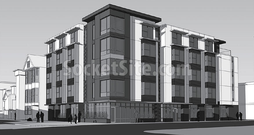
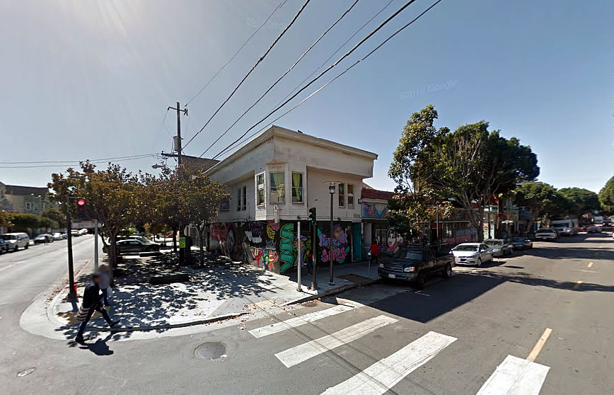
In the works since 2008 and previously aiming to break ground by the end of 2014, an all-new set of plans for a contemporary five-story building to rise on the southwest corner of 24th and Harrison Street, in the heart of San Francisco’s Latino Cultural District, have been drawn by HKIT Architects in collaboration with YA Studio and submitted to Planning for review.
As proposed, the existing Mission Neighborhood Centers building on the 3001-3024 24th Street site, which stretches along 24th from Harrison to Balmy and is currently home to the Mission Girls & Head Start Program, would be leveled.
And in its place, Casa De La Misión would rise up to 54 feet in height upon the site, with 45 apartments for low-income seniors developed by Mercy Housing and 1,750 square feet of ground floor retail space at the corner of 24th and Balmy.


So, no reason for the change? I felt like the previous design did a nice job playing outside of the sandbox while complimenting the character of the neighborhood. Too bad to see it head this direction.
Great for the ever-growing low-income senior community, but when will architects move past these dime-a-dozen designs?
It’s because these are “safe” designs not interesting ones. Why take a risk and propose something interesting when it will just be another thing used against you in a town hall meeting. “BUT MUH NEIGHBORHOOD CHARACTER!”
Dime a dozen is correct. Nothing of interest to note here.
previous design was definitely better, but Mercy’s latest on 6th and Howard is looking very sleek, so perhaps the finish will be nicer than these renderings appear.
Keep in mind that the Sixth Street project employed a different architect and perhaps budget.
While not the world’s most daring architecture, it activates a dead corner, always a resting spot for bums and so-much-trash. So bring it on. (please)
Cookie cutter all the way. This is a critical corner/intersection in the lower 24th street corridor and deserves a great statement. The building needs to be designed with a neighborhood vision–this is not an “anything is better than what’s there” scenario (per some mid market sites). The fact that it borders Balmy alley also should also inform the design. Balmy is the neighborhood’s beating heart.
Looks pretty much like every other cookie-cutter Mission building that’s gone up over the past decade. Boring.