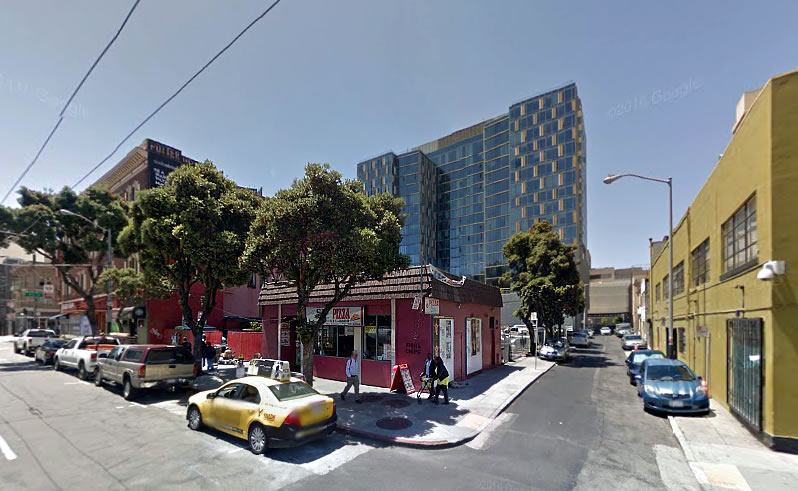
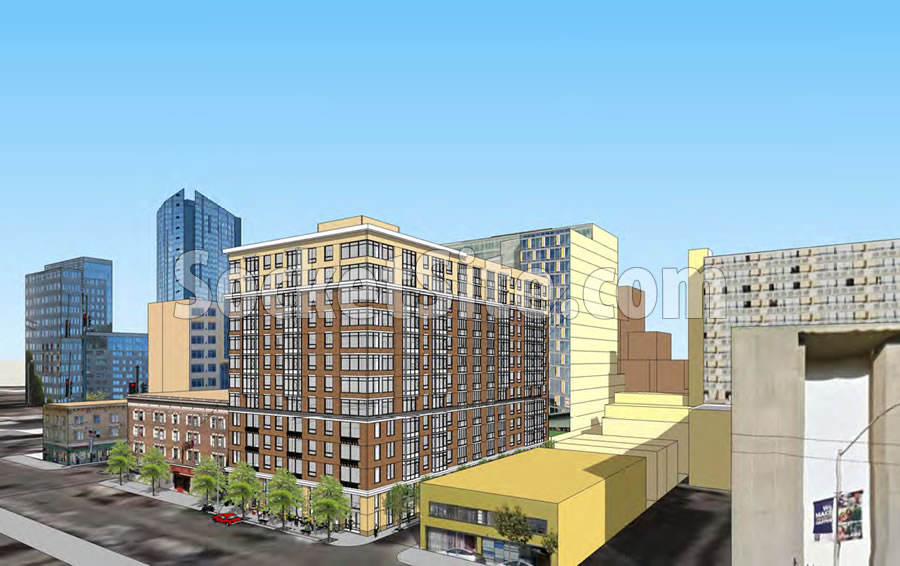
Speaking of significant projects in San Francisco with forward momentum, the City has just issued a Preliminary Mitigated Negative Declaration (which is a good thing if you’re the developer) for the proposed 13-story apartment building to rise on the 1270 Mission Street parcel, a parcel which is currently occupied by the 1,200 square foot SF Pizza Café and a surface parking lot at the corner of Laskie, between 8th and 9th Streets.
Zoned for development up to 120 feet in height, the 120-foot-tall project as principally proposed includes 195 apartments over 2,000 square feet of ground floor retail space and a garage for 76 cars and 200 bikes.
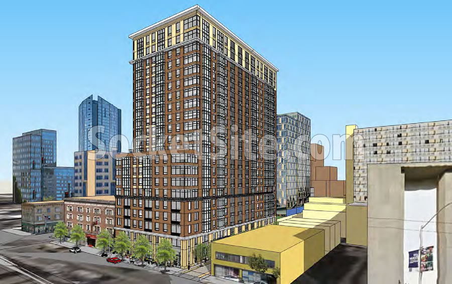
At the same time, the development team is actively seeking a special amendment to allow building up to 200 feet in height on the site, which would yield an additional 104 apartments, as rendered by Architecture International for AGI Avant.
In exchange for the additional height and density, the team is offering to provide 20 percent of the 299 units at affordable below market rates, which is significantly higher percentage than the 13.5 percent as was required at the time the initial application for the project was filed with the City back in 2014.
Since that time, however, San Francisco voters approved Proposition C, which increased the affordable housing requirements for new developments to 25 percent. And while the baseline affordable percentage for the project as proposed is effectively grandfathered at the lower percentage, it’s safe to assume there’s likely to be some pushback with respect to granting additional height in exchange for an increase in the affordable housing percentage which is below the new threshold of Proposition C.


The design has a nice, somewhat classic look. The exterior finishes radiate a sense of warmth which one wants in a residential building. Picking up the yellow finish on the bottom floors at the top floors is an interesting touch. The flat roof is ameliorated some by the small overhand. I wish they’d carry that overhang along all of the roofline in the 13 story version – as they do in the taller version.
Compare the rendering of the proposed building to the glass clad, boxy building behind the parking lot in the top photo. SOMA deserves less of the latter and more of the former.
Agreed. It looks inviting and more human than the building in the back.
Even if assuming arguendo, certainly not to say there is no place for AVA 55 9th.
Unless it ends being all stucco instead of bricks because the developer cheaps out, then it’s going to look like Vegas.
It should be noted that Prop C allows affordable units to be built affordable to 100% AMI. Per community input, this project provides affordable units at deeper AMI levels than required by Prop C, and has no affordable units higher than 90% AMI.
I must say I like the look of the 20-story version more.
i live 2 blocks from this proposed development. across the street from me a 5 story building has been approved, which will block all my southern sky. all my morning sunlight. i don’t care! this is a city. it should be 10 stories at least. so, for this one, please, please, 20 stories!
Mid Mission is 18th and Mission. This is in SOMA. And Donald has a comb-over. And stucco is ugly.
[Editor’s Note: The headline was (intended as) a play on Mid-Market.]
Always difficult to tell from a rendering, but cladding aside, this appears to have more character than say, SOMA Grand.
Tough to tell from basic rendering, but this looks like it could actually be some sort of brick/stone precast siding, not stucco.
Love the taller version. Would be great to have more ground floor retail. Keep the sidewalk and alley activated.
Looks nice, can’t say the same for the shady characters that hang outside the “medicine” dispensary 50 feet west on Mission.
very nice. but if city is planning on [600 feet for the Market Street Hub] why not get these up another 100′
So they anticipate that this will pencil in as a rental? Wonder what kind of ROI they’re expecting, and how the ownership is structured.
Also if there are long term loans involved.
Good questions. I am surprised this was not developed as a condo project especially given the better than average look of the project. Maybe it is mapped for condo conversions down the line?
The ROIs are way too low generally in the Bay Area for my investment expectations, but maybe a 2% – 3% ROI? With expectation of a big upside in the value of the property and rents in the few years after it is built? Not sure that is the best assumption to make, but many I know who invest in SF and the Bay Area accept minimal ROIs in anticipation of making it up with appreciation and such.
Why is everyone fawning over this? More pointedly, why are we assuming this is brick and not stucco? Especially since the coloring is so far off from the actual brick building next to it in the rendering?
Don’t get me wrong, ALL for height along Mission, all for more units to clean up Mission (which feels unsafe and unsavory still), all for more feet on the ground to help Mid-Market bars, restaurants, stores, and cafes, but this doesn’t seem particularly significant architecturally, and already feels value engineered.
Say no to the wall on the…err…wherever this is… (/sarcasm)
UPDATE: 200-Foot-Tall Mission Street Development Closer to Reality