Having quietly hit the market priced at $28 million last year, the asking price for the recently modernized Pacific Heights mansion at 2250 Vallejo Street has just been reduced by $3 million (10.7 percent). But at $25 million, it remains the second most expensive home officially listed for sale in San Francisco, behind 2820 Scott Street which has been listed at $28.5 million for four months.
Originally designed by the late local master architect James Francis Dunn and built in 1902, the formerly 7,300-square-foot mansion at 2250 Vallejo was converted into an eleven-unit building between 1943 and 1968.
In 2009, at which point ten of the units were controlled by the then owners and the one 1,600-square-foot unit in the basement was tenant occupied, an application to merge the ten units across the top three floors of the building was approved by the City.
In 2012, the building was sold for $6.95 million, after which it was gutted, expanded and officially merged into a “two-unit” building (which it legally remains).
And with a new garage, elevator and roof deck, and a decidedly modern/contemporary new interior, the spec home hit the market for $28 million last year, as we first reported, but it wasn’t officially listed until three months ago.
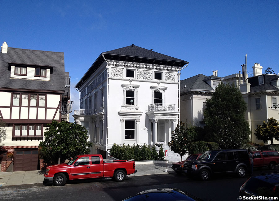













Props if you can name three buildings by “noted” architect James Francis Dunn (they don’t have to be “extravagant”) + Bonus points if you can name two projects “by ‘renowned’ Los Angeles-based architect Paul McClean” (although according to this article the airquotes maybe belong around “architect” as much as “renowned”).
Franklin just north of Vallejo, west side.
Broderick, apts, between Washington and Jackson, west side
Haight, similar to the one on Franklin.
MacAllister, similar to the one on Franklin and Haight
Excellent! (and doubleplusexcellent if you did it w/o googling). If it was b/c you’re actually familiar w/ his work, though, then don’t look at interior photos: your tears are likely to short out your keyboard.
Always wondered about the building on Franklin, glad to learn the name of the architect behind it. How bad are the interiors? IKEA catalog bad?
I would say they’re not bad per se, they’re just out of touch with the house…a 114 year old neo-classical box.
In defense of the work, it should be remembered that the house had earlier been subdivided, and much of the interior may have already been gone; so this probably wasn’t a preservation issue. But I think I would have gone for an interior more compatible with the exterior…for once, I don’t think budget was an issue 🙂
Paul McClean seems to be doing just fine down in Los Angeles.
SF can now boast it follows in the design footsteps of Laguna Beach…the parents must be so proud.
The house on Franklin, built as three flats, was mostly intact until about 2007 or so, and the new work is not destructive of the interior.
The interior of 2250 Vallejo is, on the other hand, a disgrace to its history.
This home creates a lot of confusion in the marketplace and if anything it’s doing a wonderful service to all homes priced above $10M. I wonder if they would take $19M for it. That’s my guess.
At this point in cycle they would be insane not to
Little price moves over 20 meaningless for what’s a nice almost mansion
The interior is classy, elegant and well detailed. A beautiful contrast with the equally classic exterior.
^^Agree with Futurist here. I like what they did and think this is very well done. Just a bit overpriced. My understanding was the interior was not well preserved and sometimes its best to start anew with good bones. There are at least 2 full tear downs happening in D7 excluding the modern new home finishing up on Broadway. At least this wasn’t a tear down. 🙂
Oh, what else is being torn down? I’m back for a bit. I guess it’s time to drive around the neighborhood!
I have no idea what the final sale price will be here. I’m included to agree with eddy that 19-20 would get it done.
The exterior is probably my favorite in d7. Even though I think the interior could’ve been more harmonious with the baroque exterior and still kept an modern feel, I’ve made my peace with what’s happened.
Losing the gorgeous stair and the intricate crown molding (both which were extant), is a bit of a shame, but it was far more important to bring this property back to its original use as a single family home. The house had totally lost its interior shape and was in an egregious state of disrepair given its dramatic street presence and overall potential.
The overall floor plan is pretty much what I would have done. The only thing that’s something of a fail is the spiral stair, which doesn’t seem well designed. The steps taper way too much to the center. But that’s a minor quibble. If this had hit the market 6-9 months earlier, it would’ve sold faster. Mcclean design is fairly well known. They certainly got a lot of attention for that supposed $500 MM Bel Air listing.
Someone got a heck of a deal on marble
I, for one, don’t entertain enough guests in my bedroom to have a need for a reception/waiting area with plenty of coffee table books. But that’s just me.
What, you just let everyone into your bedroom at once? I’d fire my bedroom receptionist if such a thing ever occurred.
The kitchen is small given the size of house and price point. Otherwise I think it looks beautiful inside and not overdone. The view is wonderful but it’s bit too far east to be prime Pac heights and it’s facing the sacred heart school retaining wall. It could have sold for 28 in a hot market but it’s pretty cool right now.
Disgusting lack of originality in rather nicely designed 1902 house. All of these “open floor plan” remods of neoclassical homes is a perversion of the great components they bring to the table. How many white marble kitchens can dance on the head of a pin?
To top it off, stagers use the most banal furniture this side of IKEA. It’s a hoot when you see the same couch moved from house to house.
It’s kind of funny because the main furniture pieces in this house are from Minotti, one of those trendy looking, Italian mod-furniture places in LA (kind of like B&B Italia here). Mcclean uses them in most of his homes. I’m sure every couch in this place was like 10k, and they all come with the house, so you definitely won’t have seen any of these pieces in another house. I will say that Minotti has better looking stuff than shown here, even if it’s not really my taste. The other odds and and ends, however, are from Arthur McLaughlin staging.
Looks that way to me
Most of the pieces of this interior have been seen many times before and in houses and condos at much lower price points
Nice yes but commodity nice
There are some pretty spectacular finishes in this home. This place as the trifecta of size, location, quality. I’d put each at a 9 out of 10 here. Location is a little too east (crowded) and not Broadway -1. It’s actually a pretty functional size. Maybe too narrow and I would have oriented the kitchen to face north with a view rather than west -1. Finishes are very nice and lots of good details.
The one thing bothering me these days on higher end homes is the use of Nest thermostats. Any home of this caliber should have a proper Crestron system for controls. Zero excuse for this to not be the case. Shades, HVAC, Entertainment, Firepits, Hottub, Wine temperature, Radiant floors, lighting should 100% all be centrally managed. The use of Nest just highlights to me that the controls for this home are not properly thought out and will be more complicated for the home owner at the end of the day. Even still, it’s all pretty nice so -1. 27/30 🙂
Compare this to the disaster renovation on Broadway that I would give 16/30 on a similar scale.
Agree a central system should have been put in for a place at this price point. Savant seems to be the nimbler company in a fast moving market and can control everything mentioned at a lower price. True Crestron says it’s finely crafted hardware will last decades but unfortunately it’ll be obsolete in less than 5 years and companies like Leica are struggling with same issue. I think a central system can still be installed assuming they pre-wired the house well for ~100k which is rounding error on the asking price.
Nest seems a little budget for this place, but I have a Crestron system and it was a colossal waste of time and money.
I won’t go into much detail, but it makes some things that should in theory be very simple borderline impossible. You’re stuck having to make service calls constantly because you aren’t allowed internal access to the system. It was also immediately dated. I got a quote for $50k just to make my system compatible with current technology.
It’s probably no big deal if you’re buying a $25MM house, but it’s definitely annoying and I wish I had something more basic that allowed easier interface and was more adaptable to changes in home technology. Just be aware that you’ll have to spend major $$ every few years as the technology changes.
Yup. Researched Crestron and bottom line – nice hardware but programming and updating a nightmare esp with all the gifted programmers hired for big bucks by the tech companies. Went with Savant and it’s not perfect but working well and happy so far.
I thought homes “of this caliber” came with butlers and personal assistants.
Can anybody clue me to what is on the bookshelves in the view room with grey couch? Uniform piles, look like magazines, just seems odd, but a bit of a prole I guess.
Finally sold for 21.8.