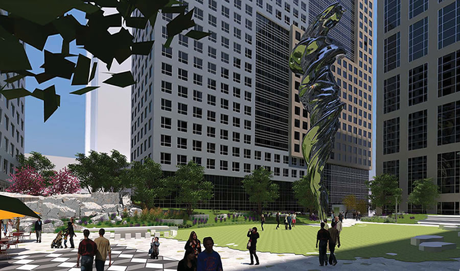
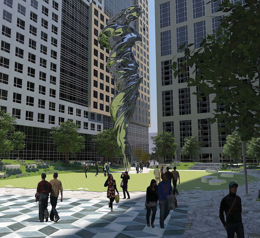
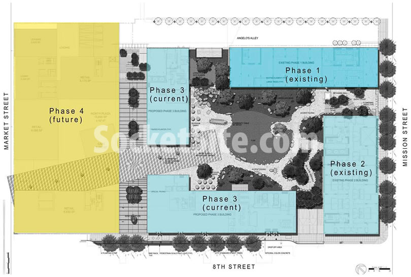
With construction of the third phase of the massive “Trinity Place” development underway, a four-phase development which will total over 1,900 apartments, 60,000 square feet of commercial space, and two acres of open space across its Mid-Market site, the development team is preparing to unveil the details of its proposed public art to adorn the site, “a thematically-unified landscape of interrelated artworks” dubbed “C’era Una Volta.”
From the Planning Department with respect to the proposal:
The concept (titled “C’era Una Volta” – Once Upon a Time) was developed by artist Lawrence Argent, and draws inspiration from classical forms and themes reinterpreted through the use of contemporary technology.
The overall composition is comprised of glass and marble sculptures, a stone wall and assemblage of blocks evocative of a quarry, and several scattered marble blocks with partially carved sculptures that appear to emerge from the stone.
These pieces are arranged within a landscape of walkways in formalized paving patterns, transitioning to an informal, organic courtyard of irregularly-shaped pavers, planting beds, and a central circle of turf.
The most prominent of the individual pieces is a contemporary rendition of the Venus de Milo which has been digitally-manipulated into a twisting form and fabricated into a 90-foot tall steel sculpture.
And from the artist himself:
“C’era Una Volta is an artwork comprised of many parts woven throughout the site, transforming it into a place of engaging mystery and unfolding meaning. Inspired by classical icons of beauty and the stone quarries from which these ancient sculptures were made, C’era Una Volta re-envisions and abstracts classical forms using contemporary digital technologies.
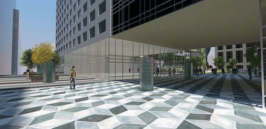
Historical fragments appear in transformed ways throughout the central garden and walkways. Paving artworks play with perspective, one of the prime interests of classical and Renaissance artists. Ultimately, this artwork is more than a series of objects. It is an entire, potentially magical, experience created through engagement with a unique place in the heart of San Francisco.”
The nine major elements of the installation, including the modern Venus, the “quarry,” a marble community table with 20 stools, and a 7,100-square-foot mosaic “carpet,” would be located within Trinity Place’s publicly-accessible interior court or the pathways leading to it.
The carpet would lead from the court out to Market Street, and vice-versa.
The detailed plans for C’era Una Volta are slated to be presented to San Francisco’s Planning Commission for the first time next week.


very impressive! hope it won’t tip over in a big quake.
but … i have no idea when there will ever be more than a sliver of sunlight, as the eyewash shows, falling upon that podium plaza. it is surrounded on all four sides by midrise towers which will generally ensure perpetual shadows.
but a good dog walk at least.
Interesting you say that. Elsewhere I had this same question about SF and was told Japan’s earthquakes are worse and they survive them & it’s no reason not to build high-rises.
Not just Japan. All over the world now high rises are built to withstand quakes
AlfieJr is worrying about the sculptures that looks top heavy and balanced only by a pointy footing.
The sculpture is basically a tall steel post. It is fairly easy to anchor it in a large block of reinforced concrete set some feet into the ground. The depth and shape determined by the physics. Much easier to secure this small static body than the large buildings that surround it with all kinds of dynamic loads from the moving masses within and the stresses that can accumulate passing seismic waves with wavelengths comparable to structural elements.
In other words, if they can’t secure a stick stuck in the ground, then you wouldn’t want to be anywhere near their buildings.
I wonder what the material of the figure is. Hard to imagine much that would tolerate the compression and expansion of the pole flexing in a quake, especially is it’s really shiny like that (which could mean metal, glass, or plastic).
The artist has used stainless steel in the past, including in napa (namelink). Probably be a slug of steel in the ground and base, and hollow above.
Something that skinny isn’t going to absorb the seismic surface waves much because their wavelengths are too long to couple to the modes of the material. If that were a problem, you would see streetlight poles littering the ground after every quake.
The much bigger problem in this location is that the ground will liquefy in a big quake and flow downhill towards Mission Creek. In the 1906 quake there were buildings near here that moved 18 inches in 30-60 seconds. The accordion effects on a building scale structure crush some parts and tear others apart. The buildings are likely resting on piers to bedrock, so they will stay while the land slips.
Thanks for the reply, Jake. Your point about street lights makes sense, even to me 🙂
Really? The best we could do was the “Venus Flushed Down the Toilet”? Has this city really become that bland and middle of the road?
beautiful art. too bad it’s surrounded by such clunky buildings.
The art IS gorgeous, totally agree. The buildings are just square and blocky, that’s offensive to me. I don’t mind height. I mind ugly.
I like it. But thought it should be called “Disinfecting Tornado”, and every night at 2:00 a.m. it comes alive and sweeps the plaza of homeless people, to insure it stays clean and usable by the general public.
Betcha it’s killing Sangiacomo expending that kind of resources for a public benefit.
yes, must have taken quite a strong proctologist to free that from his clenched ….
but at least it speaks to San Francisco …
for
she was a woman
who fell from the sky
in robes of fog
and became
a city
I just wanna know if the “hole” has been eliminated from phase 4 as from the other phases in the name of “value engineering”.
[Editor’s Note: In that case, take the rest of the weekend off and be sure to plug in on Monday morning.]
Booo! Why must we wait until Monday!? Sounds like you know the answer to the question we have been wondering since the original plans were announced. ; )
Equally important, when will Phase 4 construction start? My fear is that we could be waiting 5-10 years.
As promised, the answer(s) and rendering scoop: The Un-Holey Redesign Of Trinity Place.
The only building that has conformed to the proposed original approved design in the first one. The renderings of the proposed project in 2008 were quite nice. How did they get away with the gutting of the original design?
Anyone thinking a field in the middle of a busy set of facades as these needs art on top of all the busy-mess doesn’t understand cities. Sheesh can’t San Francisco ever breathe on its own? Don’t make every single space with interesting potential be a cloying cutesy Disneyland.
Um, some of us like Disneyland. I find that most people that criticize it have never been there. It certainly doesn’t have the garbage, crime, and other problems that plague so many cities. Perhaps we could learn from it.
And don’t forget, Disneyland is all about showcasing different transit options, especially back when Walt was alive. Car haters would be interested to note that the first monorail in the U.S. was built by the imagineers, as well as the “people mover” and other unique creations. When I was a child, they used to have an enormous scale model on display of Walt’s proposed “Epcot City” that was completely car free. After he died, the Epcot plans turned into another theme park, but his goal was a complete environment with shared transit options.
Tomorrowland! Disneyland is fun! A one day pass now is $100. Back when I was a child, my mom got those rip out per ride tickets for $7. We stopped going after the cost hit $15.
Nice…now let’s keep this building party going for at least 5 more years!!!
Sangiacomo has “value engineered” this complex into the boring mundane mess it is today. Don’t expect him to do any better. He is one of the greediest and low rent developers in the city’s history. It was his Trinity Properties policies back in the 70’s that caused rent control to be enacted. You would think that with all the fortune the city has allowed him that he would want to leave a legacy project, but no, guess he is satisefied with that funny little building at 1145 Market with the Disney like “Greco-Roman” whatever statues in the lobby. Sad we have developers like him.
Indeed, by the time this gets to installation, I wouldn’t be surprised to find this alluring, swirling body replaced with one of those tall, blower-animated, stick-figures one finds outside used-car lots. I mean, it’s essentially the same thing…
I’ll go get one of those stick figures (maybe in the shape of a giant Hello Kitty doll) to put in your front yard.
Or developer could replace it with a giant cotton candy Venus so the children could eat her as both value engineering and an act of defiance against the City’s attempts to regulate sugar consumption. Two birds. One stone.
I sure hope they’re not serious about directed pedestrian traffic across the grass (whether real or astroturf).
I love it.
If executed right… this could very well be our “Cloud Gate”— not just because of the chrome thing, but via its scale, and presentation. I also like the fact that it’s just off the beaten path.
“I wonder what the material of the figure is.”
Polished stainless steel, formed and welded with seamless welds. Over 90 feet tall!
I’m thinking the sculpture’s reflections could be blinding if it ever receives a whiff of direct sunlight. And I’d hate to be a heavy drinker/resident renter……stumbling home late, exhausted, passing that thing…..it could be a very ominous experience. I bet anything someone will end up talking to it. Maybe Trinity could investigate several sculpting options before the “flame’s” groundbreaking.
forget the sculpture and put the money into decent architecture.
Not sure about Venus — it has snake/fish head. I think it’s a satanic idol. I’m going to bow and pray when it’s up.
Enough retail space! Brick and mortar is dead. Why not just make it all apartments to help with the housing situation?
“It’s a twister, Auntie Em.”
This park in no way compensates for the terrible architecture execution that turned a promising development into a bland and ugly complex. It’s as much of a fraud as the Wizard of Oz.
Awe! That’s as proposed. Considering the way this project has changed, we can expect a birdbath as the focal point with some motel chairs scattered around. Though I bet the homeless will love it.
Love love build build build
I like the open-to-Market-street courtyard portal, whilst a tad low. Sangiacomo would only loose about 3 units if the height were doubled, presuming the interior hallway paths could be adjusted. Of course the homeless will walk right on in and have a look around. I hope one of the screamers doesn’t take a shine to the square: it looks like an echo chamber.
how much does the art structure cost?
so many cynics in the world. too bad. the BEAUTIFUL shiny silver statue is going up and as a resident, I am excited.