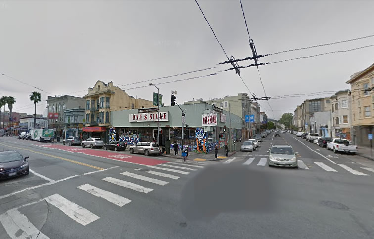
In the works since 2009, the proposed redevelopment of the “One $ Store” parcel on the southwest corner of Mission and 17th Streets could be approved by San Francisco’s Planning Commission on December 14.
While the proposed 2100 Mission Street development is still designed to rise up to six stories and 65 feet in height, with a total of 29 residential units over a ground floor retail space, the development’s previously proposed garage for 15 cars has been eliminated in favor of a storage room for 29 bikes.
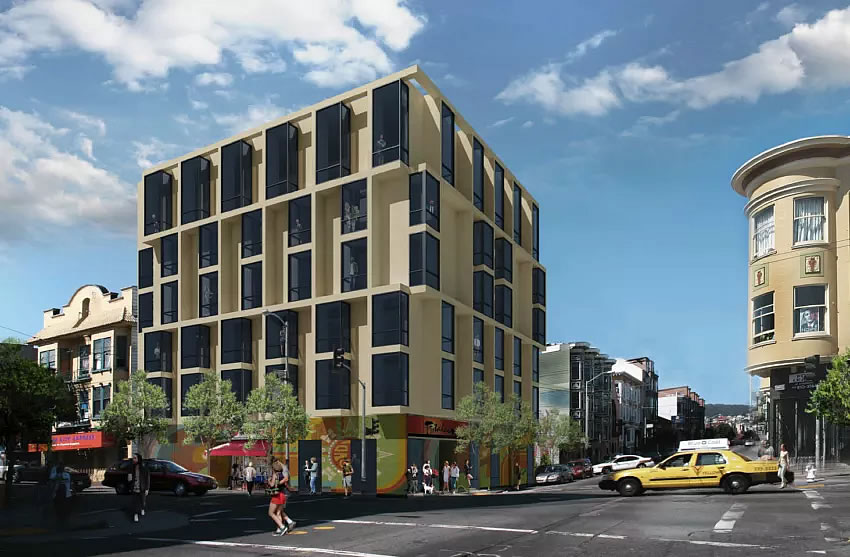
And facing pushback from Planning, and perhaps some local forces, the development’s facade has been completely reworked by Stanley Saitowitz and his team:
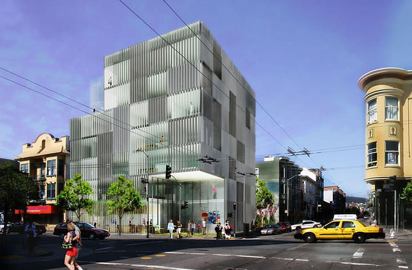
As the development had originally been designed and proposed to appear:


Hmm looks like this wouldn’t displace anyone and wouldn’t involve a lot merger. Perhaps this is qualified for streamlined permitting?
God, Saitowitz is sure turning out some ugly buildings.
Each just rearranges the massing and selects one of his three well-known technical applications and voila; architecture. All architects do it to some degree, but this man’s practice seems to thrive on it.
He’s above average. Like 8 Ocatvia b/c the odd-shaped lot forced him off the grid. Most of his work is sort of repetititititive, like Philip Glass background music. The two designs above are pretty much Saitowitz-by-the-yard.
I love his buildings.
Cause/effect. Good on Saitowitz for speaking the truth, but he’s got to feel a bit like Colin Kaepernick after this butcher job.
turned a beauty into a toad, matching the ugly new public toilets SF want to install. What a sad day for our fair city.
Wait, seriously? You realize that the yellow and black nightmare was the original?
Sorry, I just re-read the article, you were right, what a disaster.
No, not if you follow the links to the prior posts. The typical (for several years ago) slatted Saitowitz design is the original.
I think the black and yellow is the new one.
the black and yellow one is 10x better than the other, but wish this was 2 floors higher. can they use density bonues?
Yeah no, that dollar store is a dump.
Agreed!!!
I for one appreciate Stanley’s talent. Too bad the garage is gone as parking is always needed especially on Mission Street & 17th. No Parking = A lot More $$$ For The Developer’s Profit
I don’t particularly like Saitowitz’s design approach; but the new look is horrible — I would have preferred the generic Saitowitz.
You gotta hand it to the Mission activists here. The revised design will indeed discourage rich people from wanting to be anywhere near that corner. It looks like they bought the design AT the dollar store.
If the glass weren’t black and the depressing yellow were changed, it might be less of an eyesore. It’s still a mistake like the depressing albatross on Divisadero.
Agreed. I actually like most of his stuff but that Divis building is a fail.
I’m not one to usually comment on aesthetics but it’s a shame that Saitowitz’s designs were forced to go from iconic to morose.
I don’t think Mission St. is the place for “iconic” Saitowitz so for that location I prefer the new design. I realize that puts me in the minority here but I suspect not among the wider public. Were this project on, say, Market St. I’d probably reverse myself.
I have to ask, as someone who lives 1/2 of a block from this site. Why does Mission Street not deserve iconic architecture? I’d like beautiful, interesting architecture in my neighborhood.
Having lived on Hoff St a half a block up for 6 years, I am more enthused by anything going up here vs. nothing. The HOA of that loft building is considering rebuilding the garage entrance to move out the door so it is flush with the sidewalk due to so many vagrants defecating and doing drugs in the alcove there now. The original design of this building seems to have a similar playground for the sketch at the street corner that would have been difficult to keep clean, safe and lit – which is a shame that you have to design a box for a lot but a fact for this neighborhood.
A kinder, gentler maximum security prison?
If someone could just round and soften those ‘bay windows’ to create a nice undulating pattern, we might have something worth celebrating AND contextual.
Saitowitz doesn’t do round & soft. He’s square to a T.
Congregation Beth Shalom disagrees.
Not exactly soft, and barely round. Even when he does a semicircle he blocks it into a rigid rectangle.
The question is what is wrong with decision makers in San Francisco. One does not need to be an aesthete of any great depth to see that the new building is inferior to the original. Why can’t the Mission be allowed to have something interesting instead of ugly?
Totally agree – I am all for building but want it to be *interesting* – think Chicago, Amsterdam.
The first one was way way cooler – I adore SS’s designs – wish they weren’t being neutered or (in this case) entirely negated. Let the artist do his thing.
The original design looks like the Fresno County Jail
UPDATE: A Bid to Block the Redevelopment of Mission District Dollar Store