Purchased for $5.15 million in mid-2021, the four-bedroom view home at 60 Clarendon Avenue, which steps down the slope of Clarendon Heights to yield 3,650 square feet of conditioned space, not including the square footage of its five decks, returned to the MLS listed for $5.15 million in late 2022, was reduced to $4.95 million in January of last year and then to $4.75 million last February, all the while touting “SELLER SAYS BRING ALL OFFERS!”
Further reduced to $4.39 million last April, removed from the MLS and then relisted anew, with an official “1” day on the market, for $4.25 million this past October, the list price for the luxury view home in a long established San Francisco neighborhood has just been further reduced to $4.15 million, a sale at which would be considered to be “at asking!” according to all industry stats and aggregate reports but would be an even million or 19.4 percent below its value in 2021 on an apples-to-apples basis.
Once again, if you think you know the market for luxury view homes in San Francisco, here’s another chance to tell, to make excuses, or to make amends.
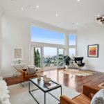
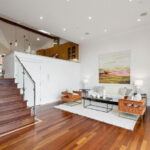
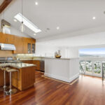


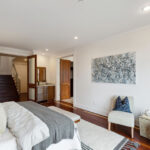
This one has been featured quite a bit on Socketsite. From my count, it’s seven levels total from roofdeck down to the lowest yard level. Not only is this an annoying number of stairs, but it means no one interior room/level really wows you. I know someone who recently bought a house like this, it features two “living” levels. They struggle when having people over: everyone either congregates on one level or the other, leaving the other completely empty. There’s no flow and no luxurious sense of space or openness. These multi-levels need to be discounted accordingly, perhaps a 5-10% hit on a PPSF basis?
Perhaps that’s why “the epitome of luxury living” only fetched $5.15 million in July of 2021, despite the finishes, which include an elevator, location and views.
The updated asking price represents almost a whopping 2.4 percent decrease from the October 2023 ask. I don’t think that is going to be enough to make this home move during the thirty day period following the price change. I’m tempted to lower my previous guess of $4.1 million.
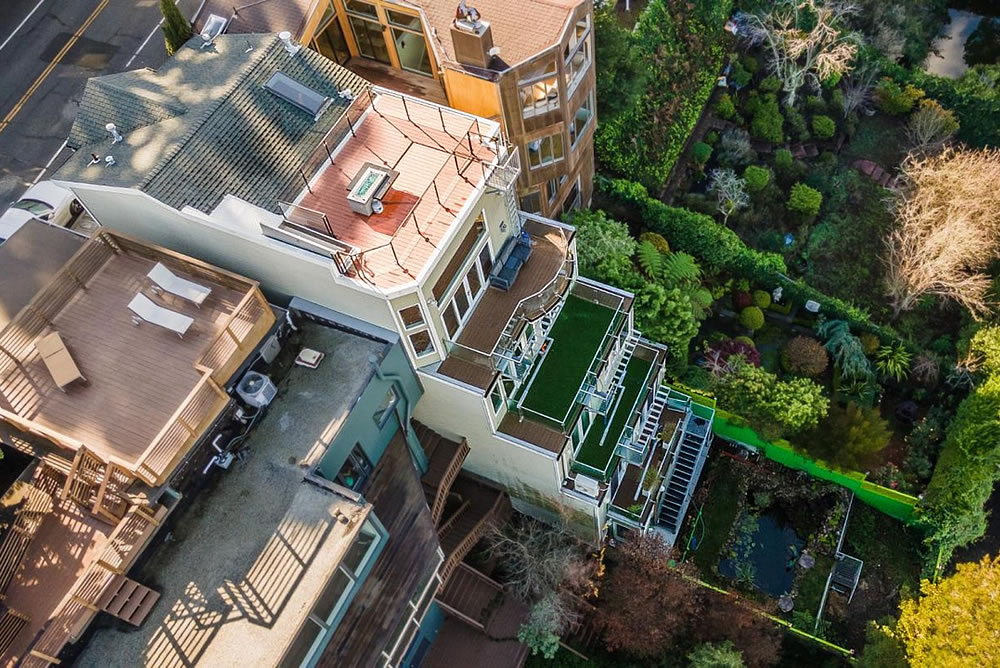
Five decks – all facing north in the one of the coldest dampest locales in San Francisco. Useless and expensive to maintain.
The house next door to the west gets it – a light court that catches the south sun and distributes it to the interior making the living spaces warm and inviting.
Too bad the elevator doesn’t go to the top (kitchen) level. And entrance to the roof deck is thru a hatch door. (Visible in the Matterport 3D walkthru thingy).
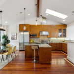
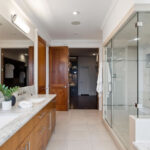
Twenty, maybe twenty-five years ago, I’d have loved those kitchen and bathroom cabinets. Today they just look dated. $4 million for a house that looks dated? Meh. And I agree with the comments about all the levels. This house would get annoying fast, I think, although you certainly would be able to skip the Stairmaster if you lived here.
I’m going to guess $3.99 million though maybe someone will surprise me and pay more.
I think the cabinets are pretty up-to-date, other than the pulls, which I’d replace with something a lot more minimal. It looks like walnut, which is pretty timeless and I’ve seen a lot of it recently as I look at houzz portfolios etc. (we’re at the start of a big remodel). The counters (and the pulls) are the dated-looking things to me in the kitchen/bath. (I’d probably go with white for the uppers too.)
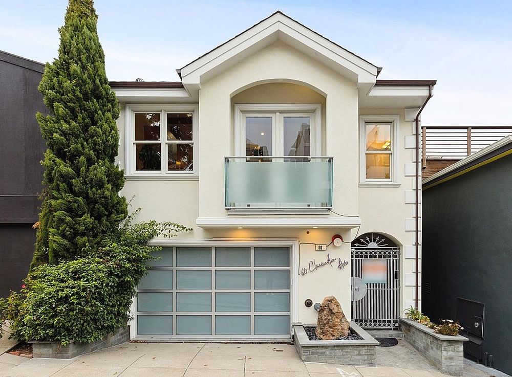
Unrelated: I get that these canyon locations are boring-in-the-front/party-in-the-back, but that metal don’t-rob-me door really does not scream $5M home — nor does the street-facing facade, even knowing there are many floors below.
That’s lots of stairs. Is there pond in back yard?
What with the rock waterfall and floating duckweed, water lettuce or water hyacinths (I don’t know enough about horticulture to tell which), it’s either a koi pond or an awfully convincing fake.
From photo it looks like astroturf behind water feature. Or miniature golf course?
I feel like we’re being pretty fast and loose with the term “lux” here….yes it’s big and probably has high quality materials (I’m far from an expert), but it’s also pretty tacky. I’ve seen the same garage door and balcony in cookie cutter developments outside San Antonio. And the address sign…
Oof, yes, that address sign. And that cable running all around it. And the metal gate.
It has zero curb appeal with no front yard and a concrete driveway pushed against a dull and dated small tract home facade. All the extra space in the back is spread over too many levels to either be functional or give a sense of spaciousness and luxury. The interior is also dated and tired. It is no wonder this has sat on the market.
UPDATE: Lux View Home Resells for Over a Million Less