Purchased for $3.25 million in May of 2016, the three-bedroom, three-bath unit #32E in the Lumina tower at 338 Main Street, which “exemplifies the prestige of highrise (sic) living,” resold for $3.5 million in August of 2019, representing total appreciation of 7.7 percent despite the short-term hold and the unit having being “used,” as is typical when the market is appreciating.
Touting “the most desirable” three-bedroom floor plan in the development, with walls of windows that flood the unit with natural light; a usable balcony; high-end appliances and custom finishes; and a parking spot in the building’s garage, the 1,791-square-foot unit returned to the market priced at $3.15 million last month, a sale at which would have represented depreciation of 10 percent on an apples-to-apples basis.
And with 32 days on the market, the list price for 338 Main Street #32E has just been reduced to $2.995 million, at sale at which would be considered to be “at asking” according to all industry stats and aggregate reports. If you think you know the market for prestigious high-rise units in San Francisco, now’s the time to tell.
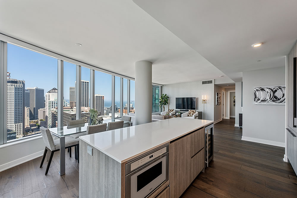
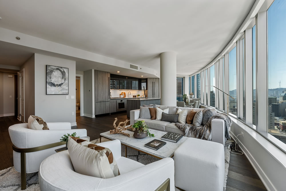


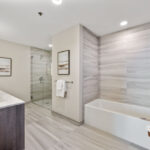

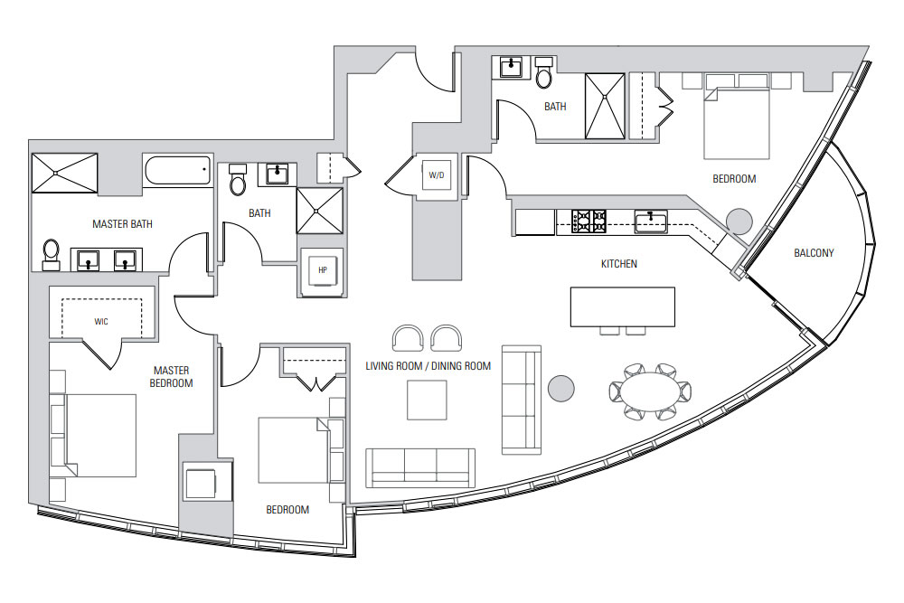
I’m not a fan of this floor plan. It’s a really underwhelming amount of living space for the price, square footage and view the place has. I’m an armchair architect, yes, but that large second bedroom with its own hallway is not a good use of space.
Agreed. Would’ve been better to shift the kitchen counter “left” 3′ and put the bedroom door by the pillar… even better, then shove the kitchen “up” a few feet to eliminate the now-unnecessary bedroom hallway space, and you avoid a very awkward interaction between the kitchen and the “living room/dining room” amorphous zone while creating more common space.
I was thinking much the same. Pushing the kitchen into that corner allows for an L shape + island, a much better work configuration. And more common space.
When I see things like this (all too commonly), it makes me concerned for the state of architectural training and architectural firm procedures. How could something like this get drawn, let alone pass through multiple levels of review and approval?
And then there’s the door to the Master Bedroom…it has no home. Can the designer not see the conflict in circulation? Going from bathroom to closet and suddenly the spouse entering…boom! Yet, this arrangement is also all too common. I don’t get it.
And the closet door’s facing the bed … it should be proximate to the bath, which facilitates dressing, and also allows one spouse to be (generally) undisturbed in bed if the other is getting dressed. I think most hotel rooms have a more functional layout than this main bedroom suite…
I can’t help but notice that the editor here focuses heavily on South Beach hi-rise condos. I suppose it’s a decent indicator for that neighborhood, but San Francisco real estate encompasses a LOT more than just this segment of the market.
Which is why we actually focus on a LOT more than South Beach hi-rise condos. In addition, large developments are naturally going to yield more apples based on typical turnover rates and the fact that newer units are less likely to be renovated between sales.
OK, That’s fair. It wasn’t a criticism, just an observation – and you’re right, you do focus on more than just South Beach hi-rises (hey, I’m a fan and a long-time reader). Not really sure why it felt that way, but that’s for me to figure out. Now, back to the unit at hand…..
It’s a fair feeling, no offense taken, and we do appreciate your continued readership and contributions. As noted, large developments are going to yield more “apples,” relative to older, less dense buildings and neighborhoods, due to the fact that newer units are less likely to be renovated between sales and typical turnover rates for buildings, which certainly can make it feel “that way.”
I recall from certain site cohorts during the run-up neither objections to socketsite’s extensive coverage of SOMA condos, nor observations that certain deficient floorplans were going for a premium over value. Curious! 😂
The hilarity of illiquid asset broker disingenuousness aside, the high sales frequency and generally shorter holding periods of SOMA units make those particularly good barometers of market conditions at a given time.
$3M and yet still no recessed lighting so you’re stuck using lamps like an old motel room. How this was still common practice as recently as 2016 I do not understand.
My guess is that it’s done to reduce floor height, maximize number of floors within limits.
Last place I lived had 10 foot ceilings, but they were concrete slab. We were the top floor; I’m not sure if lower floors had the same. Now we have properly drywalled ceilings and are much happier for it.
Modern LED “puck” lights don’t need much clearance. The last ones I installed only needed about 2.5″ vertical (due to the J-box controller, not the puck light itself). Maybe they weren’t available when this building was constructed?
Recessed lighting is shown in several of the pictures displayed.
I only see it in kitchens and bathrooms. Not a single ceiling fixture, recessed or not, is shown in any of the primary living spaces or bedrooms, which to me is shocking especially at the $3M pricepoint.
I’d never want recessed lights in the bedroom – maybe that’s just me but I don’t want my bedroom flooded with light, at most I want spot lighting and quiet.
This still seems over priced. The covid exodus impacted the downtown condo market as much as anywhere. It’s not clear that the new price reflects much higher rates. My guess for value would be $2.5mm as a good outcome for sellers.
This will languish on the market at this price.
Based on Lumina stories covered here, no buyer has ever experienced price appreciation.
That’s incorrect, as has been previously noted and ignored: Luxury One-Bedroom Fetches 0.8 Percent over Late 2015 Price.
It is true, however, that our coverage is representative of the actual market and trends, over which we don’t have a lot of control.
UPDATE: Prestigious High-Rise Unit Trades for 23 Percent Less