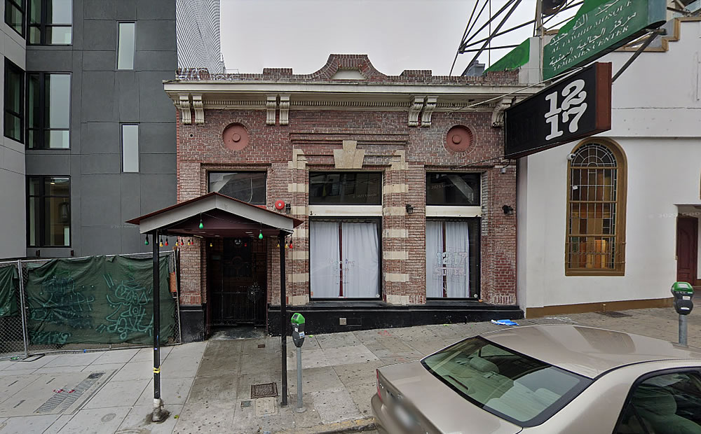
Plans to raze everything but the historic façade of the recently refurbished Polk Gulch building at 1217 Sutter Street have been in the works since late 2020, as we first reported at the time.
Built in 1911, after a two-story, wood-framed house on the site – which was built for an immigrant urologist, surgeon, and Chief of Staff at the German Hospital in 1902 – was destroyed in 1906, the two-story brick building was leased to the U.S. Postal Service and served as “Station O” from 1911 to 1933.
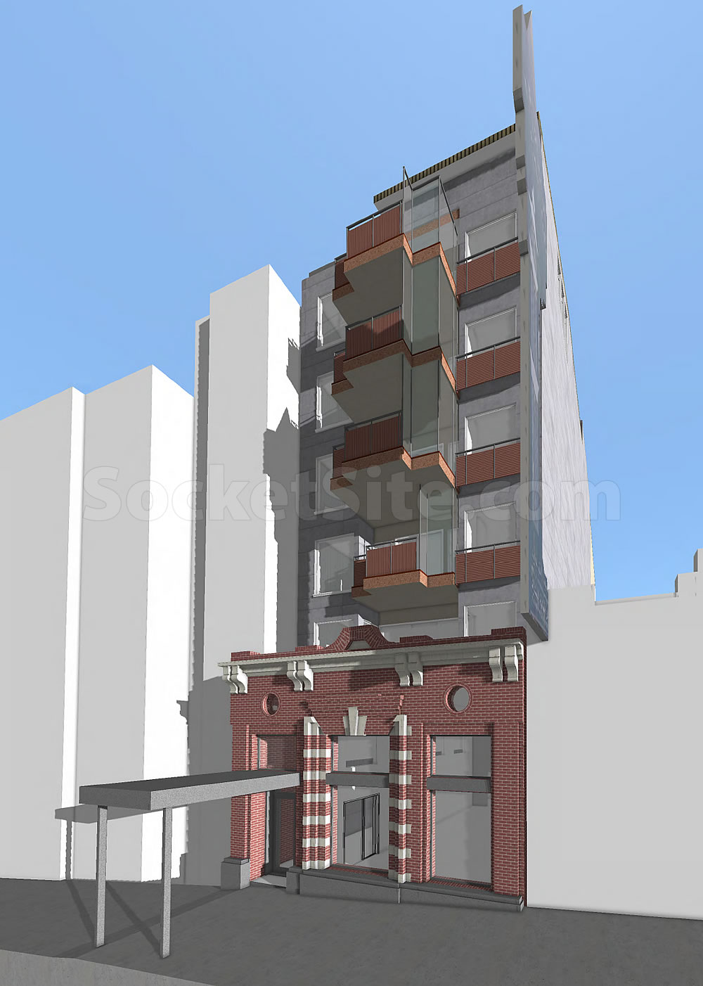
Home to an assortment of upholsterers, clothiers, galleries and a rug shop from 1934 to 1987, the building was converted into a Thai restaurant in 1988; operated as a sushi shop from 1997 to 2015; and was then renovated by a developer and re-opened as the Rusted Mule lounge, which shuttered in late 2019, prior to the pandemic, in 2017. And plans for a new 7-story, 17-unit building to rise up to 82 feet in height behind the building’s existing façade, with a ground floor retail space, were then drawn.
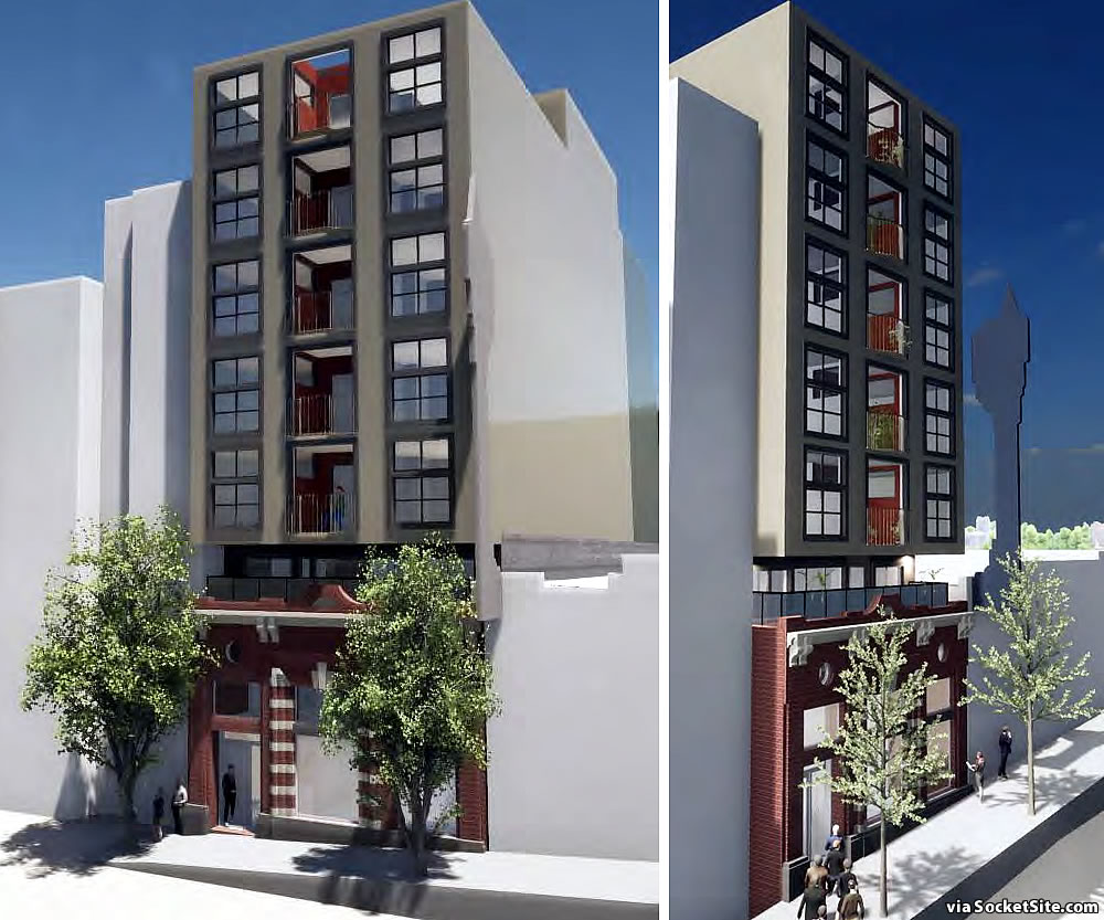
The proposed plans for the site have since been tweaked to yield 19 units in an 8-story, but slightly shorter, building behind and above the historic façade, with a ground floor retail space fronting Sutter, as newly rendered by Stephen Antonaros below:
A formal application to entitle the tweaked set of plans has just been filed with Planning as well. That being said, the project team isn’t expecting construction would commence until early 2025, at least not currently. We’ll keep you posted and plugged-in.


The Rusted Mule, with its brick walls all around and tall ceilings, definitely felt like it was from another era. I was hoping they would keep the entire first floor retail space, but it might not make sense from a structural integrity / earthquake POV.
Glad to see one less single story commercial building in this city.
A little history of the block. To the right of this “infill” is a mosque, and to the right of the mosque was (still?) an Asian restaurant. The people in the mosque tried to stop the Asian restaurants from serving alcohol but did not succeed.
Fave part: modernized entrance canopy.
Ha!
UPDATE: A rendering for the tweaked, 19-unit project has been added above (and the modernized entrance canopy removed).
Facade-ism at its worst.
I guess the facade is nice, but this seems rich to say that this restores anything of merit. Instead, you get this bland, conflicting setback apartment tower.
I would prefer to skip the facade, and instead build something top to bottom that blends into the neighborhood.
I’d argue the currently rendered design blends into the neighborhood, in particular the façadist treatment of 1238 Sutter across the street.
Touché. It’s hideous too.