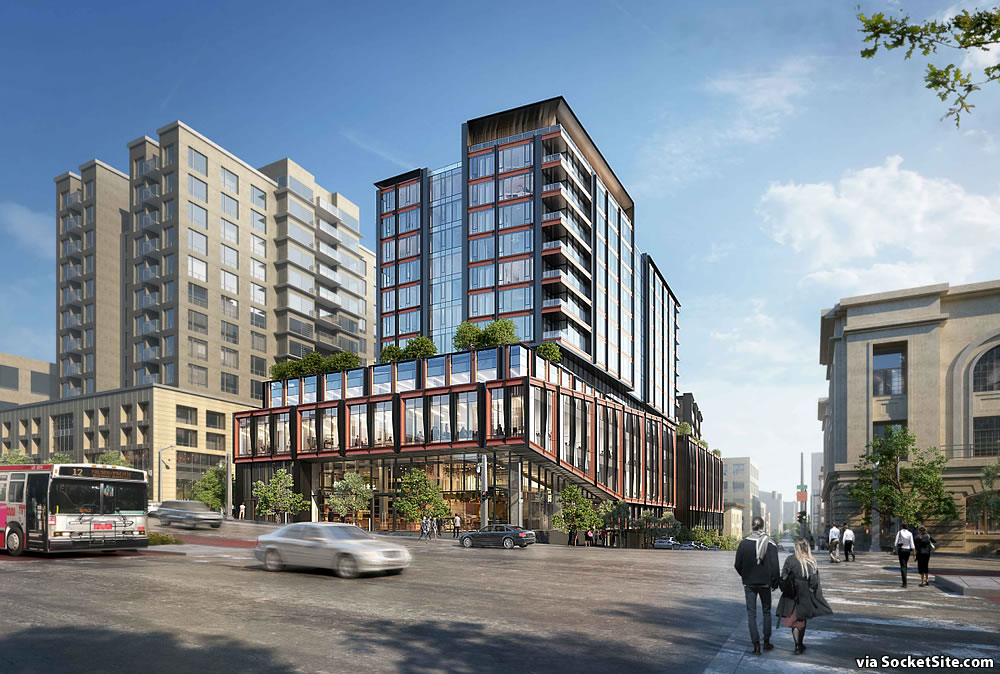
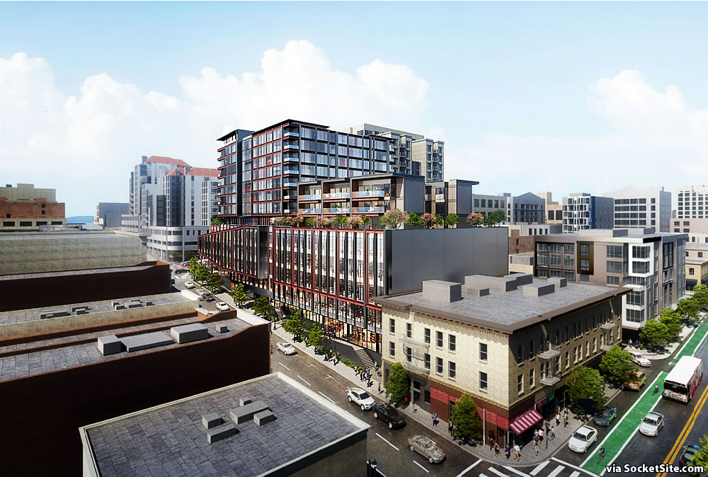
Having just cleared a key environmental hurdle which obviates the need for a detailed Environmental Impact Report to be prepared for the project, the further refined plans for a bold 13-story building designed by Woods Bagot to rise on the northeast corner of Van Ness and Post are now even closer to reality.
The development as proposed would now yield 107 condos, a mix of 59 one-bedrooms and 48 twos, over a new 107,000-square-foot medical office building, with a 4,400-square-foot restaurant space and adjacent terrace atop the buildings podium, on the 6th floor, a 275-car garage with 53 spaces for the dwelling units, and 24,500-square-feet of retail space (which isn’t likely to be leased to a full-service grocery store as originally teased but could still support a smaller market as the space has been divided in two).
As we noted at the time, an updated application for the project had already been submitted to Planning as well. And the refined plans were slated to be approved by San Francisco’s Planning Commission this past July.
Administratively continued prior to being heard by the Commission, the project is now slated to be heard and approved this week, with Planning’s blessing and support from “Lower Polk Neighbors” but opposed by the Cathedral Hill Neighborhood Association which has expressed concerns related to zoning, general plan consistency and parking issues. We’ll keep you posted and plugged-in.


Wow, this project was initially proposed in 2016. It’s 2021 and even after clearing a “key environmental hurdle”, we’re still waiting for a final go-ahead. If that doesn’t speak to how broken the system is….
Bold?
Apparently in SF this is considered bold. I was hoping for brazen given the proximity to Polk Gulch.
So, what gets me about SF planning is that a building going up pretty much on top of a subway line gets a better parking:unit ratio than a building on a bus line. Maybe the builder is hoping for a Van Ness subway…
Very handsome. Love it.
I am concerned about the silver Mercedes running the red light and about to run over some pedestrians. Also, the Range Rover is driving on the wrong side of the divider.
Can’t complain about the rendering being unrealistic for once…
love it and much needed in this locale