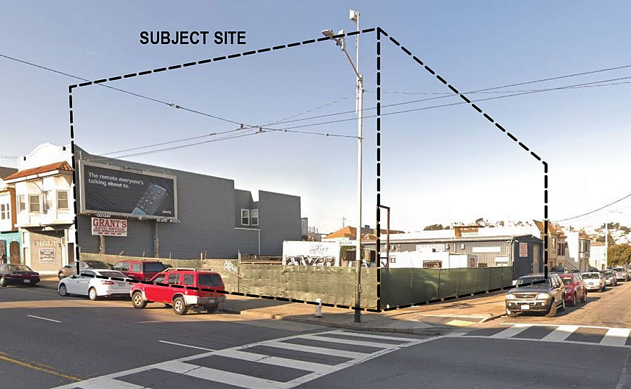
The plans for a mixed-use, four-story development to rise on the Grant’s Auto Repair shop parcel on the southeast corner of Mission Street and Foote Avenue, on the border of the Outer Mission and Crocker Amazon, were drafted back in 2018 and approved last year.
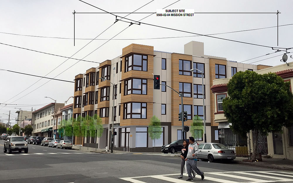
And as approved, the development would yield a 77-bed residential care facility for the elderly (RCFE), along with 8 group housing units and a 2-bedroom owner’s unit on the top floor, one off-street parking space for a van (and four bikes), and an 888-square-foot retail space on the corner, as rendered by Schaub Ly Architects below:
But the ground has yet to be broken and a new set of plans have been drawn. And if approved, the development would now yield 24 residential units, a mix of 6 one-bedrooms, 15 twos and 3 threes, over a ground floor child care center and a storage room for 24 bikes.
And while the revised plans would yield 3 units of below market rate (BMR) housing, as required by law, the project as proposed falls “just short of the 25-unit threshold that would trigger the higher tier requirements of the [City’s] Inclusionary Housing Program,” as noted by Planning. The development could be “eligible for a density bonus” as well (as we noted back in 2015). And as such, Planning is asking the project team to “please work with Planning staff to understand all available options for maximizing [the] residential development and affordability” of the project as newly envisioned.
We’ll keep you posted and plugged-in.


I will refer you to my comment on the Telegraph hill development one week ago.
When will SF do away with its ridiculous neighborhood design guidelines??? They are singularly responsible for the city having one of the most boring architectural landscapes in the world. When everything is homogeneously based on a style that’s a century old and built by stingy developers, it looks like this project.
Might as well put Made in China on the label.
Unfortunately the architect has a reputation as a developer’s architect and makes such bland buildings due to being squeezed for profit margins by the land owner….see their website which shows similar basic level archi-mundane facades.
A few extra stories here would be good but make sure they play with the ground floor more glass or variation vs the shown lacking variation or scale changes needed.
So the owner/developer scrapped the original elderly residential care living concept and the city doesn’t give a crap
These new buildings look boring. They look like they belong. Blah design. Been here since the 1950s.