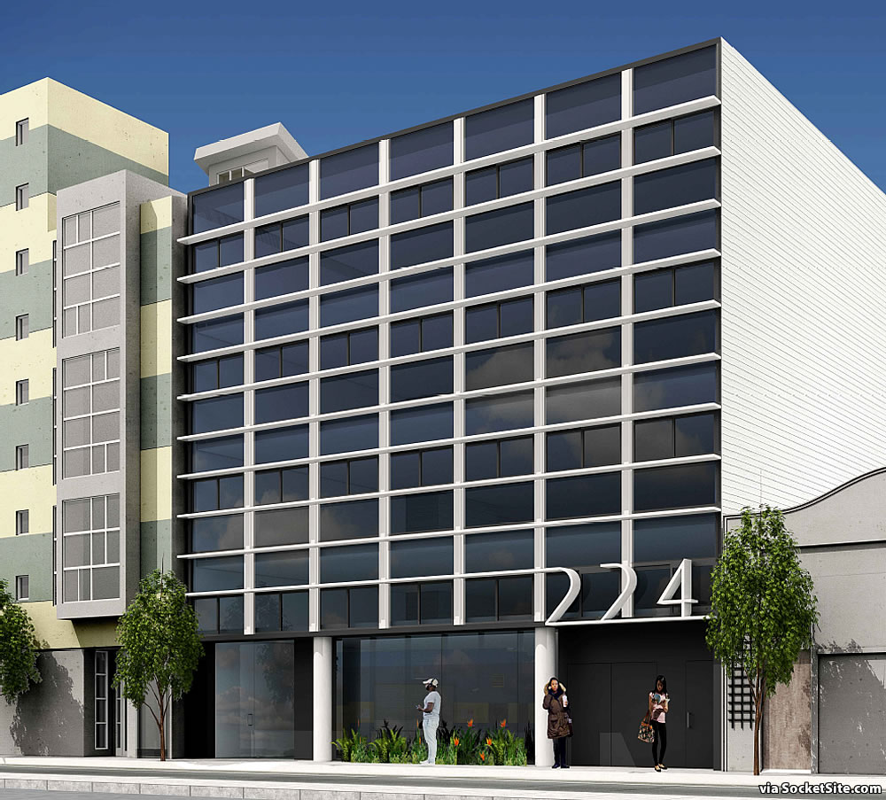
The plans for a modern five-story, nine-unit SoMa development to rise at “224 Clara,” between 5th and 6th Streets, could be approved by Planning this week. From the design team at STANLEY SAITOWITZ | NATOMA ARCHITECTS last year:
The grunge of SOMA San Francisco remains, but the demographics are new. It is now an international gathering of millennial techies that inhabit the streets in a babel of tongues. This new population have sophisticated urban tastes and money. These units are for them.
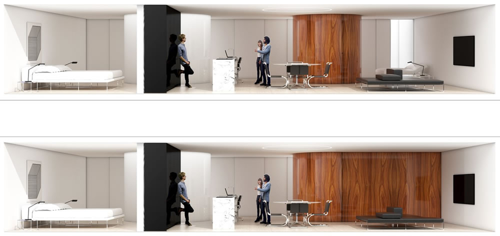
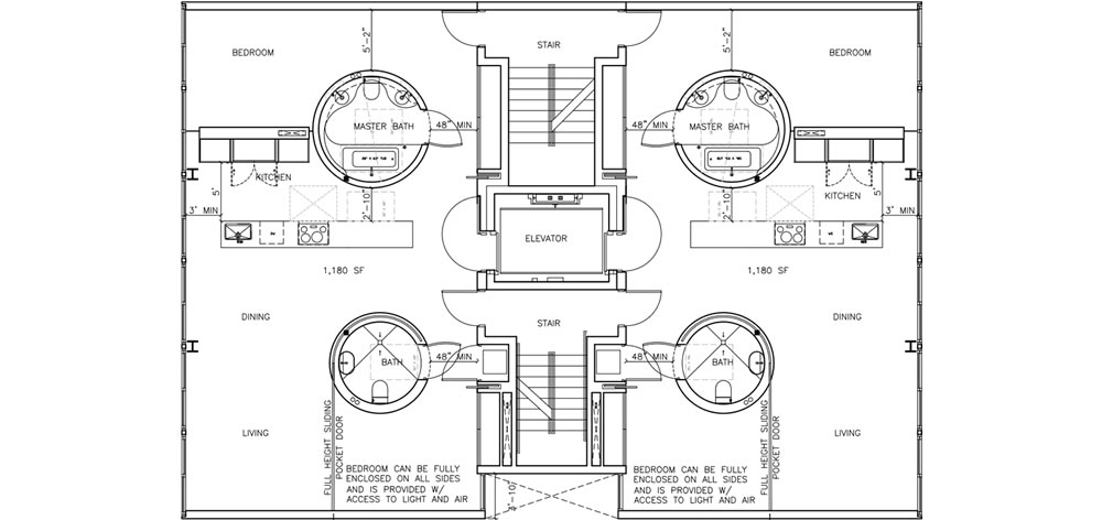
[The top four floors of the building are] divided into two units, each accessed directly from a two-sided elevator. The open floor is anchored by two circular elements which contain the bathrooms and establish the sleeping areas. A linear kitchen floats and becomes a desk. The space is both open and intricate, flowing around the objects and into the defined areas behind.
A full-height pocket door emanating from the curved wall of the secondary bathrooms in each of the eight two-bedroom units, which would measure around 1,180 square feet apiece, would allow for the full enclosure of the second bedrooms from the open living rooms (with a 840 square foot one-bedroom on the building’s second floor).
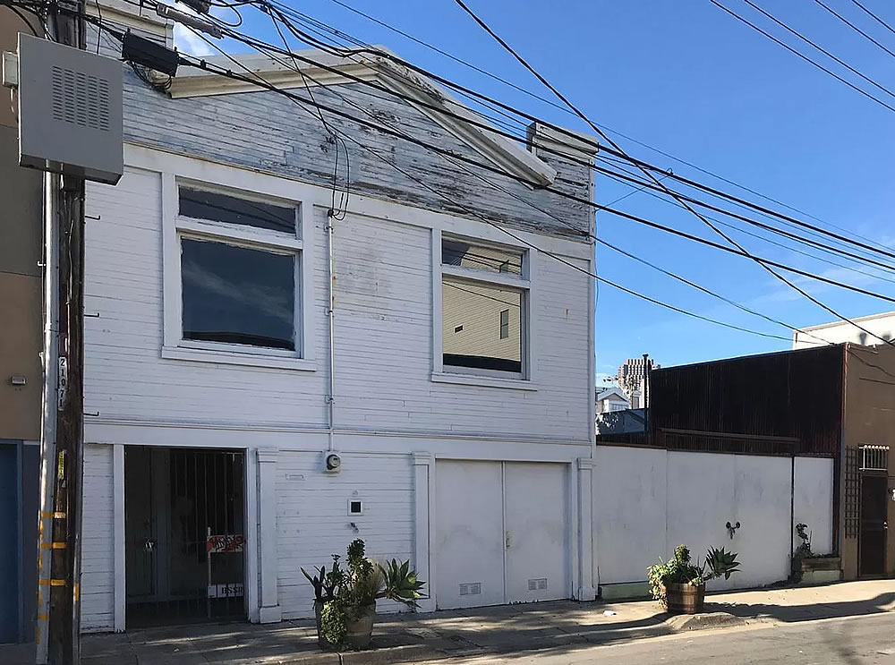
And while neither demolition or building permits have yet to be requested for the project, the proposed development would rise on the two-parcel site of the 800-square-foot, single-family home at 228 Clara Street which was purchased for $1.525 million in May of last year, following the tragic discovery of the decapitated torso of Brian Egg, who had owned and occupied the little home since the 1970’s, inside.
The building looks like a 1980s dental office building. Saitowitz is not even trying anymore.
And the units are just… weird.
Looks très Corbusier.
Whether that’s a complement or an insult is, I guess, a matter of opinion.
The only part of this building that even has any remote semblance to being considered similar to Corbusier’s style is the ribbon window. Even then, that looks like a stretch here. None of the 5 points are shown here at all, and this is nowhere even close to anything Corbusier would do. Perhaps your brain sees some white in the facade and then you got easily excited thinking you could jump on the architect hate bandwagon. If you’re going to sling hate at an iconic architect and drag his architectural style you don’t appreciate into this monstrosity, at least get the history correct. Ignorant real estate people, investors and flippers on this site send architects in a rage.
Every time I come to this site, some untrained mouth-breather knows *how to do it better* . This design may be atrocious, but you sound even worse trying to critique it. Like used car salesmen commenting on automotive engineering and technology. You couldn’t even sketch something that would be a better design nor can you enter into a dialog to begin to critique or develop the design. Do you know what you sound like to architects?
Well Said. 🙂
That too might seem to be a matter of opinion, non ??
But I will say this for your rather petulant diatribe: no confusion if it’s an insult or not.
Hmmm, l always thought Notcom was more of a retired NIMBY with usual pro affordable housing but anti-building sentiments that keep this city so profitable for all the real estate investors/flippers. Notcom, please clarify.
here’s my untrained critique: it looks terrible and agree with the dentist office comment. I have no architectural training or style, but can at least tell when something is truly hideous
Bosh. You need to spend time with the TROO ARTEESTS (“The Compound”) to understand the power of modernism. Especially Brutalism. Because you SHOULD as a client or neighbor or random passerby feel like a WORM in the face of such masterpieces as the Federal Building, for example.
Opinions of “untrained mouth-breathers” are valid. I’m not a painter but I know the difference between Matisse and Thomas Kinkade.
Hahaha, this sounds so hilariously vain, insecure and defensive that it makes me want to inappropriately insult Corbu more often.
In certain countries, BLASPHEMY is still a Capital Crime. Perhaps Mikey Mike would apply for a position as Head Enforce of the Committee to Protect Virtue and Prevent Vice.
It is amusing to me that as “the culture” begins, in some ways, to devalue religion and religious authority, the self regarding authority of “artists”, including architects, becomes more and more important. No more cathedrals, but plenty of “Centers for Contemporary Arts”.
Heaven forbid anyone do anything unconventional in San Francisco.
I agree the facade leaves something to be desired, but the plans are actually quite successful IMO. They solve a common problem where users may want a large open space, but need to be able to divide the space when having guests, or when their family needs change.
The round bathroom walls provide a way to conceal the pocket door in the most efficient amount of space.
Well done.
Meh. Pretty bland indeed, but I support the density.
Sorta looks like a hotel I stayed at in Lisbon once, near their little cable car thingy.. Bland, yet functional.
I live a block away and there’s definitely some shady stuff happening in the house there now…plywood over the windows but people inside and weird signs on the gate sometimes. Had no idea the previous owner was killed. 🙁
Yep and it was awful.
This makes me want to comment that Stanley Saitowitz is my most hated architect, but of course he doesn’t have an architect’s license (here at least) and this building was probably designed by someone else who works at the firm. The firm’s oeuvre leaves me cold, and I hope this building is never built.
This comment demonstrates you know little about the business of architecture and the profession as a whole.
Nope, I think “Brahma” has it just about right — except that Saitowitz would never let anyone in his office design the fundamental part of a project.
neither did Le Corbusier
There may not be many ‘Moneyed Techies’ left in SF by the time this is built
be nice if the bathrooms pivoted….
Who designed 259 Clara, with all the pop-out windows?
Natoma Architects
One thing I’ll never understand is how new buildings have the ugliest utility doors. It’s a good 30% of the ground-floor facade, and yet it’s prominently and aggressively boring, with no apparent effort being made to integrate them into the streetscape. Not just this building, though it looks like it’ll be a fine example.
Ok…I give up. How do you get four floors out of the eleven horizontal bands?
You can see faint ceiling lines in the photos. Look like each of the upper 3 floors has 3 bands (the two-panel windows are the middle band), and the second floor has only 2 bands…which makes me think of that half-floor in Being John Malkovich. Everybody bend your heads!
good eye – thank you!
The floor divisions are shown in (what I assume is) the stairwell on the left.
stairs are in the center core – see floor plan [in the gallery above].
You’re correct: I mistook the adjacent building (228 Clara) for being part of this one; apparently it’s just happenstance that the windows in each align. And as a side note: the architect’s webpage tries to assure us this pays homage to Mies…if only I’d name-dropped better!
Indeed…The Tugendhat House in particular. Thank you for the link!
I think it looks great. Good grief, not every residential building in SF has to have bay windows.
My biggest problem with Saitowitz is that his buildings have no engagement with the street. In fact, it almost feels like he has a disdain for anyone on the sidewalk.
We looked at renting a unit in 1080 Sutter and were extremely turned off by how the lobby felt designed to push people into or out of the building. If you came in from the cold, there was nowhere to catch your breath temporarily, just a foreboding hallway to a squat waiting area for the elevator.
His designs feel actively repellent to humanity.
The Yerba Buena Lofts on the ground floor that front Shipley do engage with the sidewalk quite well. Whether the occupants actually do is another matter. Architecture can only do so much in this regard and I find that culturally San Francisco (similar to its use of balconies) does not engage with the street scape to same degree as other cities. The exception is the Mission where its common to pass stoops and open garages with people hanging out and spilling onto the sidewalk. Since the YB Lofts were built, the SF street has become a pretty repugnant place so I understand why modern construction would choose to disengage.
“It is now an international gathering of millennial techies that inhabit the streets in a babel of tongues”
what is this supposed to mean?
It’s a polite way of saying…
The neighborhood is [filled] with young techies holding H-1B Visas.
it’s not polite. If the people who wrote that copy had a clue, they’d know that “techie” is a derogatory term used by people outside the industry.
The politeness comes in the reference to the visa holding
(hint, hint)
It’s disappointing they couldn’t have incorporated the current historical facade into the design of this building. 🙂
Funny, as a ‘techie’ I’m not crazy about the aesthetic. I usually like modern, minimalist architecture… as well as the melange of styles that we have in the city. I find it silly to spend so much of one’s income on rent – I’d rather have financial security, precisely because tech is so turbulent (and stressful).
What about the 14 museum and internationally represented artist next door who has owned her building for 47 yrs – working out of it all that time and about to lose all her light and skylights? The last seriously represented artist on Clara St and the surrounding area and she was told to “buy bigger lightbulbs.” Yes, there will be no more high end techies in a few months, just ask anyone who has built on Clara or Shipley lately. And there will be no more cultural life, as represented by this artist, when this goes up.
Do we need another empty upscale techie building planned before Covid in place of an actual artist of many years just next door? Does SF want or need or deserve any cultural life at all?
Interesting efficient floor layout – kind of like a spaceship. 2nd bath, temporary bedroom good for having out of town guests. I think there is a market for that.
The facade though? Looks like they went through the curtain wall catalog playing ‘how LA can we be?’
Wonder if building code required the 2 sets of stairs? Fire egress every 20 feet or so? Otherwise, wondering why 2 sets. I don’t love the actual spaces as presented, nor façade, but the plan is clever. Also wondering what the moveable partitions are made of: how might they age.
I like his interior aesthetics but I would never want to live in one. I find it very showroom like… meaning looks great but not usable for everyday people. If you are super anal and uptight (ie extremely organized and clean), then his condos are for you. If you are the type with lots of stuff and not particularly organized, move along…. nothing to see here.
I wouldn’t exactly compare him to Corbu. Saitowitz’s aesthetic is more Mies IMO whom I happen to think is an architect god.
“moneyed techies”, so 2018.
They aren’t there anymore, sir. I can’t stress this enough, they are GONE.
And SoMA is the last neighborhood anyone wants to buy in on.
if that’s the case (and I think it’s too early to tell, really) then the lenders that provide the funding for projects like these will refuse to provide the capital to build it, regardless of whether it is approved by Planning and the people who are already here, who are not “millennial techies” inhabiting the area “in a babel of tongues” will have nothing to worry about.
That might be a sad development for penny ante landlords and real estate agents who have arrived here from elsewhere with dollar signs in their eyes, ready to make their fortunes off those “millennial techies” and then quickly decamp to Texas or Florida after they’ve made their nut, but it will be a positive development for the rest of us.
Saitowitz has lost his touch. And I don’t think Brian Egg’s house should be demolished. Not until the scumbag that murdered him is brought to justice.
I agree with you, but I doubt our current DA will put that scumbag into the house where he deserves to rot.
This is nauseating. How about affordable housing if we’re serious about making any dent in the housing deficiency here.
Another “luxury” box for techies in a city with many new developments for techies already sitting empty and unleased.