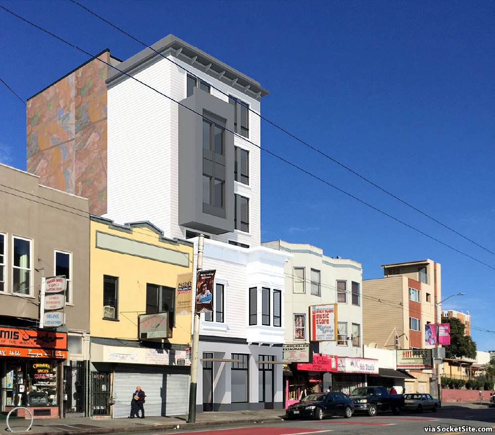
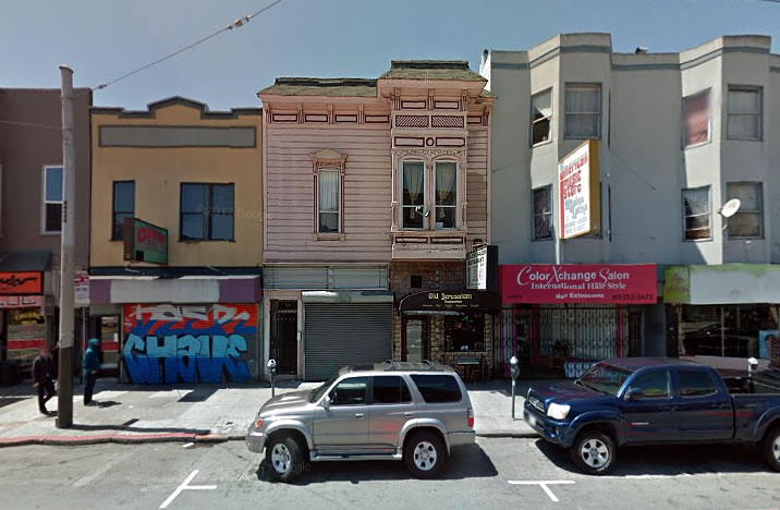
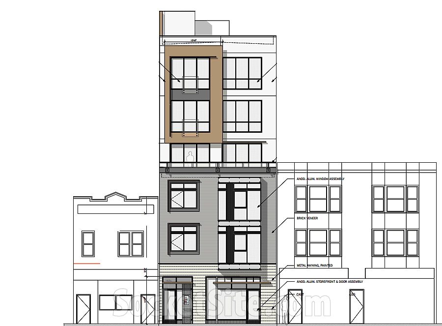
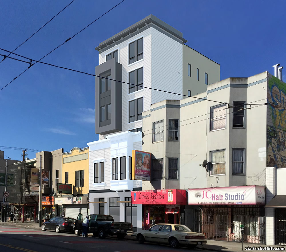
As we revealed back in 2017, plans to demolish the two-story building at 2976 Mission Street, which then contained two 1900s-era residential units, one of which was unpermitted, over a commercial space that was occupied by the Old Jerusalem restaurant, and develop a new six-story building, with eight residential units over a 1,600-square-foot commercial space fronting Mission, were in the works.
As newly rendered below, refined set of plans and approach for the project have since been drawn by Elevation Architects, employing the existing building’s Victorian-era façade to “preserve the continuity of the street front.”
While Planning was recommending a minimum 10-foot setback for the building’s new upper floors, however, the proposed setback is only 6 feet (or 2 feet from the front of the two Bay windows and balcony).
And once again, as the proposed development will require the demolition of existing housing, the project will need the approval of a Conditional Use Authorization to proceed, an approval which Planning was having “difficulty supporting” without any of the new units being deeded as permanently affordable. All eight of the residential units, a mix of 3 one-bedrooms and 5 twos, are slated to be market rate as proposed.
We’ll keep you posted and plugged-in.


But you know, the way the market’s going they’ll get 8 affordable apartments!!!
God that’s an ugly design, especially that vomit marble. But maybe that’s an advantage. Anything too nice would probably be shot down by MEDA for not being in the “character of the neighborhood”.
That’s actually a placeholder for a (perhaps abstract) local mural.
That is the most grotesque example that I have seen! It totally overwhelms the structure beneath…and places a faux/faux Edwardianish cornice above…in my eyes, there are no redeeming qualities about this boorish and amateurish “design”
It is the first baby step towards an Edwardian skyscraper.
Mullet architecture.
No one is quite sure why we have the platypus, but I expect SF Planning had something to do with it…
I’m just glad they’re trying to preserve the Victorian façade. It’s adorable. Everything else is much less compelling, but at least it is more housing.
I was bummed when I first read of it being demo’d, since it’s the only facade with any character on the whole block. Glad it’s being preserved, even if what is planned above it leaves a bit to be desired.
Is Elevation Architects responsible for the bay windows with brown and orange all over new buildings in SF? This has to stop. How can they not see how hideous this is?
Small number of market rates here? Not necessary. Van Ness/Mission just a short hop away has a glut of market rate towers sitting there.
Mission & Van Ness is probably two miles from this location.
Looks like a Kleenex box with a a big mouth.
honestly, SF is screwed. No one is going to build up and live in the mission moving forward. they should have increased density and made all of SF more affordable by building more residential apartments/condos. Instead, they failed to build and everyone is leaving. they are not coming back.
MovingOn – We often see the points you raise on Socketsite. Would you mind clarifying them.
1. “Affordable” seems a rather evasive term – at what price is an apartment or condo affordable?
2. How does increasing density make SF more affordable? NY is much more dense and is not more affordable.
3. SF has been building up in SOMA for a decade now. Has that made SF more affordable?
I don’t think so. The Mission did build up and people still like it. Cities that see rents go down tend to grow younger.