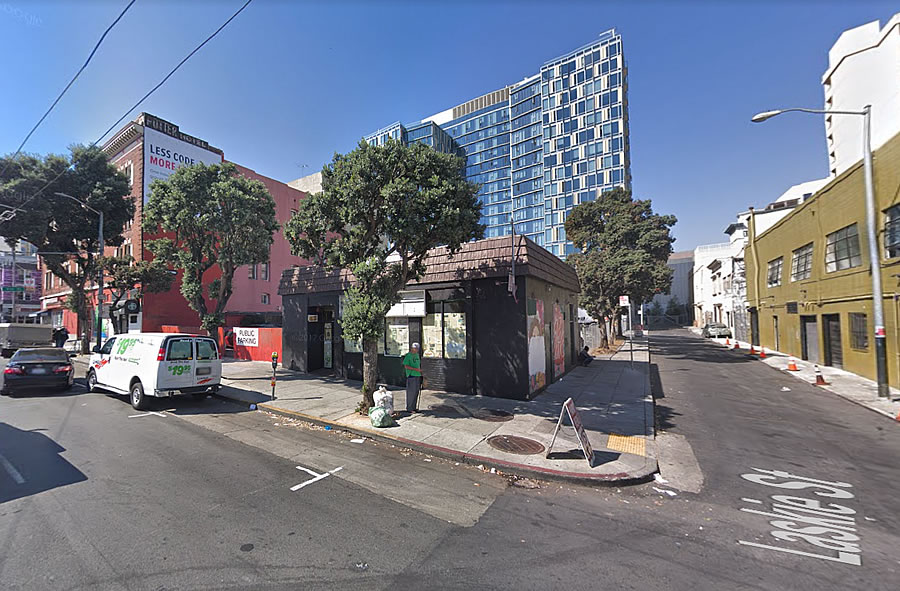
While plans for a 21-story building to rise up to 200 feet in height on the SoMa parcel upon which the since shuttered SF Pizza Café and parking lot at the corner of Mission and Laskie, between 8th and 9th Streets, were approved back in the fourth quarter of 2016, the ground has yet to be broken.
And while the development had been “on hold,” IwamotoScott Architecture was engaged to redesign the approved project, eliminating the previously proposed 15-foot setback along Mission Street, adding 22 units to the project for a total of 321 (25 percent of which will be offered at below market rates) and adopting a decidedly more contemporary aesthetic, eliminating the previous use of brick.
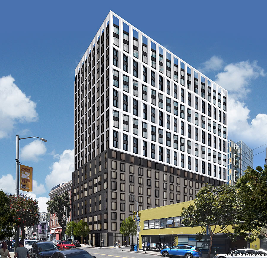
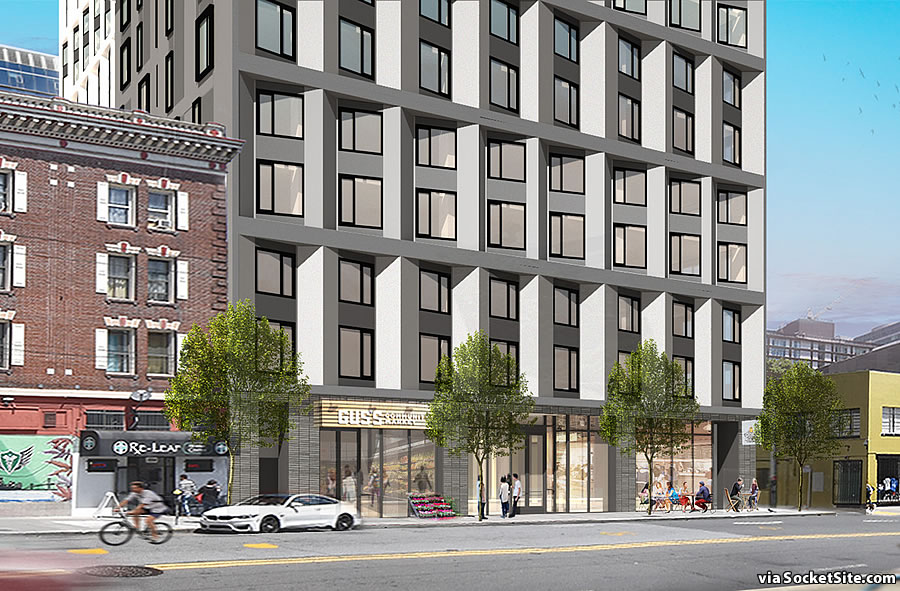
With the changes expected to be administratively approved by San Francisco’s Zoning Administrator, the preliminary review of which has already been completed, the building permits for the 1270 Mission Street project have just been approved by the City. And yes, the development has been newly rendered with a Gus’s Community Market fronting Mission.
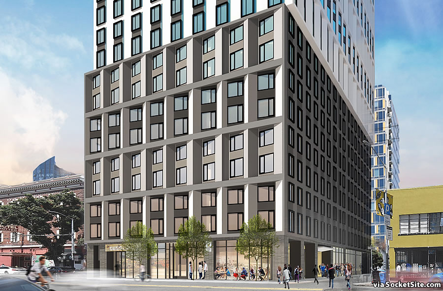
UPDATE (9/18): But while rendered with a Gus’s Community Market, according to Gus’s team, the owners of said market haven’t discussed opening a store in that location and don’t intend to move into the space after its completion.
Horrific! Worse case of “VE” [Value Engineering] ever.
It looks like an absolute improvement for that block.
My neighborhood. I thought the brick was much classier. This looks like another generic office building. Blah.
I find fake brick veneer to be tacky. If they could make it look like real brick then that would be OK. But it always looks fake.
Perhaps the illustrations made it look better than it would have been in real life. Still this redesign is, as Orlando said, ‘Horrific!’ I’ll see this everyday from my apartment. And will occasionally walk by it. I would prefer the tacky brick veneer. And the setback.
Gross.
Strong addition to that intersection!
Do they get some kind of bonus for using as many window styles a possible ?? The building looks curiously like it’s an addition to an existing one.
I’m surprised someone would actually invest that kind of money on that block. That’s where the city should place the navigation center.
This is actually a more expensive architecture than the stuck on brick. I think it looks great. And 25% affordable onsite! What’s not to like? BUILDIT
awful
looks like 1 building fell on top of another
And they’re all made out of ticky tacky
And they all look just the same.
egad. Another stalinist box to accompany the Trinity boxes. While the previous design was uninspiring, at least the stepback provided some relief and interest. Building this massive should not be just boxes.
Oh Man! The drug-addled & homeless are gonna be eating a lot healthier now! And I can get my riced cauliflower & a craft kombucha (after I get my weed) around the corner from my gym / cubicle!
Good defensive design for that particular location.
Shifting brutalist is facades lacking any sense of scale and use of vertical elements to provide street level sense of comfort….whole ground floor like gangs twisty tower looks squished to max profit and ignore any creative sense of scaled elements.
love it. much needed here and all across western soma
by the way, how many parking space. hope less than 50 considering the location
This is the ugliest thing I’ve ever seen. I wonder how the design process went… ‘hey let’s take that bad 70’s building over there, and then that bad 60’s building over there, and cut them in half and stack them on top of eachother!! Perfect, render it up!’ Iwamotto Scott should stick to interior design and just keep trying to take credit for other peoples buildings instead of designing their own, it seems that’s pretty much all they’re good for. What a disaster.
Glad to see the outpouring of concern over subjective aesthetics rather than… you know… the unprecedented housing crisis that is in turn fueling rising homelessness.
Well, most of the homeless are not local – so the two aren’t actually as connected as folks think.
Actually, they are.
its not a believable survey. survey methods severely flawed and half the homeless probably dont even know what day it is much less where they were 2 yrs ago
It’s certainly far from perfect. But keep in mind that the survey results have been relatively consistent, from 61 percent of respondents having reported they were living in San Francisco at the time they became homeless back in 2013, a share which increased to 71 percent in 2015, measured 68 percent in 2017, and inched back up to 70 percent this year.
those doing the survey want this to be the answer. in addition to major methodological flaws, there are not truly testing a hypothesis. they are gearing questions to get their defined outcome. I have a source who is part of the survey who told me that this is a clear objective to survey takes before the survey starts
Compared to the earlier design, which would have brought some nice architectural variety to Western SoMa’s mini skyline, this is bland and a real disappointment. Seems okay at street level though. The new residents and Gus’s will be good for the neighborhood. Maybe it’s time to upzone the adjacent blocks and get a variety of buildings around this height so this one doesn’t stick out?
The previous design was awful.
Brick. In soma? Groundbreaking.
I agree. I love seeing all the new construction this cycle, but why can’t we stick with quality design? Disappointing new rendering that will not age well. It’s cheap looking.
Enjoy living next to the dispensary.
This design lacks an IDEA — big time.
I’m all for more housing, but this is embarrassing and inordinately unattractive.
Come on architects — you can do better than this!
Hell yes it has an idea, and even an IDEA at that: “Maximize square footage on this rectangular lot, and make it as cheap as possible.” (Architect not required for that one.)
“Now, Architect, where are you, get over here. Make it look cool, do something to the outside, you know…but don’t start with me again with those fancy materials.” (Architect wipes tear from cheek.)
I stand corrected — I should have said an “Architectural IDEA”.
Which, btw, most certainly does not preclude optimizing net rentable / sellable square footage — it would just make it look a whole heck-of-a-lot better!
Alas, due to our current — and, apparently, chronic — housing shortage, the market is so distorted (Thx NIMBYs!) that as Andres Duany once said: “We no longer have customers — we only have victims”.
I forgot about this one! Boring architecture. I will look down on this one 2 blocks away. Glad it will not affect the view from my apartment.
i’m probably the only person here that knows about the building across the alley. biggest after-hours club in SF history.
It looks like an homage to the Bayview Federal Savings Building at 21st & Mission
Please give us the grey building or the white one. These two designs smashed on top of each other mess is visually confusing and just plain weird (and not in a good way).
UPDATE: While rendered with a Gus’s Community Market, according to Gus’s team, the owners of said market haven’t discussed opening a store in that location and don’t intend to move into the space after its completion.