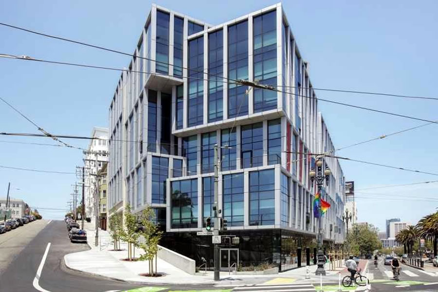
Purchased as new for $1,016,000, or roughly $963 per square foot, back in March of 2014, the “primely” located two-bedroom, two-bath unit #415 at 8 Buchanan Street (a.k.a. Linea) returned to the market priced at $1,156,999 in June of last year (a sale at which would have represented total appreciation of 13.9 percent since the first quarter of 2014 or roughly 3.1 percent per year).
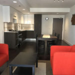
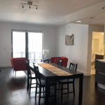
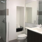
In addition to Bosch appliances, Italian cabinetry, quartz counter-tops and Kohler and Grohe fixtures, the unit comes with a deeded parking space in the garage and a balcony overlooking the building’s courtyard. And apparently, the unit, for which the HOA dues have consistently run around $620 per month, remains in nearly new condition, having never been rented as an income property nor lived-in full-time.
And after 9 months on the market, the resale of 8 Buchanan Street #415 has now closed escrow with a contract price of $1,047,048, representing total appreciation of 3.1 percent for the unit over the past five years on a straight line basis (and more likely with a bit more up, and then down, between).
This has to be the worst new building to open in the last few years in terms of community. It’s FULL of renters who really don’t care about the building and should make anyone run away from buying here. Runs more like a dormitory than a condo building.
Nobody moves to San Francisco for “community”
You got that right.
Yeah we do, a lot of people just don’t know how to reach out to others
Are condo owners more reach-outable than renters? Seems like the renters are usually the more lively ones while the homeowners are generally more home bodies.
Must be a non-smoking building. That would explain why the JUUL Jillionaires didn’t bid it up. And it is a busy street and they overpaid.
Either that or condo decoupling. One or the other.
You understand that most units in the city are rented, right?
“…the unit comes with a deeded parking space…”
In new sales parking is supposed to be unbundled from the residence. I guess that doesn’t hold for the resale. Sellers are not required to put the parking spot and unit on the market as separate transactions and can rebundle parking+residence into a single transaction. If so seems like a loophole that erodes the effectiveness of unbundled parking to reduce home ownership costs.
I guess at that point, since the parking space is built, it doesn’t really matter as much as when building is new.
Alternatively, maybe the listing says “deeded”, but actual paperwork filed will keep them separate.
Linea ages like a fine bottle of Thunderbird. Excluding Saitowitz’s maximum-security condo compounds, is there a more sterile, soul-sucking, neighborhood-killing building in SF?
Ooh, this sounds like a fun prompt. In terms of potential squandered, how about “The Light House”?
hey two beers – you are in the minority when evaluating architectural aesthetics… John King and many others always love the Saitowitz designs. This Linea design is also pleasing to many. What do you want fake Victorian and Edwardian building in an attempt to blend into an existing pattern that isn’t really there?
I didn’t even interpret two beers’ criticism to be primarily about aesthetics, but about civic mindedness. A lot of Saitowitz buildings (there is a townhouse in Soma that I have in mind) look like they are trying to isolate the residents from city life and present blank wall to the public. If you hate other people, move to to Contra Costa and don’t ruin the city for the rest of us. Linea doesn’t seem as aggressively bad that way, but it is still not the most pleasant to walk by on the sidewalk.
Architecture is very subjective…
True though some aspects of architecture are easier to objectively evaluate. Pretty much every safety related feature for example is encoded.
As for this specific “engagement with the street” aspect, that is also fairly objective. Front porch with rocking chairs: engaging with the street. Windowless cor-ten steel wall punctuated heavy security door: withdrawn from the street.
8 octavia looks like a prison. worse building in SF, even makes Linea look nice
I LOVE 8 Octavia and many of Natoma Architects other projects.
Their condo building facing Folsom near 4th is incredible.
Linea, and everything else in the city by Arquitectonica in The City is a complete mess.
(The Infinity, Trinity Plaza….)
Ohhhhh John King, now there is a guy who knows what he likes. 400+ foot towers prompt him to wax-poetic. I think his last name has gone to his head.
So I honestly loved this building in the renderings but the final product has always underwhelmed, especially at street level. I like what they were going for but they missed the mark somehow.
I agree. It is what happens when “designers” who lack any detailing ability/ technical skill, waterproofing knowledge have an army of unpaid interns make conceptual renderings in their remote studios. Between schematics, construction detailing and on site construction, there were obvious corners cut and the building doesn’t seem like what was promised.
Arquitectonica has been pulling this “bait and switch” for years. Great renderings, then terrible buildings. It’s a shame because the firm started with some striking, innovative buildings in Miami. But who is to blame? Was the firm just trying to sell its design? Did the developer “value engineer” the design to death? It’s a shame.
Yep. This is one of the biggest rendering-to-reality disappointments I’ve ever seen. It looks like a credit union, not a place to live.
my biggest gripe with this building is this block had the chance to be a little cool commercial strip.
orbit room and kantine both draw conssitent foot traffic at 1900 market, then got the mint a few doors up for good karaoke, yet this place, retail sat vacant forever, then a boring HR Block went in.
The lack of a back door on these retail establishments will severely limit what goes in to them. There’s not really any place for a truck to pull up and offload in front, either, so you’re limited to services like HR Block, or small product and small volume retail, like eyeglasses, etc.
The potential cafe/restaurant space with the *built in patio* became the worst possible thing: a urgent care clinic with *built in homeless encampment.*
Yes these condo buildings that go rental (many are illegal short term that only advertise overseas) are a major nuisance. They aren’t professionally managed like a high end rental building should be. The association outsources management to some random out of town company that does squat about upkeep and tenant management. It’s every condo for itself.
Just take a look at the interior court yard view ! It makes the office building facade on Market St. look beautiful in comparison. The inside facade is cheap and hideous looking.
Wow, over a million in such a tight living space (eg. dining table in the kitchen).
Huh… subsidiary of Kinkos Japan sells to three San Mateo based LLCs.
I haven’t seen The Linea in quite some time and the photo doesn’t show the Market Street frontage head on, so I can’t tell if one of the upper floor units still has its windows covered with tin foil.
This unit looks into a graffity on a concrete wall. The most depressing view ever with no light. The original buyer made the mistake of buying on a floor plan rather than take a look inside.
UPDATE: In related building and trend news, the two-bedroom unit #808 has just been listed below its early 2014 price.