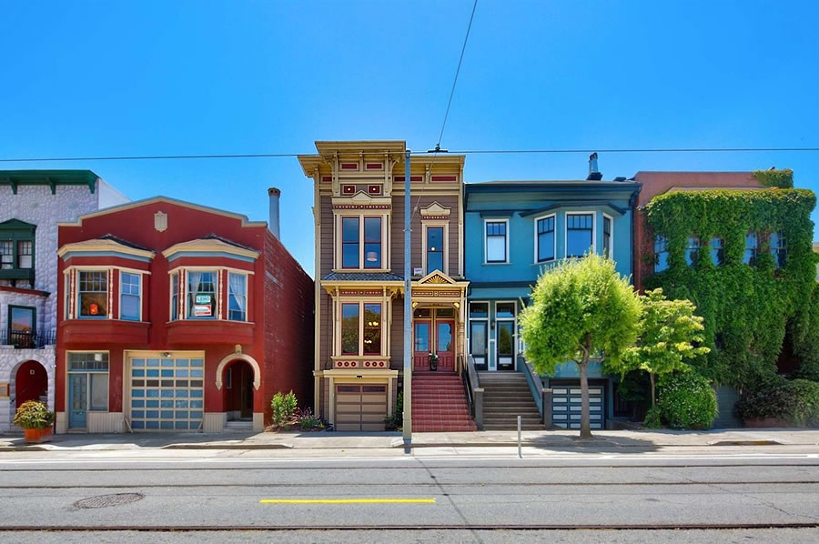
Purchased for $2.55 million last year, the “Exceptional Eureka Valley Home” at 3751-3753 17th Street, which had been “lovingly curated” by the same owner for over 40 years, was subsequently remodeled and its ornate detailing and original woodwork was whitewashed.
Sporting two new kitchens and baths, the 3,100-square-foot duplex returned to the market listed for $2.95 million this past June, touting all “the comforts of modern-living without compromising the elegance of yesteryear.”
And the sale of 3751-3753 17th Street has now closed escrow with a contract price of $2.8 million or roughly $903 per square foot. And while that would appear to represent appreciation of 9.8 percent over the past year, that’s not accounting for the cost or value of the new kitchens, baths or other work to the property.





I realize the high Victorian taste wasn’t for everyone, but this was a crime. It was for someone and there’s not much like it left. Now this example is gone and cannot be recreated for any reasonable amount of money, all in the name I suppose of catering to the generic taste of the wealthy tasteless.
“this example”, lol, it’s a home, not a museum. Also, how do you make the leap that because this Victoriana or Arts and Craft style is no longer desirable…by any class, not just the wealthy…that people are tasteless today? Yes, the new look is extremely bland, that’s what flippers do. Hopefully whoever buys it will make something of the blank canvas.
Agreed!
Perhaps, but an infraction at most: I think it was widely agreed – yes, by us self appointed experts – that the interior was most likely not original, as it seemed more like a caricature of Victorian excess…so it certainly could be recreated, and if only by an “unreasonable” amount of money, well, there’s plenty of that around.
All that having been said, I wish SS would end it’s OMGWhitewash! Fetish and show us examples of tastefully remodeled older homes: even if there less click-and-shock value, I think it might prove more useful in the end.
And for those who might complain that “tasteful” is subjective, perhaps we can compromise on “original”…as in “at least two colors.”
I agree. This was not the original interior of this home, but likely a recreation from the 1980s. There were bits of wallpaper in my house from the late 1800s sealed up inside walls, and it was infinitely more restrained. There was one wall of red flock and another with brown (almost a faux leather) with blue edge details. The Haas Lilienthal house interior, I would argue, is more representative of the time period. Very few interiors survived WWII unscathed and certainly not urban renewal of the 1950s.
What was interesting about my house was that I could scrape through 100 years of paint to see what the original colors were on the woodwork. When bought it, the wood was painted green, and it went through beige, yellow, red (!), and all the way back to and original coat of… green. Most of the wood was painted, only some rooms were naturally stained.
If someone wants to go back and recreate Victorian style here, they can. I would have kept a few more architectural details than the flipper, but this isn’t the worst we’ve seen and seems really tasteful by contrast. You should’ve seen what they ripped out of 2250 Vallejo.
The wallpaper patterns on the walls and ceilings looked like Bruce Bradbury reproductions. If I remember right they started getting popular among Victorian enthusiasts in the late 70’s/early 80’s. The paper was high quality and printing immaculate but, when I was hanging it professionally I was covering up an old paint job that was covering up wallpaper that was covering up…..
Real Victorians, especially ones in this style, didn’t look like that ostentatious nonsense originally anyway. The white is almost certainly much closer to the original and the stylistically ‘correct’ aesthetic than the pre-renovation look.
Yes, that is true of the exteriors. But the interior woodwork was probably not white a century ago.
It wouldn’t have been a complex color or pattern either. Likely a solid color or 2.
The woodwork, or at least a large portion of it, was already painted (fauxed) in the last version of this home.
Exactly!
A great example of of “it was here first, (more like just.. earlier) so it’s better and should never be changed” in SF that drives me crazy about this city.
This is one reason why sales volume has slowed – flipping is a 0 npv enterprise for most cases. Not really up or down, just flat. Ho hum.
The projected budget for the remodel, not including the cost of carry, had been estimated at around $350,000.
Estimated by you?
Budget is $350k for the infill addition, roof deck and kitchen bath remodel. A permit that only got as far as a Planning and was never looked at or reviewed. If they did work it is unpermitted.
I don’t believe you need a permit to paint, and although $350K obviously – at least I hope it’s “obviously” – covers more than that, the repainting seems to be the focus of the coverage/outrage.
Based on the pictures from the prior article they must have done a fair amount of work in both the kitchen and bathroom at least.
Seems like several people made a little money, (brokers, painters, remodelers) though none made anything to justify putting 2.55 at risk. To my point about a lack of flippertunities taking some volume out of the market. 2.55 last year was a decent outcome for the (last) seller.
The whitewash doesn’t bother me. At least they preserved the original moldings, doors, and period fireplace mantles. The same cannot be said of many of these quick flips.
Agreed. At least the woodwork, mantles, and plasterwork is still there. This is actually a rather tasteful renovation. Surely beats the sterile Apple Store designs we see happening.
Agreed.
nice job remodelling.
Dear gawd, the pre-remodel is awful. Reminds me of the well-preserved brothel in Pompeii, except less tasteful.
As best I could tell, it sold in 2016 for 2.5, then sold to someone else for 2.55 in 2017. So the first buyer loses his holding costs (3%+1% property tax) or $100K and realtor fees $128K and transfer tax $20K but got $50K more, so the first buyer lost about $200K on this before giving up.
So buyer #2 now pays 4%+1% or $127.5K, and realtor fees of $140K and transfer tax of $21K but got $250K more. So I calculate a $35K loss, just on the hold. If they did everything on the cheap, they probably spent $200K (not to sparky quality), for another loss of $235K, plus whatever time they spent on it.
Total losses racked up on this property were at least $435K in 2 years. During which time the stock market is up 50%. Genius!
All true. And yet the 2017 buyer paid more than the 2016 buyer, and the 2018 buyer paid more than the 2017 buyer (even adjusting for the likely cost of renovations). So buyers certainly haven’t done too well by waiting. Lesson seems to be don’t buy if you’re not going to stay a while, which is a good lesson, even when prices are climbing.
This was not a great remodel. First, as someone mentioned above, it seems as though the new bathrooms and kitchens were remodeled without permits, so who knows what was done. Second, there are a number of annoying things in the remodel — such as drawer in bathroom won’t open because it hits the door trim. There is a gaping hole in the side of the building where they removed a vent but didn’t bother to fill in the hole. None of the windows were replaced or repaired. The electric seems to still have tiny breakers (I believe Federal Pacific though not positive). The back deck / back stairs seems to have been added / repaired without benefit of a permit either. This remodel may seem pretty at first blush, but is certainly not a high end or professional job.
I would understand the complaints if the interior of this property in its former state was of any historic value.
As has been stated before this is a relatively pedestrian example of a house of this type which had been tarted up with a lot of 1970s-80s faux Victoriana. Even the stone mantels look like they may be later, “period correct” additions.
The so-called whitewashing appears to have retained the few elements that are likely original to the building (plaster ceiling rosettes and some wood trim) and made the formerly oppressive spaces airy, pleasant and livable.
“the formerly oppressive spaces airy, pleasant and livable.”
“fresh and clean”
“flooded with light”
These are the phrases of those trying to sell something plain, boring, simple, and forgettable. There is a reason that historic homes, in every advanced country, draw large numbers of visitors every year.
I think what is being bemoaned, in this case, is not necessarily the destruction of a ‘pure’ Victorian era aesthetic. What has been lost is an example of whimsy and creativity typical of a certain era (1970s) and sub-culture of San Francisco.
In general, a lot of these remodels are wiping out traces of San Francisco’s various sub-cultures from the second half of the 20th century (and not some mythical ‘pure’ Victorian era details which disappeared long ago). We are just too close to this recent era to notice that this has value in its own right.