Five weeks ago the “Exceptional Eureka Valley Home” at 3751-3753 17th Street hit the market listed for “$1.695 million,” or roughly $547 per square foot for the vacant and “lovingly curated” two-unit building in an area where the average sale price has been running closer to $1,070 per foot. And it sold for over asking!
To quote SFGate’s featured story on the amazing sale:
“Sometimes, you’ve just got to love San Francisco. Not only is this a city where a truly unique home like 3751-3753 17th St. exists in all its hand-drawn muraled and stenciled glory, but it’s also a city where a home this over-the-top could sell for $800,000 over asking in a matter of weeks.”
Yes, $800,000 over asking! That’s $2.5 million! In a matter of weeks! And it’s $806 per square foot, or a discount of around 25 percent from the average sale price for the neighborhood. Only in San Francisco.
Regardless, the listing photos for the top floor unit are definitely worth a peek, most likely for posterity’s sake.
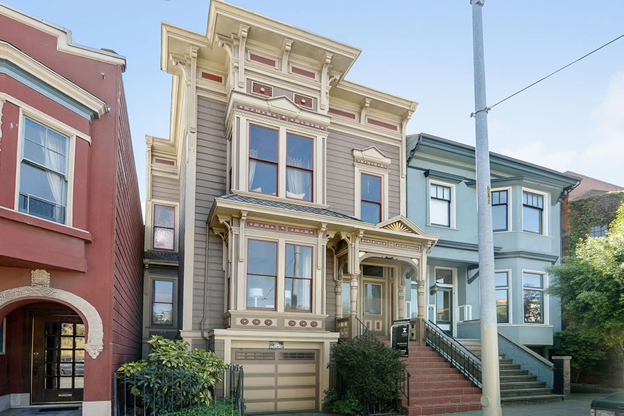

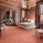
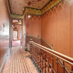
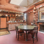

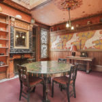
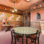

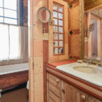
Yeah, hard to believe that “over asking!!!” line still moves anyone, but that apparently is not going to change.
This seems like a pretty good price in this crazy market as the 2BR in-law would fetch about $4000/mo. The big winners are the city of SF and citizens – annual property taxes on this place will rise from $954 to about $29,000. Up yours, prop 13 . . .
I’d hate to paint over all that Dr. Frankenstein (err, “Victorian”) detail – or rip off the wallpaper; can’t tell from the photos – but I’d have to. One day in this place would give me the creeps.
3 million if you want to make comments!
Personally I LOVE the interior
Thomas Kinkaid meets the Mustang Ranch whorehouse. Yuk!
Nailed it!
The whole thing is terrible! What an oppressive interior. I get that Victorian interiors like to cram everything on to the walls – but this is even worse than that
Truly hideous interior. Who in 2016 wants to live in a house like their great great grandmother did?
I would love great great grandmama’s house, if this was hers! But I think my gggm lived in a hut made of sticks.
It’s easy to be overwhelmed, but looking carefully, just removing ceiling detail, putting in hardwood floors, and some paint here and there (but not everywhere), and this could be easily transformed into something pleasing to a greater percentage of the populace. I mean, what kid wouldn’t want a bear mural?
But wouldn’t touch that living room. Would get a nice smoking jacket and a pipe full of Emerald Triangle’s finest and sit in that armchair with reading material that is actually made from paper.
I want the bear mural and I’m 57.
I’ll bet it will be very hard to find a single buyer who truly wants to live in a mausoleum of Victorian wall coverings on drugs.
In my opinion you have a narrow view of design and what people want, I bet there are a lot of people that would enjoy this interior. It’s actually quite amazing.
I agree that just removing the wall coverings (wallpaper? leather? can’t tell from the photos) could really transform this place. I’ve personally removed 2 houses full of wallpaper already and it makes a huge difference despite the agony of the process. I’m quite tolerant of a lot of detail but this is way way too busy. I hope whoever installed that stuff received years of enjoyment because it must have been expensive to install.
I would.
Gut job.
Beautiful mini- palace.
It’s how my imagination sees Tales of the City
Tales of the City was never that low-brow. Anna Madrigal would have had a lot more ferns and bowls of pot around.
At least they kept the “character” to the interior, unlike the neighbors two doors to the east.
I don’t truly like to make negative remarks… but I COULD NOT live in that home. To my eyes, it is extremely ugly… now if I were about 140 years old and the house was still decorated in the same fashion, I would probably feel comfortable and proud of my decorated house.
You’re doing fairly well at not making negative comments 🙂
interesting interior.
for a museum
This place needs a lot of work but there is some detail worth saving. White-box treatment here would be a crime.
Thank you! It’s sad that everyone wants to destroy all of the hard work and artistry so it can be a beige box like everywhere else. The atrium and elevator lobby at 1 Market comes to mind. It all makes me feel very old, and I’m only 35.
I bet flippers would say that whiteboxing it maximizes the the number of potential buyers, i.e. playing to people with no taste.
The Adams Family meets the Munsters meets my Great Grannie – None of whom had a nickels sense of design or style – How awful
SocketSite, you’re comparing apples and oranges. The $1000+ metric absolutely applies to single family homes, but this is a 2-unit which if rented out, would then be subject to rent control. $806 PSF for a rent-controlled 2 unit is actually above-market for rental. Note that there also isn’t even a remote possibility that the buyer can legally combine the units. Nonetheless I agree that “wow this home sold for over ask” is a silly argument since sellers often underprice on purpose to generate interest or to create a bidding war.
The price per square foot was for properties in general, not simply single-family homes. In addition, it’s a vacant two-unit building which qualifies for expedited condo conversion. And the majority of soft multi-unit mergers to effectively create larger single-family homes haven’t been legally approved.
Ah, thanks for the clarification on the PSF metrics. Would be interesting to see what the average PSF is for 2 unit properties in the neighborhood. Also, I thought legislation was recently passed to make all condo conversions much more difficult?
Comparing a vacant rent controlled building and an occupied rent controlled building is comparing apples and oranges.
True. You could find 2 buyers who would condo convert the units.
No doubt some idiot will destroy the interior, not modify it intelligently as some posters have suggested. After all, in our philistine city, “clean and fresh” is goodness. Look at 2600 Jackson.
However, it will probably be used, one way or the other, as a single family home, its best value.
I don’t understand why people pay a premium for used stuff? It’s essentially old and antiquated, might as well raze it and start anew.
Yeah! Two more rent controlled units effectively converted to condo and classified as SFH. We will see the decline of pre-1979 units ever so slowly reducing to zero if we continue this trend.
That kind of thing was probably always going to happen once a dividing line of a date was chosen.
I appreciate the palette upstairs: beige/coral/cream/apricot, but agree it’s way too busy. A designer in Noe Valley recently did his petite domicile in similar hues, and it’s very pleasant, but his style is much more filtered and eclectic.
I usually agree with most people on here, but I can’t this time. This isn’t a Victorian interior; it’s a remarkable example of the British Arts and Crafts movement. The most famous examples are in the movie, “My Fair Lady.”
The dark wood, hand-painted murals and many different patterns are the hallmarks of this style. Of course, this might not be most people’s taste – or any reader here – but to alter it would be a crime. I hope the new owner has a velvet smoking jacket and silver tea service; they will feel right at home.
It’s a remarkable example of over-the-top 1980s faux Victorian BS that is in no way remotely connected to the “British Arts and Crafts Movement.”
Anecdotal story…this building was under-priced from the start.
Coming soon: yet another Apple Store clone.
It is hard to imagine how difficult it was for the owners to leave behind this marvelous creation.
I can see that most of you have no idea experience with decorative arts and interior design beyond the latest IKEA display. The wallpaper in many of the rooms is no doubt from Bradbury & Bradbury and jlasf is right, this is not a Victorian but rather Arts and Crafts in the most vivid sense of the movement.
Is there any hope that people with some vision have bought this place because they loved it? They have to be out there…
There is a wide gap between IKEA and Miss Havisham. If one must err toward one extreme or the other, I’d take IKEA over this. Fortunately, the broad middle is available. That said, I do agree that it would be awesome, and far less wasteful, if the buyer happened to like this, er, “creation” as you put it. It is a lovely house regardless.
Seriously, this shows a very high level of taste, finish, and execution. Unfortunately for the economics, it is very specific to a very limited number of people. You folks who talk “gut job” and making it into a white box really lack a sense of history.
Unfortunate, but as one of the commenters posted, this really is a labor of love, was probably quite expensive to do, and while “busy” is truly one of a kind.
Yes, I could do without the bear painting. But the level of finish and choice of materials is exquisite.
I could not agree more.
UPDATE: Only in San Francisco, Take Two