If the whitewashing of ornate detailing and original woodwork in the name of modernizing drives you crazy, now’s the time to look away.
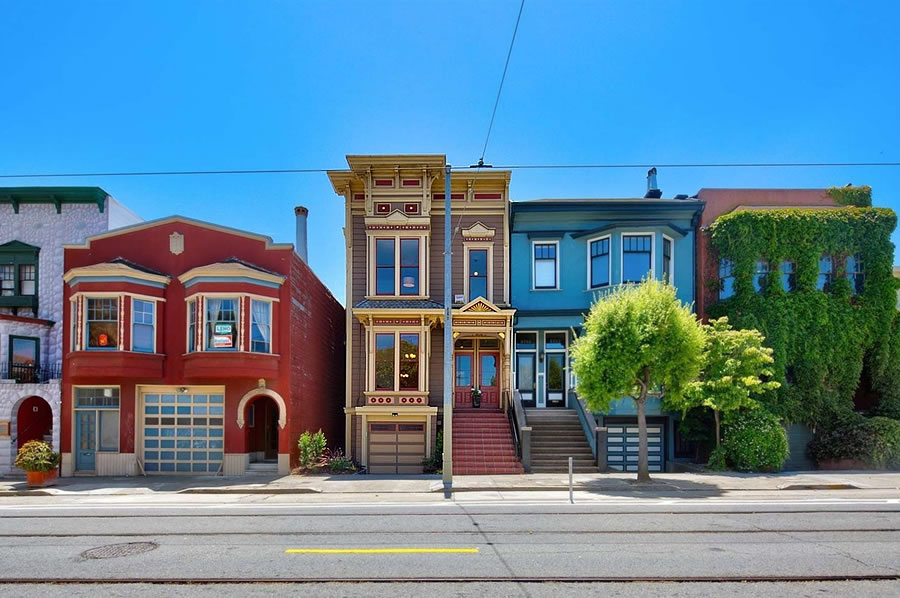
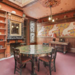
Purchased for $2.55 million last year, the “Exceptional Eureka Valley Home” at 3751-3753 17th Street, which had been “lovingly curated” by the same owner for over 40 years, has since been remodeled.
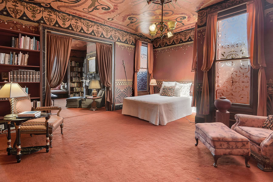
The decorative painting and stencils that had adorned the upstairs unit are, in fact, history.
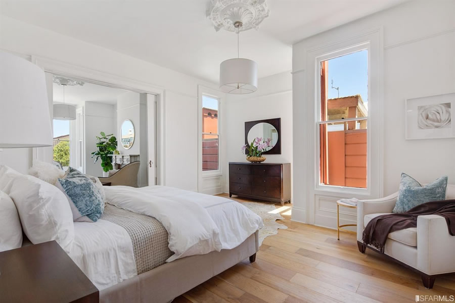
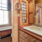
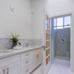
And with two new kitchens and baths, the 3,100-square-foot building is now back on the market and listed for $2.95 million, touting all “the comforts of modern-living without compromising the elegance of yesteryear.”








Appalling.
That first sentence should have read “If dark, busy, ornate, cluttered interiors drive you crazy then look away.” I’d call the previous decoration scheme “escape from salmon”. Not that the new whitebox is appealing though.
Nice rephotography on that slide show. Were those shots of the new interior coincidentally taken from the same perspective? Or did someone intentionally try to match the angles from the old listing photos?
I think they’re evidence photos from a crime scene.
Actually, I rather agree with you: to see and appreciate a classic “Victorian” interior is also to realize why they went out of style (although, technically this seems to be a ‘trompe’d’oeil” recreation of one). But a lot of effort went into creating this and now it’s lost..probably forever: too bad it couldn’t find an owner that wanted to keep it. (But they get props, I’spose, for uncovering the wood floors.)
You mean installing modern plank style flooring. Most certainly not original.
Sorry, guess I didn’t look too closely, and thought they were wide pine boards…which wouldn’t have been in a main room: so no props for them!
I’d be curious about the vintage of some of that decor. Some of it looked quite antique (living room?), some not so much (eg kitchen, bathrooms). Shameful whitewashing.
How much of the ornate interior was original? It looks like it was in pretty good shape—regardless of being outdated or out of aesthetic standards.
Definitely sad to see such a seemingly well-dialed/preserved interior get rinsed away, but also understandably not the most practical thing to keep up. I hope there’s one room hidden somewhere that kept all of the original detail as a kind of curiosity cabinet, meets time capsule.
I have acquaintances who have been doing similar “period” decorating to their home. Decorative wall papers and borders, at least 5 or 6 patterns per room, including ceilings. I do say the color combinations are impeccable, but the fussiness sets my OCD into overdrive
More of a repainting than a remodel, which is good. They kept the “bones” intact.
Agreed. I’m not seeing much in the way of structural or woodwork changes here. Just a lot of repainting.
I’m glad they kept the fireplaces. Though in the kitchen/family room area it looks like the took out a lot of the wood work around that fire place. IMO, that and some of the wood paneling could have been more tastefully preserved, but the structure is still there.
They did slightly reconfigure the kitchen and bathroom and they both seem much more usable. Victorians and Edwardians are pretty, but this seems a little more functional, if not bland.
I don’t mind seeing the prior decoration go since it was too much. The remodeled version leaves enough room for style improvements by the new owners. Arguably one can always add some nice linen or hand-drawn wall paper to blank walls to customize per taste and budget.
There’s a lot I could rant about, but private property is private property, yatta yatta … for me the biggest travestyis removal of those spiderweb window lites… not only are they really nicely unique, but they *do* affect the exterior appearance of the house, not just the interior.
Yeah they would have fit in fine if just painted white and they still would give the place some character. They also removed the frosted glass on other windows (or maybe it was just decals) that provided privacy from the neighbors.
oh please. who would want to live in the original? just because something is old does not mean its tasteful.
I, for one, would prefer the original to the replacement, which looks too similar to an Apple Store location for me to live in. It doesn’t, at all, offer “the elegance of yesteryear”; it offers whoever Apple retail’s head of design’s aesthetic preferences circa 2003. But to each greedy, ignorant flipper their own.
I would far prefer the original. Does the new design have a single bookshelf?
I would, but I’m not a millennial.
Agreed. I’m no millenial either and that mostly looks gross. (I dig the floors..)
I’m with you, MKP. The replacement is pretty bland, but the original is heinous.
where’s the NTHP Lawyers?
the SF Historic Preservation Commission, this should be on the agenda….
Unless the interior were landmark, which is rarely the case (and I doubt the house was a designated historic landmark either), an owner is free to make interior changes as they see fit, provide they otherwise meet the codes.
I doubt all of the interior was original (and the carpets were certainly not), but some of the woodwork and perhaps the mantel was original detail. I think the interior could have been given a contemporary makeover without erasing all the original detail and making the home look like the waiting room in an LA plastic surgery clinic.
The original doesn’t seem that original? And it wouldn’t work for most buyers imo. The new design is basically a blank canvas. Lots to work with.
At least it’s mostly painted over, not removed entirely. Except for that fireplace in the kitchen. Hard to tell if the stuff over the mantle was original. And who paints stone? (I suppose the mantle and surround might have been faux painting, but it sure looks like stone.)
If the old light fixtures are available for purchase, let me know…
From looking at the pictures, most of the “stone”/”marble” is faux, and the one fireplace that appears to be actual marble was not touched/painted in the revamp (the one in what seems to have formerly been the library)
That is indeed really unfortunate. To be clear, the design was more idiocyncratic than strictly historical. At least, most of it clearly doesn’t date to the original version of the house.
It looks much more like the “victoriana” trend so popular in the 1970’s-80’s, with the great popularity of things like Bradbury and Bradbury Wallpaper, and paint effects like marbling and sponging, that just went way over the top (as much original victorian design did as well). I relate it to a refinement of the 60’s hippie aesthetic of the more visual stimulation the better.
But it’s still sad, even though I would also have a hard time living in “escape from Salmon”, because this place was so very individual and now it is bland bland BLAND. As our Despot in Chief would say “SAD!!!!!!”
More than appalling; should be criminal
What a bummer
Honestly, the white is probably closer what that kind of interior that type of Victorian would have had originally. My relatives owned different Victorians in the city dating back to the Gold Rush. I’ve seen photos of the interiors of them, and none looked that ornate except one, which was a much larger and grander house that the one in question here.
The wood would not have been painted. It might have been faux wood (higher quality wood species over cheaper one). And wallpaper for the formal rooms would have been very likely. We found old layers of remarkably ugly wall paper under our stairs. 🙂
Truly despicable.
We need a new legal means to landmark interiors, as I have said before, even if this compromises resale value.
Perhaps your law would have prevented the faux monstrosity that was there before it all got painted over.
You must be joking.
Who would designate it — the property owner voluntarily, or the city? You’re telling me you want a system where the CITY can come in and tell homeowners that “your house is now landmarked, no interior changes on the house you own and bought”? That is sheer and utter lunacy.
The property owner voluntarily, prior to sale. There might be a charitable tax deduction if a non-profit took control of the designation, such as SF Heritage.
Not only is this a horrible idea, it would be unenforceable. So it all works out.
bender, sorry if it offends your libertarian sensabilities, but you’re factually incorrect. In other countries, they have the concept of a listed building which would protect the interior of a house like this one from the depredations of greedy, ignorant flippers.
If implemented here, as Conifer suggests, it would just act as a deterrent, to direct the efforts of flippers to properties that actually needed renovation, rather than having them go on ruining properties that have no need of being turned into a low-rent clone of an Apple retail store.
JWS, this was no ordinary homeowner deciding to change their interior to meet their own desires, it was the work of a flipper who was trying to make a quick buck upon resale. Don’t insult us by pretending there’s no difference.
Yes, in other countries, with different laws, this might be permitted. In California, under California laws, this would not be enforceable. That’s my only point. I have no idea how a simple statement of what is lawful and what is not has anything to do with “libertarian sensibilities.”
Point is, we can change California laws to conform to what the people people want, and if people want it, we have laws that work to the desired end already on the books in other places ready for copying. Apparently you’ve missed the fact that In California, California laws can and do change on a regular basis and sometimes based on laws in other places.
I am well aware of the fact that California laws can be changed, although the relevant laws have been in place for well over 100 years. If someone thinks the people favor a change in the law that permits a third-party to stop a homeowner from painting his or her walls, lobby your representative. I think you will just get laughed at, but perhaps I’m wrong.
Here’s a 12 year old Bentley for the same price as a new base model 3 series. Sometimes the market just doesn’t want to pay for upkeep of exuberant elegance.
Also, painting a house like this and putting in crappy finishes (Jesus, are those East Star cabinets with Ikea pulls?) in a kitchen and bath, with some flooring and some staging, will likely get these flippers what they deserve, which is a small loss. The loss deserved is not so much for the aesthetic decision (that old stuff was rank) but the lack of a design with any better, assertive character.
I project $250K price cut in 30-60 days, and then a trade approximately flat vs. the $2.55mm acquistion price. Nice try. Stick to the Excelsior where your choices are an upgrade.
In a reasonable world, you’d be right. But given recent comps, I’d guess this one goes for well over asking.
To be fair, the 70’s and 80’s and 90’s in SF saw a wave of “Swiss coffee” paint overs so extensive that they now sell that previously custom paint color in bulk most places.
I will be interested in the final price. To me, it looks like they just painted it all white, threw in super bland and boring kitchen and baths that don’t even look particularly luxurious, and put in some flooring. Will they get 400K+ for that? As a buyer, I would almost feel like, heck, I could’ve done that and at least chosen different materials and kept more of the original detail and wood stain.
The place was due a paint job in some areas, but they seem to have gone overboard. White stairway railings? White windows around stained glass? No clawfoot tub? You can always go white but it’s hard to go back.
Only in San Francisco: both sides of that entire block (between Church and Sanchez) have had all the street parking removed to install bike lanes. Not one parking space left on that block.
Thoughts and prayers.
great, that’s how it was in 1900 when this house was built, at least the exterior is more authentic now 😉
I’m sobbing for you 94114, sobbing crocodile tears. Parking spaces have been removed from the public right of way for something (bike lanes) that benefits….the public! So sad.
But….but….the HOMEOWNER owns that right of way. I see an Eminent Domain case!
This should be illegal, shame on them for destroying this home!!
Nothing was destroyed. And you sure as hell can’t dictate what color people paint their interior walls.
I love how people want to control what you do inside of your home. As intolerant as any right wing christian.
Look I’m not going to even get into the continual harping on design preferences that younger families currently enjoy (because I love the interiors of the new home and would never live in the older home) because one day too I’ll be alienated by where interiors have moved on to and will myself shake my fist up at the air bemoaning the youth who want lava rock floors and magenta camo counter tops and complain that nobody wants a clean and bright look anymore.
But for pete’s sake, none of you will ever live in this home and none of you ever owned it. Not one of you even knew these interiors were there a few days ago and now it is a travesty? How has this remotely changed your experience in the city if you never knew it was there and will never be invited into the new house? We are already being strangled by DRs from entrenched homeowners nitpicking everything from roof decks to door knobs, that’s already asinine and wastes an unbelievable amount of time in planning, the planning commission, and DBI. Now we want to control what people voluntarily do with the INTERIORS of their properties because YOU feel it should be something else even though you never saw it before, and will never go in it after, and will never own it? Why? Why on Earth does your personal preference matter?
I thought progressives pushed a mandate of bodily autonomy and the right to free expression (both things I think are important) so how is it progressive to demand people keep the interior of their home, which you’ll never go into, to YOUR liking? That’s literally as insanely conservative as you could possibly get.
The idea of keeping a home a museum to the people’s tastes who once lived there reeks of the new owners lack of self worth. The former tenants decorated their home to enhance their lives, to get the most out of the spaces they spent their lives in. And now someone else will enjoy that home. Someone who will love the updated, airy, GORGEOUS new spaces that they own. The idea that anyone should have a voice about how someone decorates their property is communistic. You can slobber over the refurbished facade but mind your business how people live their private lives.
I love the new interior. Very happy for the new owner. In 30 years somebody may buy it and paint it lime green. It’s their house. Get over it.
There is nothing less appealing than an inexpensive facelift on a distinguished piece of San Francisco. The house went from warm inviting living to cheap YUK.
Well, it is warm and inviting if you are my 85 year old aunt whose only remaining hobby is knitting doilies.
What is more appalling is stating it is in Eureka Valley. Mission Dolores is 2 1/2 blocks away and more clearly defines this location, not to say one must walk through the Castro before they get to Eureka Valley.
Umm..it IS in Eureka Valley, by either geography OR by the official SF Real Estate Maps (which are sometimes more about marketing than absolute geography). Don’t know what the chip on your shoulder is all about.
I don’t know which version is worse. Certainly the new one is cheap and sterile, but the old one made me think of bedbugs. All it needed was a refresh, and a clean up of some of the most excessive frippery.
It would be hard pressed to find any buyer wanting to keep that (somewhat faux) Victorian interior. I suspect none of it is original. Those wall coverings and decorative bands are readily available thru such companies as Bradbury and Bradbury.
The kitchen alone is seriously painful to look at, and notice the cheap white refrigerator with doors hinged the wrong way from the workspace itself. The new interiors are welcome, refreshing and easy to sell.
What I don’t understand is if you have the money to invest in a property like this. Why would you buy the one that had been lovingly curated for decades only to paint it all white, when the one down the street was in a less pristine state and worthy of this kind of intervention? Why choose to wipe all this out rather than starting with a cleaner slate, other than some nihilistic intent, that the interior offended you so much you’d rather buy it just to eliminate it?
(Oh, and book cases are ugly, and books are icky!)
Of course it’s all a matter of taste, but isn’t it completely obvious the “lovingly curated,” “original” interior is 1980s ersatz Victoriana to the nth degree? Why people get all uppity about “desecration” and “loss” when it’s just the new owners peeling back this kind of schlock is beyond me. Nothing to mourn about the loss of some old queen’s over-the-top decorating fantasy that probably had little or no relation to how the house originally appeared.
Disgusting. Absolutely obscene. Not everything needs to be so sanitized. Why buy something like this if you’re so offended by it that you have to bake it all one color?
Totally agree. Anyone who likes this all white artic cold interior must have a cold heart to match.
Shamefully beautiful.
UPDATE: Whitewashed Victorian Fetches $250K More
Astonishingly unimaginative.