Remodeled with a decidedly minimalist/modern aesthetic, and to leverage its panoramic Bay View, the two-bedroom Russian Hill unit #201 at 1070 Green Street hit the market listed for $2.9 million ($1,795 per square foot) in October of 2015, the price at which the sale of the 1,616 square foot unit closed escrow that November.
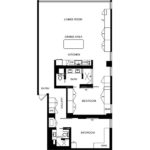
Designed by Michael Hennessey, the sleek unit features an open floor plan and a wall of new Starphire glass windows which frame Alcatraz, the Bay and all the views beyond.
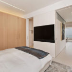
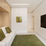
The Italian porcelain floor is heated, the oak wall panels and cabinetry are custom, with storage behind.
The modern kitchen is outfitted with a white quartz island that doubles as a formal dining table, high end cabinetry and appliances.
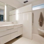
Both bedrooms are outfitted with more custom cabinetry, built-in storage and en-suite baths with walk-in showers, quartz-topped vanities and in-wall toilets.
And having hit the market listed for $3.2 million five months ago, a sale at which would have represented total appreciation of 10.3 percent since the end of 2015, but then reduced to $2.995 million after a month, the resale of 1070 Green Street #201 has just closed escrow with a $2.85 million contract price, down 1.7 percent on an apples-to-apples basis over the past 2.5 years.
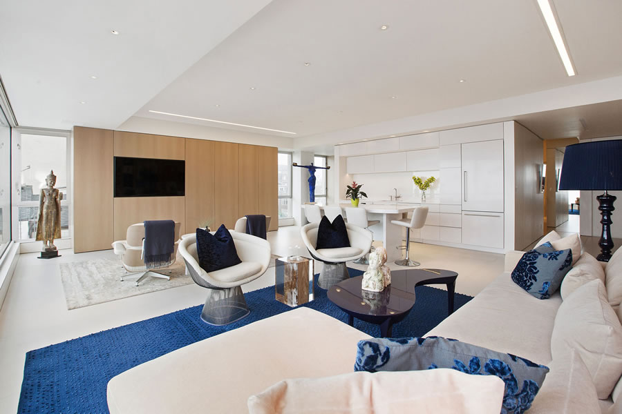
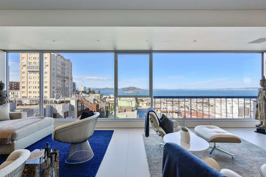

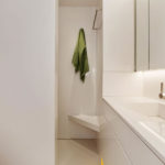
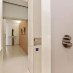
that is a really cold unit. lots of white, corners and lines. feels like a hotel.
What’s the over/under on a starchitect design and custom cabinets/heated italian marble floors/etc/etc ? $500k?
$500K? No chance. Double or triple that amount. Retail runs ~$1k per foot for a remodel similar to the one above.
Yeah… I’m out of the loop at this point, but recent quotes I received for a down to the studs remodel for an almost identical property were close to 2k per foot and not with an ultra high-end contractor and no unusual or unique/custom finishes.
I would imagine a developer can get things done a $500 a foot, but for a private owner looking to remodel a place with similar finishes, I would imagine 1k per foot would be a start.
In that middle bedroom there’s not enough clearance between the closet and the bed for the closet doors to open. You’d have to position the bed more towards the center of the room to make it work. Unreality on the stage.
That’s an artifact of the photography and incorrect. Note the custom headboard, lighting and side-tables were built-in with the closets in mind.
Thanks for the alternate angle, I had assumed the headboard was moveable. I can’t believe I was fooled by a wide angle lens.
But milkshake, tell us what you think about the Fine Art Sculpture collection. Assuming it was transferred with the property and not on it’s way to a warehouse, destined for another stager to use in the future.
The sculpture is tasteful but not my cup of kopi luwak. I’m more of a Becher, Kiefer, or Robert Williams beverage.
a white quartz island that doubles as a
formaldining tableThere’s nothing formal about eating in the kitchen.
I agree: the narrative seems unusually fawning, almost like it was taken verbatim from a sales brochure (tho I wouldn’t think a sales brochure would contain an awkward statement like “…the porcelain floor [sic] are heated…”)
I’m rather surprised the building allows variations in fenestration. The rule seems to be all window, breaks at certain points, if you must…
We might suggest reviewing the rear facade of the building, not its front.
I did look at the rear and posted a link (which you appear to have deleted, possibly because my link didn’t show the rear side). Even in the link you provide instead, there is some variation. On some floors, expanses of only glass cover separate panes on other floor. The rule, as I said, seems to be uniformity in the position and material of vertical breaks.
So someone spent $1.5M and lots of time and energy on a redo, sold it for less than they paid and coughed up $200,000 to the realtors, transfer tax and stagers. That had to leave a mark.
Seller is very, very senior at First Republic Bank, proving that even someone on the inside isn’t immune from mistakes. At least she sold before it got any worse.
To be clear, the down to the studs remodeling, which included the capture of former balcony space, occurred between the unit’s purchase for $1.2 million in 2011 and sale for $2.9 million in 2015.
Ah, didn’t understand that. Well, then she “only” lost $200,000. Tis but a flesh wound.
Interesting that buying at “the bottom” and selling at “the top” still yielded nothing for the prior seller, who was out $1.2+1.5+.2=$2.9 and sold for that price.
I’d say part of their problem was they spent so much money to make it appeal to a relatively small sliver of the population.
As a point of reference, while it took three weeks to find the buyer, the unit was in contract within three days of being listed at $2.9 million, at least back in 2015.
Wow, staging really butchered that space.
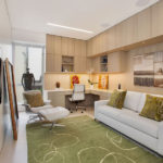
I’m inclined to agree. This might be the owner’s furnishings and art. I would have staged this much differently, with a designated dining space and less taste specific art, though I doubt that would have changed the outcome. The layout makes the unit seem quite small while appearing to function as a one bedroom + given how narrow that office appears.
In 2015, they should have bought the 2BR place at 420 Mission Bay Boulevard No. 1103 instead. It just sold for $310,000 more than the 2015 price.
Wow! And it’s not like there have been some major new developments, project approvals and other alpha-esque changes to the neighborhood around that unit in South Mission Bay since 2015. All of which plugged-in people would have known to expect, of course.