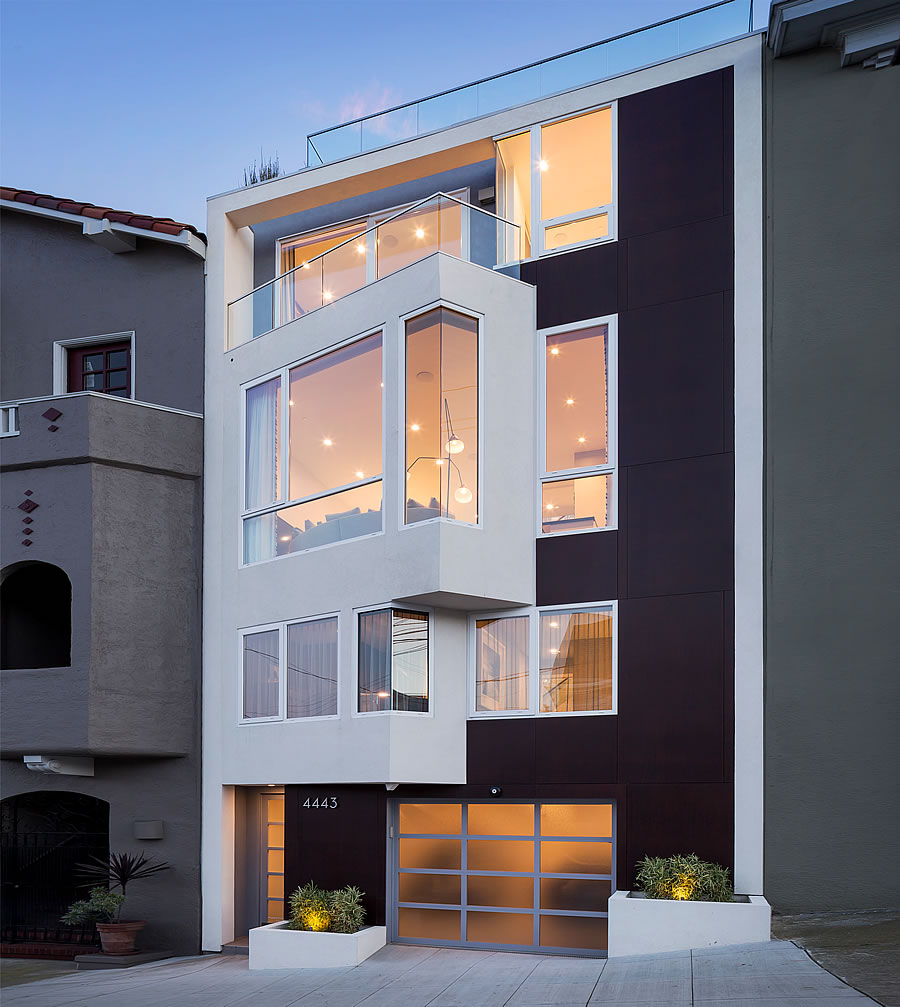
Designed by DNM Architecture, built for “a technology company executive” in 2014 and priced at $4.75 million in the first quarter of 2016, the LEED Platinum certified home at 4443 19th Street sold for $3.3 million that June.
Listed with a total of four bedrooms, which includes a detached one-bedroom cottage behind the 1,650-square-foot home, a cottage which has been flagged by the City for having been illegally rented on a short-term basis, most recently with an unregistered listing at $265 per night on Airbnb, the property returned to the market last month with a $3.595 million price tag.
And yesterday, the sale of 4443 19th Street closed escrow with a reported contract price of $3.675 million, representing total appreciation of 11.4 percent for the LEED Platinum home in Eureka Valley, with a rather spectacular roof deck and remodeled cottage, since the second quarter of 2016.


I know realtors want to cleanse the Castro from their listings…but since this is a few hundred feet from the Harvey Milk Academy let’s go ahead and call it the Castro anyway.
The randomly angled jutting out part on the front looks pretty cheesy, but that roof deck is sweet!
I want there to be a reason, like for the window to catch more sunlight, or it aligns to a cardinal point, but looking at DNM’s other work, I think they just like the “contemporary” vibe of an oblique angle.
Essentially it’s a bay window: why would/should there be a reason beyond that?
A good designer has a reason for any given decision. Bay windows can can take many forms. This window is clearly stylized from the standard form. So, why this form for this window? I think it’s a legitimate question.
A bit more floor space, an improved view to the northeast, a more interesting facade.
I’ve been in that property. The windows are angled to face the downtown view.
I went to school on the East Coast and four years walking up three-four flights of stairs to go to your bedroom multiple times a day even at the spry age of 18-22 was enough for me. Not sure about paying $4 mil for the privilege.
I was wondering the same thing. Where is the elevator?
My cousin’s high schooler is graduating from Phillips Exeter Academy and though it is a beautiful campus, she walks 3 flights of stairs up and down daily for four years with her books and more stairs at various buildings for classes I was tired after a couple of times.
Apparently there’s a dumbwaiter that serves all the floors, so at least the books could ride up.
You fat Americans.
You are here as well, right? So the correct statement would be “we fat Americans”?
I climb stairs.
As do I, but having settled here and making a living here I feel included in your statement as should you! Unless you just read this site from your residence outside the Americas.
Are you a fat American? Then you are included. One needs to climb stairs to live in this house. Many Americans do not want to climb stairs, and are fat.
Being American does not equal being fat as your statement implies.
Climbing Stairs does not solve the problem of being fat, but of course it doesn’t hurt.
If you hate climbing stairs, this house is not for you – many people of normal body weight does not like climbing stairs. I have a 2-story and don’t mind the stairs; I work on the fourth floor and frequently use the stairs; this house would require a lot more stair traffic and I am not sure that I would appreciate that.
You do not! You have a one-story ranch home in the Peninsula! Or you did.
You would have to be a “dumb waiter” to want to live in a 5 story house with no elevator.
Looking at the average American, maybe it is not a bad thing to have stairs to navigate. At least for people without disabilities?
I imagine some of the commenters here drive three blocks if they are going out for coffee?
Apparently we are not a rugged people! Vanquished by stairs! lol
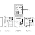
3 floors of living space and only 1650 square feet = small, cramped spaces (in addition to the constant climbing).
that’s why it only got $3.675mm
Yes initially I thought his house went for a steal. Then I saw the floorplan.
I assume they were forced to keep the little cottage at the back of the parcel.
Correct. The cottage was the original structure on the building.
Totally agree–too many floors for such little square footage. Lots of other stuff to like about this place, but that would be tough for me to get comfortable with.
Did Helen Keller provide the interior finishes?
How about we excise jokes based on disability from our cultural lexicon?
It helps to give a normative example: “were the interior designers still wearing their eclipse glasses”
Great roof deck. But oof. That interior. Not for me.
Gosh these comments are rude…Fat Americans, Dumb people, Helen Keller comments. Really?
Typical social media effect where the majority of the comments aren’t related to the post. That’s why.
As for the home itself, the interior will be dated in no time, so when it gets sold in 2028 the buyer will most likely gut and replace. The deck, while striking, lacks any protection from the elements. I used to live a few blocks away. When those winds whip around Twin Peaks you need all the protection you can get. Laundry is two floors down from the master suite, but given the price tag the owners most likely won’t be washing their own sheets and delicates.
That’s just like, your opinion.
This is a spectacularly awful design. The entirety of the rear is covered in opaque glass, eliminating almost all of the view of the garden. The “entrance” is in the rear garden, requiring guests to travel up to the third floor to gain access to the public space or enter a warren on the second floor near the private spaces. The aforementioned distance to the laundry is an issue as is the distance from the kitchen/entertaining space to the roof deck. Poorly laid out with so-so finishes. A steal at $3.7 million.
“or enter a warren on the second floor near the private spaces.”
I don’t see a door to the outside on the 2nd floor.
For some reason the door is omitted in the plans on the realtor’s site, but on the architect’s site there is a door.
There is a very good and obvious reason for the angled bay…that is a nod in the direction of the spectacular downtown view.
[Editor’s Note: And that’s a bingo.]
former owner of a unit in the bldg to the left here. I can confirm the angled window is to get the view of sf downtown plus bay bridge and east bay hills. It’s a nice view.
I remember this house being built. There was a video featuring this home a few years ago. I was excited to see it when it was first pocket listed. (I linked to the original Houzz project write-up.)
It feels smaller than one might expect from the street. I think this is due to the limited building depth, which was driven by the lot being only 75′ deep. Aside from the spectacular roof deck, the outdoor space is near non-existent. The kitchen might work for an intimate gathering, but it would pose challenges for a larger gathering. The translucent rear-wall photographs like privacy glass; it’s a polycarbonate panel system. The roof of the cottage has quite a few solar panels, although the site position may get quite a few shadows outside summer.
To me the house read more like a pied-a-terre or bachelor pad than a family home, which I think may have been the original intent.
Yes, Richard, it is.
I didn’t quite understand the opaque glass when I saw the house either because the garden outlook is beautiful. My only thought is that it may be to keep privacy between the house and the cottage, supposing that they are occupied by two different parties.