As we first reported last year:
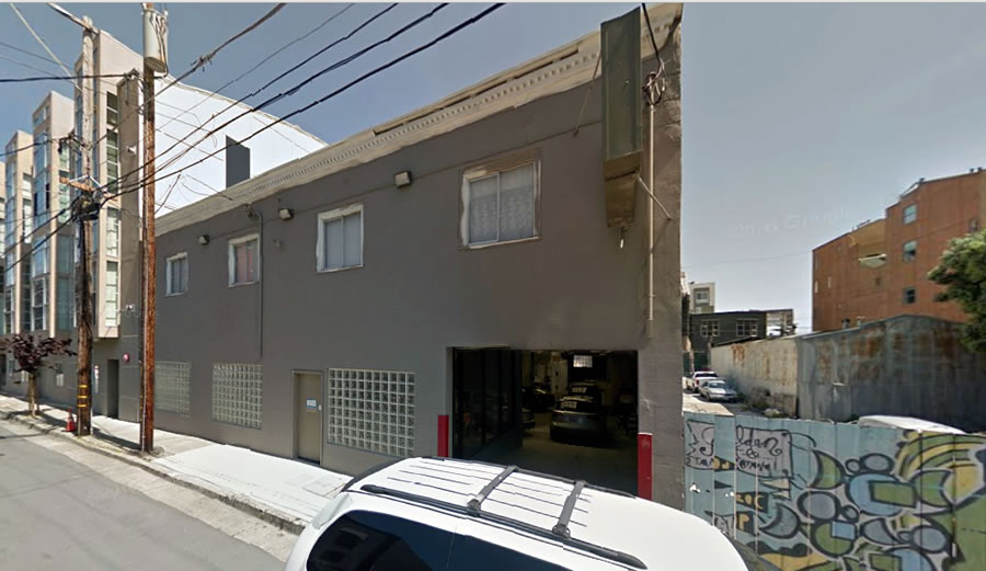
Plans to level the two-story Auto Trust Services building at 255 Shipley Street have been drafted. And as proposed, a modern four-story building designed by Natoma Architects will rise across the Western SoMa site with 24 condos and parking for six cars.
The development would stretch from Shipley to Clara Street, with a courtyard between, and overlook another modern infill project designed by the Stanley Saitowitz | Natoma Architects team which is nearly construction complete.
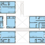
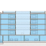
The plans for the proposed development, which is technically five connected buildings across five mid-block lots, have since been refined as newly rendered below.
As designed by Natoma Architects, the proposed units would average around 950 square feet apiece, with five (5) studios, three (3) one-bedrooms and sixteen (16) twos; with 2,500 square feet of “half-sunken” PDR space at the base of the building along Clara.
And the formal application to move forward with the project has been submitted to the city and is now under review. We’ll keep you posted and plugged-in.
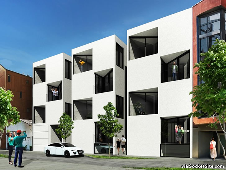
Those renderings look like some sort of giant Hollywood Squares set. Is that Paul Lynde in the center square?
ROFLOL! Awesome comment. I used to love PL when I was a kid. Especially as “Uncle Arthur” in Bewitched!
They seriously can’t go higher? Why not use the state density bonus? Regardless, I support any plan to replace autobody shops in SoMa with housing. Go go go.
He is the master at designing (some) unlivable spaces: that triangular balcony!
Would it kill them to put some actual windows in the main living space facing OUT TO THE STREET?
Good point. Installing the sliding glass door at a diagonal creates two unusable wedge point spaces. Straighten it out and viola, extra space in a small unit for zero cost.
It’d be pretty magical if they opened on a corner hinge and could close/open the balcony. Sort of a giant swinging glass door with a few configurations.
This is smokers balcony. Nobody does squat outside on a balcony in SF other than stare at their plants from inside and a BBQ 1 day a year.
These are truly, truly awful. There is something horribly off with all of the units and who –WHO– is going to buy that closet of a studio with only a window into the light well?!
You’d be surprised.
It is amazing to me that after more than 50 years, clean modern design is still drawing this sort of reaction. I get that it isn’t going to appeal to everyone, but am just baffled by the complete dismissal of modernism like it is some new thing that just started happening and that will be gone in a minute once we understand that design really was better in the early nineties.
I like the design.
I don’t dislike Modernism in general. Stanley Saitowitz’ stuff disgusts and infuriates me because the majority of it is just rehashed Brutalism (I wouldn’t apply that tag to this particular building, even though it could be).
I understand that some people really like it from the standpoint of wanting to épater les bourgeois.
Sounds like you’re saying it needs more bay windows.
The small separate buildings are a pretty cool, it reminds me of something you’d find in Toyko! This is like a mini version of the housing he did in Berkeley, those units look pretty nice from photos.
Western soma plan is a travesty. How about 12 floors here?
It seems like it needs more bay windows.
The street level units would need bars on the windows. The street level surfaces will be a graffiti magnet.
Design looks banal, even for Saitowitz. Looks like a graffiti canvas.
I love how the middle/left unit has a bathroom that opens straight into the living space…will make for some fun parties!
Most of the dimensions appear to make the rooms look unlivable. And yes, definitely a magnet for burglars and graffiti artists on those first floor exterior walls.
UPDATE: Refined Design for Modern SoMa Infill Project as Proposed