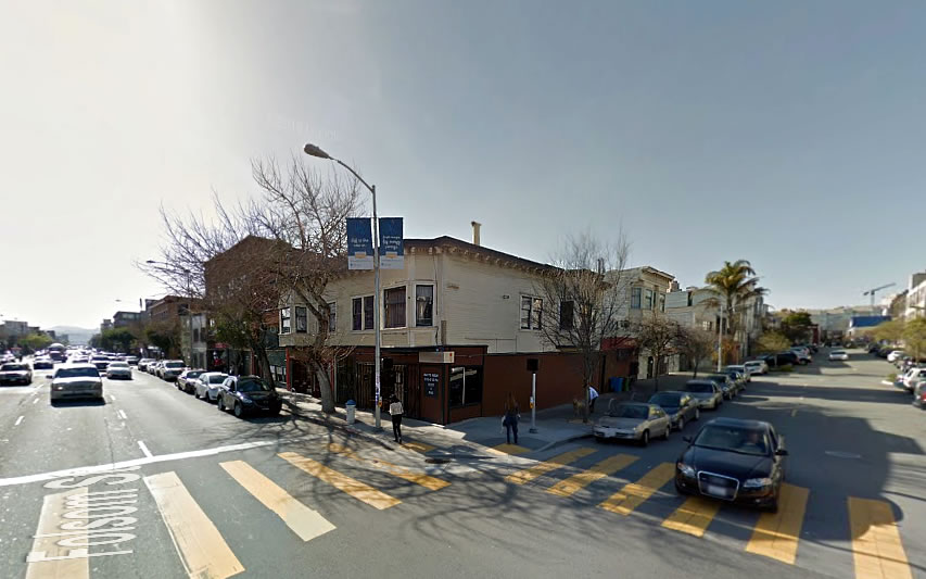
As we foreshadowed, the proposed development to rise on the northwest corner of Folsom and Russ Street, upon the current Fondue Cowboy and Deli Board site, has been redesigned.
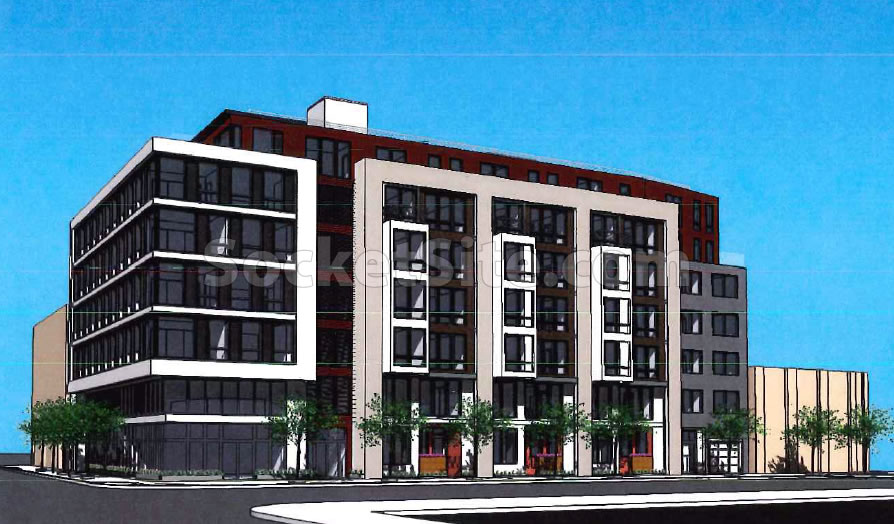
Gone are the Art Deco and industrial flourishes which Planning had viewed as “muddled.” And in addition to adding a seventh floor, while maintaining a building height of 64 feet and 6 inches, six inches below the maximum height for which the site is zoned, the proposed unit count has jumped from 46 to 63 while the garage space has been reduced from 21 to 17 spaces and the ground floor retail space is down to 2,100 square feet.
But the issue of casting some new shadow on Victoria Manolo Draves Park’s basketball court across the street remains. We’ll continue to keep you posted and plugged-in.
Ugh…so it’s just more boring Mission Bay boxes
What the hell is planning smoking? The old design was way better. At least there are more units now, i guess…
SO strange, it was much more clean and interesting. This is so ugly.
I thought the first design was more visually interesting and slightly more unique. I agree, this looks like the exact same building we have seen going in everywhere. As I walk through the city these days, I can’t help but think how many wasted opportunities so many of these new buildings seem to be. Some of them look aged and weather when they are still brand new.
I have visited Lyon a couple times, and look at what this city full of old architecture is doing. Why are we not pushing boundaries here, only sketchup boxes with ‘details’.
If i remember right, Lyon was actually one of the cities that SF specifically looked to, when it comes to some of the recent redevelopment plans (Mission bay? Western SOMA? Just in general? I can’t remember)…looks like they’re doing a good job with that (sarcasm alert).
And now it looks like an office building.
Contrary to common perception (and SFs red-tapey-BS) it’s really not that hard to design a simple and tastefully contextual, mixed-use building—even in a city with so many “muddled” design references to borrow from.
Neither design was particularly interesting, but planning seems to have gone from bad to worse. I hardly call the former rendering Art Deco in any way, shape or form. It’s like adding a cornice and calling it Victorian. Whatever. However, what gets me is that it appears very little thought went into the second design since the first one was only revealed a couple days ago. My assumption is that they had some kind of template and just cranked out a half-baked design overnight, because riokf hit the nail on the head…it looks like the exact same building going up everywhere.
[Editor’s Note: The original design, and feedback, was drafted over a year ago.]
Can’t have people playing basketball in mild shade as the sun goes down…
Planning’s argument that the previous design was “muddled” is even more absurd in light of the new design. The previous design, whether or not you liked it (I personally did), was actually very coherent (planning’s real argument was that it was too faithful to surrounding art deco/industrial buildings, minus the bay windows, an argument that is strikingly unconvincing).
The new design, meanwhile is legitimately muddled, but will almost certainly get a thumbs up from planning because it looks like all the other postmodern boxes going up around the city (and hence can be deemed appropriately “contemporary”).
The fact that planning is unreceptive to anything outside these increasingly narrow and aesthetically nihilistic designs ensures that no architectural risks will be take within the foreseeable future (not to mention anything even vaguely approaching imaginative design).
please don’t call this postmodern, there’s nothing postmodern about this design. According to Wiki “Postmodern architecture is a style or movement which emerged in the 1960s as a reaction against the austerity, formality, and lack of variety of modern architecture, particularly in the international style advocated by Le Corbusier and Ludwig Mies van der Rohe.” sixties seems a little early, but it was certainly in full bloom by the late 70’s and 80’s. Not all of it was good, and much was bad, but stylistically had NOTHING to do with this kind of bland corporatist architecture.
Point taken – this doesn’t fall under a strict definition of postmodern architecture. For the record though, I didn’t call this postmodern architecture, I referred to “postmodern boxes.”
In any case, these buildings definitely have something to do with postmodern architecture, specifically in the sense that they have adopted some of the more banal tendencies and done away with the creativity (in particular, the attempt to incorporate multiple styles and periods within a single building, as well as the desire for complexity).
However, the use of asymmetry and multicolored facades (as is common in these current designs) is without question highly indebted to postmodern architecture’s legacy (even if these tendencies are also a vast simplification and even a distortion).
nice thoughtful response. 😉
Has there ever been discussion of revamping the entire Planning Dept? They routinely kill or severely handicap interesting projects, and are making this city look incredibly boring and bland. i don’t know a single person – literally, not one – who likes these gross boxes, yet that’s all Planning seems to like. Clearly there’s something wrong with the department.
[Editor’s Note: Damn That Planning Department To Hell!]
Still muddled but bravo to fitting 36% more units in. I’m of the radical opinion that people having homes is slightly more important than trying to make sure every design pleases everyone.
It is not clear to me that there was a trade-off here. Is there any reason that a building in the original style could not have been built with more units?
As with others, I am still puzzled by the Planning Dept.’s object to the original design. While it was perhaps not award winning, it had a clear concept and was cleanly executed. It also was different from many other new buildings. As a replacement, we have a boxy building that resembles so many other new buildings. Is the Planning Dept. so enamored with that style that they think it should be imposed on developers?
NoeNeighbor, perhaps a building in the original style could indeed have been built with the additional units. If that had happened, I’d cheer that as well. My remark was meant simply to say that while neither the old nor the new design is particularly to my taste, I’m happy to see housing get built.
I had to look up “muddled” just to make sure I wasn’t misusing the word this whole time. Hate it when that happens. Makes me feel like a plunger.
The previous design was better. Far more interesting, it paid homage to the industrial past of the area and engaged. Unlike this new design which is more likely to “put off”.
The Central SOMA does not have historic buildings in the proper sense of that word, but it has interesting buildings and certainly so compared to what they are or will be replaced with.
Rather than up-zone so much of the area, why not encourage the retention of some of these buildings with setbacks allowing 4/5 story additions to the older building? This would at least force some thinking in terms of the design elements of the newer part of the building – that may be the best one can hope for given Planning’s total inability to nurture/encourage interesting an aesthetically pleasing architecture.
This new design is not by the same architect. The previous design was rejected by Planning apparently because it didn’t like it paying homage to the industrial buildings nearby.
Kinda looks like the “example” building free in the REVIT software ‘ let’s draw an apartment building’ tutorial. Pretty sad for a City that brought you the Palace of Fine Arts….
Despite being more ornamented the previous design was cleaner than this neo-Azerbaijan SlickBox. That’s quite an accomplishment.
UPDATE: Folsom Street Development and Its New Shadow Closer to Reality