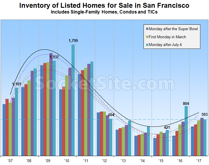
With supply (new listings) roughly even with demand (sales) over the past three months, the number of single-family homes and condos currently listed for sale in San Francisco now totals 593, which is 3.6 percent lower than at the beginning of April and 26.2 percent lower than at the same time last year but 40.9 percent above the inventory levels in place circa 2015.
At a more granular level, the number of single-family homes currently listed for sale in the city (191) is currently running 34.4 percent lower than at the same time last year while the number of listed condominiums (402) is 21.6 percent lower, not including the vast majority of unlisted new construction condos for sale across the city, the inventory of which currently totals around 900, which is 28.5 percent lower versus the same time last year.
And in terms of pricing and expectations for the inventory at hand, 22.3 percent of the active listings in San Francisco have undergone at least one price reduction, versus 19.4 percent at the same time last year, while 35.2 percent of the homes on the market are currently listed for under a million dollars, versus 41.4 percent at the same time last year and 34.5 percent three months ago.
If typical patterns holds true, expect inventory levels in San Francisco to slip through the summer before climbing again near the end of August or early September.

All the data points in the content talk about a large drop YoY. Plateaued?
What data are you referring to?
5 colors in the chart….only 3 in the key/legend…I think red and purple are missing. Or am I just confused on that? It is Monday and Im slow today, but I think the key is missing two colors?
Red = Tuesday after Presidents Day
Purple = First Monday in April
oh, thank you. Part of the sequential timeframe here, makes perfect sense.
its intersting the chart looks dramatic, but if you compare the peak available inventory of 1799 in 2010, vs today, its only about 1000 net less units today, which really isnt that much if you think about 1000 units as a % of total housing in SF that could be listed.
To me the chart kind of shows what might happen during the next recession – listings spike due to layoffs this time not so many “bad loans” (+ layoffs).
But with all that, its hard so see any sort of major 2008 – 2010 type correction in housing again anytime soon. Hopefully not until my kids are ready to buy in 20 years.
“but if you compare the peak available inventory of 1799 in 2010, vs today, its only about 1000 net less units today, which really isnt that much ”
But the flip side of this is that it didn’t really take all that much excess inventory to cause the dramatic 2008 price drops.
SF is a thinly traded market which causes more dramatic price swings than you might expect. Both on the upswing and the downswing.
Reminds me of the Socketsite chart that had time running backwards for a few months.
The one where “we could un-smooth the line to (mis)impact a higher level of precision” (but apparently [sic] they didn’t)?
Actually this looks like a classic sine curve function, although of course you can always “fit” data to any line you want…even a perfectly horizontal one (to match the “table top” effect people on here complain about, perhaps.)
Uhm, can we keep it simple: are Fab 7×7 home prices, SFH and condos separately, going up or down? I need to know if I need to call my mortgage broker again or that I can now eat a bigger lunch at work….
district 9 condo sales, last 90 days, per MLS:
– 226 sales (75 sold per month)
– Avg. list price: $1,239,398 ($1,063/foot)
– Avg. SALE price: $1,247,642 ($1,081/foot)
– 142 active
what about district 8?
district 8 condo sales, last 90 days, per MLS:
– 112 sales (37 sold per month)
– Avg. list price: $1,312,377 ($1,077/foot)
– Avg. SALE price: $1,333,571 ($1,107/foot)
– 71 active
District 1?