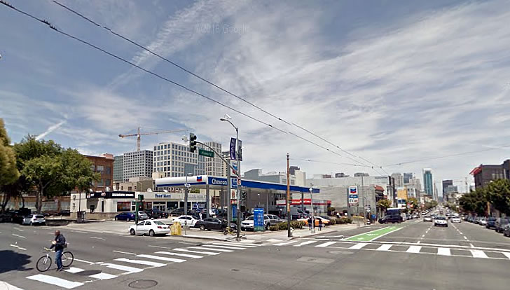
It was nearly twenty years ago that San Francisco’s Planning Department first authorized the theoretical conversion of the gas station parcel on northeast corner of Howard and 9th Street which is zoned for development up to 55 feet in height.
Two years ago, preliminary plans for razing the existing Chevron, Burger King and Starbucks on the 1298 Howard Street site, and building around 120 residential units over 13,000 square feet of commercial space, along with a mid-block pedestrian alley, were first submitted to the City for review, as we first reported at the time.
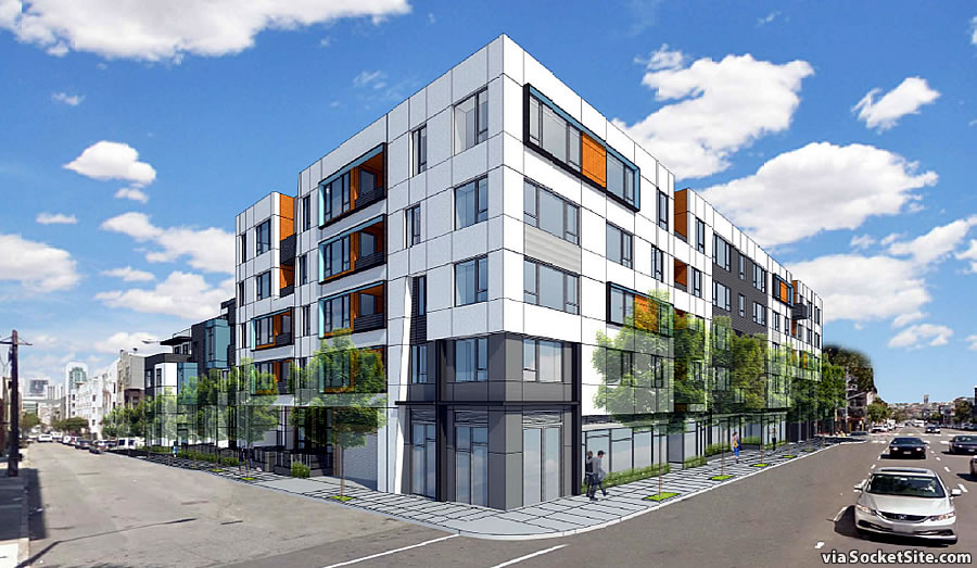
And as early as next month, the refined plans for 124 apartments, nearly 14,000 square feet of ground floor commercial space, and a basement garage for 71 cars (and 188 bikes) could be approved to rise up to five stories in height across the Western SoMa site.
As newly rendered by Levy Design Partners, the mid-block pedestrian alley between Howard and Natoma remains, which would be lined with residences and could be gated as designed.
And in terms of the project’s timing, while Chevron’s current lease runs out in two years time, we do believe there’s the possibility of an extension (or two).
We’ll keep you posted and plugged-in.
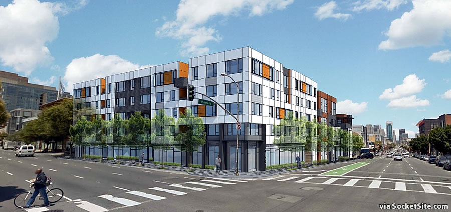
This is a large parcel and an atrocious design – it should have been something special – dare I say even spectacular? But no – this is SF don’t you know. Not all new buildings can be special, but fewer and fewer are. What is the point of even having a Planning Commission when designs like this are not turned back – which I doubt it will be.
Much as the Baker Market/Duboce travesty won’t.
Yeah, I know, I’m tilting at windmills.
The initial renderings, though “bland,” were better than these drawings.
Maybe its already being VE’d down? One issue with this and so many SOMA buildings is the flat roofline. Its not as if it would cost a lot more to detail/enhance the roofline but…. it seldom happens. This is how you end up with basically block after block of uninteresting and sometimes off-putting rectangular blocks throughout SOMA. There is an entitlement project planned in MV which is about the same size as this project. but superior – the roofline treatment making all the difference between that project and this.
I just hope they went to bedrock.
We don’t want this monster falling over.
such a sad state of affairs. the western SOMA plan is the worst plan ever created in the city of SF. this is the downtown core and should be 12+ stories. what would it take to rip up that stupid plan and start over?
OMG YES
looks like they purchased the design from ikea.
ügsklø
I worked on that Starbucks back in 1998. 🙂
Good riddance to the dead spot/strip mall.
The building design is banal, the ground floor looks too short (should be 15′ min.) and doesn’t have much to say to the sidewalk. A taller structure would work well at this location without looking out-of-place. Also, 50% is too much parking. I think zero parking, or perhaps 20% with a car share pod. Sick of all these awful, value-engineered, MCM-influenced buildings. On this one, even the colors are awful.
UPDATE: Plans for Prominent SoMa Corner Slated for Approval