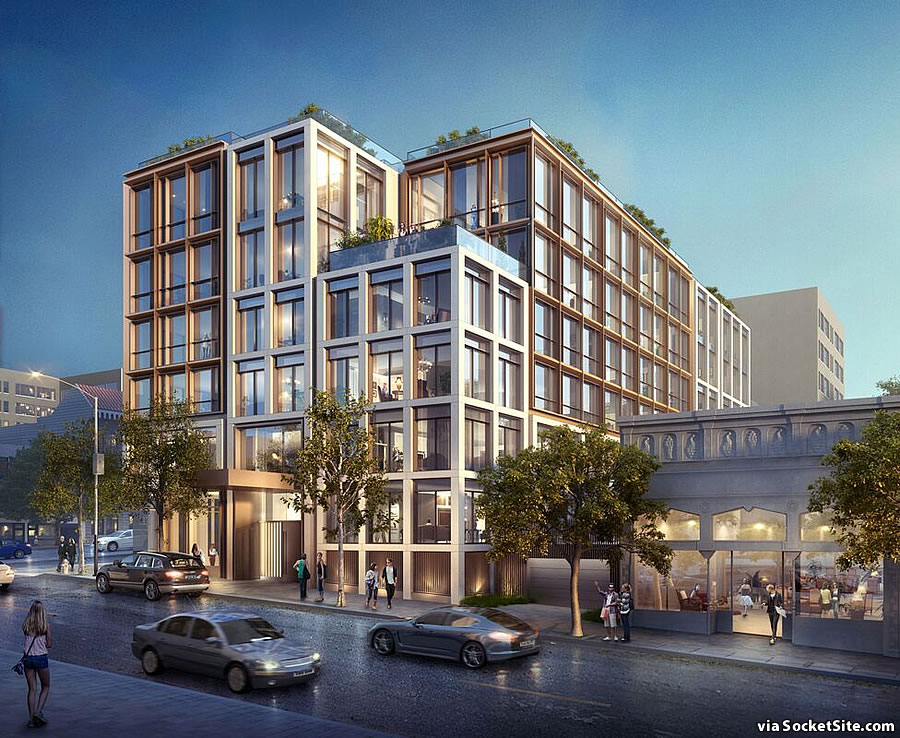
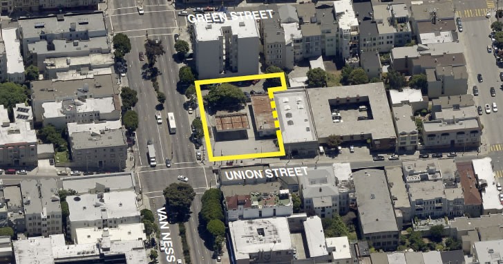
As we first reported last week, the formal application for authorization to move forward with developing a seven-story building upon the long-shuttered Chevron service station site at the corner of Van Ness and Union has been filed with Planning.
As designed by Handel Architects for DM Development, the project includes 41 condos over ground floor retail and a basement garage, with its entrance on Union, for 31 cars.
And if approved by Planning, the development of 2465 Van Ness Avenue, for which the financing has already been arranged, is slated to break ground late next year and be ready for occupancy in 2019.


Much nicer than the Amero which was built one block down on Filbert and Van Ness.
My thoughts exactly. The Amero is pitiful at best.
This one is all about details. It seems to have a nice variety of depth. But then, so did Trinity.
Detail provides more opportunity for leaks. Not always a good thing.
So do windows. And balconies. And roof decks. And. And. And.
I know, I know. I owned a townhouse (wood frame) that was “too complicated” for the skills and competence of the builder. After a few years, the leaks were pretty endemic. But, sure. You are right, of course. 🙂
Competence … very appropriate word. Hard to find a builder that can put up plumb wall these days.
Aside from details, this also looks pretty similar to the 240 Pacific proposal which is also Handel Architects.
“Aside from details”
The windows are almost exactly the same..
I think it’s that the color looks the same. The rest is pretty different.
Not really. It looks like a different wing of the same development, with only slight variations on the general theme.
Agree – looks like the took the same file and tweaked it to fit a different lot
The rendering doesn’t show it, but as of today, there’s a bus stop that would be literally right in front of that entrance. While it sounds like a great convenience factor, is there any chance that the stop is moved because of its current location versus the entrance to the building? Any city codes about something like this?
With all the traffic lights on Van Ness being optimized for BRT by the time this is built, I think they will have to rethink all the bus stops on cross streets which will have longer red light periods during rush hour. This should be a right-turn lane and the bus stop should be on the opposite corner, after the intersection.
Opposite corner after the intersection is a fairly steep hill heading up to Polk St. The buses have to slow or nearly stop there to adjust to the gradient, and there is already a bus stop at the top of that block at Polk. Moving it back to Franklin may make the most sense, but I am not an urban planner.
Don’t a lot of SF people want their buildings to look the same? That is why all those Victorians and Edwardians look pretty much the same.
Yes, that is why all the subdivisions in the suburbs only have a handful of homes that they repeat across several developments for years on end… when you build run of the mill stuff you don’t have to be unique.
This looks pretty unique to me.
UPDATE: Contemporary Cow Hollow Development Slated for Approval