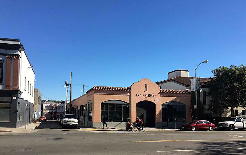
With San Francisco’s Historic Preservation Commission having cleared the way for Loren ‘Hap’ Jones’ former motorcycle shop at 235 Valencia Street to be razed, the formal plans for the site have now been submitted to Planning, as plugged-in readers have known to expect.
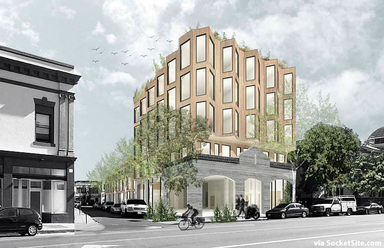
As designed by Heller Manus for DDG Partners, the proposed five-story development would yield 50 apartments, a mix of 28 studios, 2 one-bedrooms, 15 two-bedrooms and 5 three-bedrooms, over three commercial spaces and a storage room for 51 bikes on the ground floor.
And in order to “memorialize the legacy of Hap Jones,” three options for the building’s façade have been drafted.
Option A would maintain 235 Valencia’s existing façade, behind which the new building would rise, while Option B would maintain an artifact.
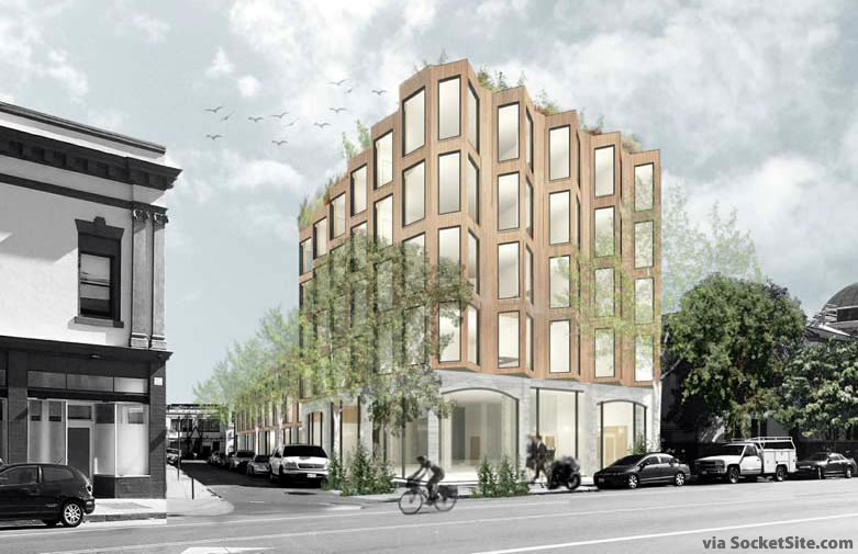
Option C would raze the existing building in its entirety.
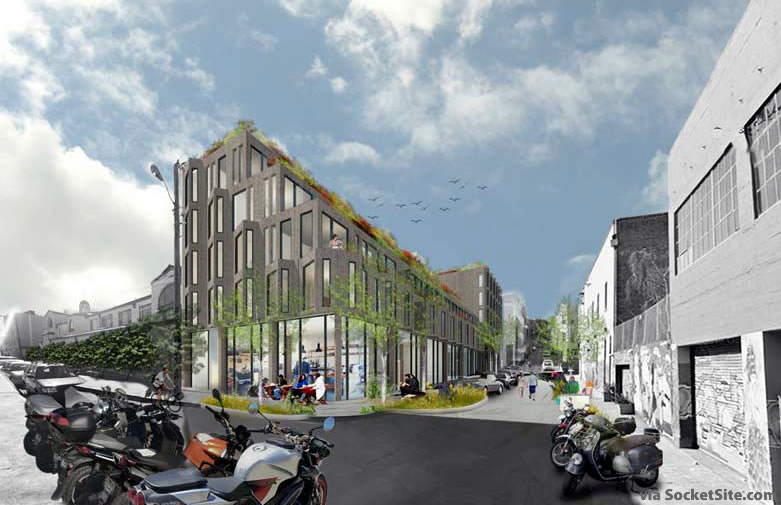
Regardless, all three schemes include a proposed “living alley” dedicated to Hap along Clinton Park, with seating and planting and a restaurant or cafe at the eastern end of the development, which steps down to Clinton to yield more sunlight, fronting Stevenson.

Wow! three swing-and-misses in one at-bat: doesn’t anyone know how design anymore? Even a simple facadectomy gets botched.
The “haunt” in the title hits a little too close to home…
When you shell out millions to fight ridiculous lawsuits from “historic preservation” committees and neighborhood busybodies, you can only end up affording the cheapest architects to design your products. This is what we are left with. SF has made its own bed in this regard.
Heller Manus is not a cheap architect. They’re just not very good designers.
A little wonky—though much better than the beige + vanilla we often get from this scale—but interesting, considered and welcome. Bring it.
What? No parking for motorcycles? What kind of a tribute is this?
If they’re going to have tribute parking for motorcycles, they should also have a loaded-up Okie Model T on display in honor of Irene “Granny Clampett” Ryan, who got her start at the Valencia Theater at this location before the motorcycle shop and church.
looks like the walls of a dungeon. i get turning the facade outwards in the alley, but along valencia? looks like spike city.
also, it’s a shame to see architects drawing windows like that on housing. it’s a lie. they will need to be escape windows with operable portions more than 24″ from the finished floor. it’s a small detail but it ends up changing the entire look of the facade. you gotta design for it.
heller manus is used to designing office towers. that’s the main problem here.
Not sure what you mean by “turning the facade outwards”. What other way can a facade turn?
Option C please… we don’t need to freeze this city in Amber. If we want to save important street scenes or quality architecture that is one thing, but not every little commercial structure and garage is worthy of preservation.
The design itself is not great, but not bad like so much of what is built here. Not to mention the living alley with shrubs a plus.
The ground floor treatment is actually good. Different. The architects had to put some attention to the base, which they often don’t do in buildings built here, because of the requirement to retain a semblance of the façade.
I think the base on the first rendering is good. An interesting juxtaposition to the upper part of the building.
Another point. The articulated front façade ameliorates the flat featureless roof in a good way. The stepped back structure on the alley is perfect. Imagine if this had been built as a solid rectangular block and then look at the alley rendering. How open and interesting it is with that stepped back feature.
Yeah I agree, not bad. Certainly compared to what gets build in this town on this scale. Let’s take our cookies and go home on this one. Plus activating that alley will be a plus for the walkability of that area of Valencia.
I love it.
I like Option A. Are those vultures gliding in the sky above the building?
and very remarkable vultures too. See how they fly in the exact same pattern when seen from the front and from the alley.
synchronized and highly symmetric vulture flocking has long been observed around Page Mill Road, but in recent times has been increasingly reported in SF FiDi/SoMa . Perhaps an adaptation to Al Gore’s invention of global warming.
“the ghost in the machine” looks like they try to keep the “presence” of the shop, vs. looking at a new re-vamp for the ground floor…. when in doubt put lots of green on the roofs…. (back to the drawing board….)
I love the design. I am excited to have this in my neighborhood.
This looks fantastic. I love the design. Goddess, Please don’t let this get sanitized by the design-by-committee that kills so many interesting designs in this our fair City.
UPDATE: Modern Mission District Project Moving Forward with New Facade