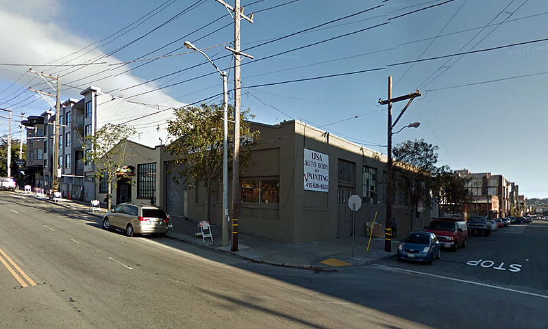
The application for a permit to demolish the two one-story auto shops on the southeast corner of 16th and Florida Streets have been submitted to the City.
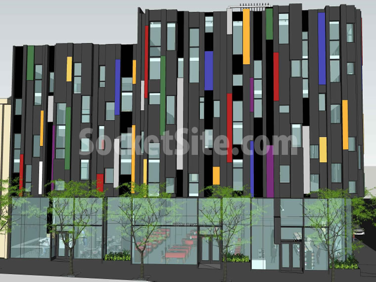
The plans for a seven-story building designed by D-Scheme Studio Architects to rise on the 2435-2445 16th Street Site have just been granted an Eastern Neighborhoods Plan-based exemption from having to complete a lengthy environmental review.
And if approved by San Francisco’s Planning Commission, the proposed Mission District development will yield 53 condos (a mix of 30 one-bedrooms, 18 two-bedrooms and 5 three-bedrooms) over three restaurant/retail spaces and a basement garage for 40 cars which would be accessed by way of Florida Street.
The preliminary plans for the parcel had proposed parking for 53 cars which was 13 more than principally permitted.


I like the design. It’s unusual and colorful, and I like the mixed-use with the restaurant at the corner.
More disappearing PDR in the NEMIZ, workspace that was supposed to be protected under the “plan.”
yeah, how do they get around that? Surprised the ground floor doesn’t have to be preserved as PDR.
great news for the neighborhood and a good looking design.
No, it’s not good news for the neighborhood at all. You have perhaps not noticed the flanks of tents along Florida, illustrating how desperately this neighborhood needs affordable housing, not more multiple-story condos. Longtime residents like myself have had it with the overcrowding that these condo developments bring
Which problem is bigger? Affordable housing or overcrowding?
SF should take after other great cities that have neither problem and also support business, like Detroit has done with Shinola.
Very nice: interesting, lively façade, retail spaces AND much needed parking.
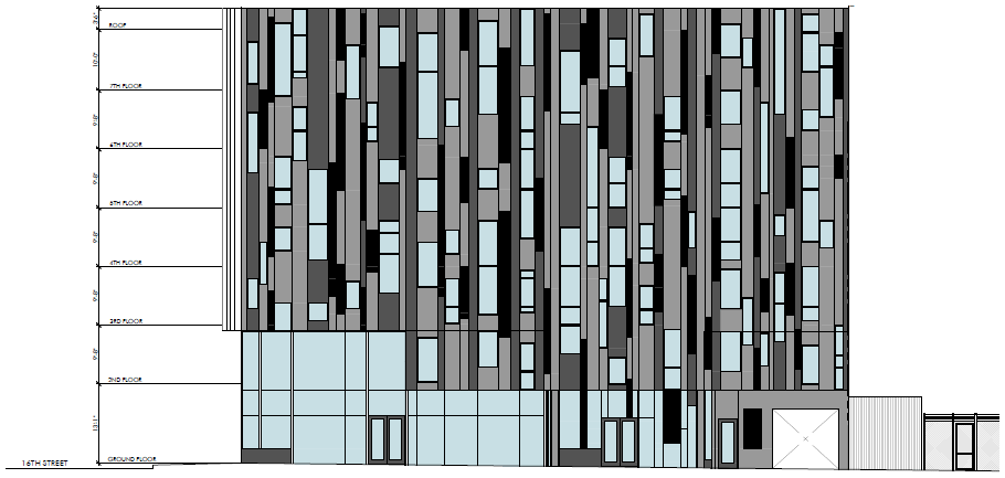
The different greys and black shown in the elevation looks a little more compelling than throwing in colors just for the sake of it. I expect planning to push back on the 1 to 1 parking.
Well, not really. I don’t think colors are just “thrown in”. You could end up saying the same thing about the greys ands blacks. I would suspect it’s just part of the design ideology of this architect and client to enliven the façade. Nothing wrong with that.
As for the parking, you do realize that parking spaces are VERY hard to find in this neighborhood, esp after 6PM. Now imagine adding 53 new housing units and inadequate parking for those owners who have a car.
Not a good idea.
You’re assuming every potential owner has a car or should have the right to a spot if they do. Assuming onsite BMRs, units offered without a spot would be more affordable. Maybe some of those spots will be offered up to the retail tenants. As for the color it looks like a Cosby sweater but hey, tastes differ.
I hate to admit it, but I kinda agree here about parking. I’d rather get vehicles off the streets and underground as much as possible to free up street parking for others. The hard reality is that cars are a necessity in the Bay Area given the pathetic transit options most people face. If the city were filled with subway lines and the region linked with 21st-century regional rail then I might make the case that 1:1 parking is ridiculous. But, that’s just not the case in SF.
They did. Parking was reduced from 53 to 40.
My sympathies to any firefighter having to adjust the aerial ladder to gain window access to this….or even a window-washer.
7 story buildings = this area is changing and I dont think for the better
perhaps slightly scaled back is better
Where do you expect housing to be built? Not everyone wants to live in a 40 story high rise in SOMA. As much as I personally dislike the design (all subjective), 7 stories is a good fit for the lot. In fact, there should be more upzoning on 16th St., especially if it ever gets BRT or transit upgrades.
Look at the buildings around it. Nothing is that high. Closer into Bart and Mission St I see the height and as the buildings head to Bryant they get a bit shorter. Then on the other side of Potrero, 16th gets tall again. Why make the whole of 16th a tunnel between buildings?
Just an opinion – I know we need housing (all for it as a matter of fact) just we shouldn’t plan on making all of the streets tunnels. Please build more homes – moderately priced (preferably)
I now understand what the majority of readers find as “pleasing” architecture, sadly.
At the end of the day, whatever; we need housing and 16th street is soon to become much more of a commercial thoroughfare, but this design is not setting a very high bar for architecture (albeit, aesthetic or otherwise).
For what it’s worth, this project is a visual example of the kind of fresh, modern urban architecture one often sees in progressive cities like Amsterdam and Berlin. It’s meant to be a bit quirky, edgy, not caring to be very contextual or sympathetic to past historical styles.
Is it “pleasing”? I don’t know what that means, and I’m pretty sure the architects don’t either, nor do they care. What is your idea of pleasing?
I’m not sure if you’ve actually been to Berlin or Amsterdam (recently), but this is no example of the type of projects that are going up in either of those places, let alone any progressive city in Europe.
I think I understand what you’re association is, but quirky or “edgy” falls pretty short of the contextually challenging work that’s being done abroad. This looks half-assed and crude comparatively.
“Pleasing”, on the other hand, is in reference to the frequent complaints about “ugly” or “boring” I read about 90% of the projects posted here—which of these is most fitting for this rendering, I don’t know.
Yes! This is not European, not that we need to aspire to that. But we could.
If our buildings reflects our society, we are a superficial society.
Completely agree.
Arguably, the majority of the projects that are more progressive (“European”) get watered down pretty quickly. The only one that I can think of that may have a chance of maintaining its integrity is the recent-ish Flower Mart plan.
It’s a little hard to tell from these renderings exactly what it will look like as far as materials, but I like that it looks different and more interesting from most of what is going up in SF.
Design, intriguing. Colors, bad. Hopefully it will be paint, which can later be redone, not anodized metal.
Build it, please.
Yes. Somewhere else.
Someone went through thousands of pinterest photos to find the ugliest kitchen backsplash ever, then rotated it 90 degrees.
Yes. This an amateurish design with amateur critics praising it.
Is that any different from amateur critics dismissing it? It’s all subjective regardless if you’re an award-winning architect (do we have any on this site? if so, please step forward.), a ditch digger who happens to live in a rent-controlled unit a few blocks away, or your want-to-be-informed SF citizen who has a vested interest in what gets built and where.
Design is not subjective; there is good design and not good design.
Can designers please start thinking about the renter/buyer… Let’s talk patios and balconies…Fresh air and sun is good for people
Appraisers don’t value balconies or patios. Also, there are parks.
In my experience, most balconies don’t get used except to store people’s stuff.
These patios and balconies are tiny and can barely fit a bistro tables and two chairs. Look around many of these developments with balconies. How many of them are ever used? I live out in parkside/sunset. Few people use their outdoor space.
If the facade is oriented this way, they might as well get the artist Agam to commission it. Could be much more interesting with his play on colors as you move and look across the building.
The streets are crowded, the post office is crowded, the park is crowded. The soccer field and children’s playground are at capacity. Traffic density is spurring road rage and road rudeness. Those of you who are flocking to our city to live someplace colorful, cosmopolitan and authentic are stripping it of all those qualities as the bistros, playhouses and clubs that make it unique are razed to make room for these insipid condos. Go home.
what a nice a welcoming person. pull up the drawbridge!!
They don’t get much uglier than this. You can’t even tell how many stories there are in this project by looking at the drawing. Instead of building up from a lower street corner height, they appear to be building down from it. Wonder how the Commissioners will appreciate this. They are displacing a block of PDR businesses, but, who is protecting them when there is money to be made in real estate?
Forget about crowded parks, shopping lines and transit systems. Before the citizens weigh in on how much density they want to accept, they should all experience the joys of Manhattan living, or I should say, working. Nobody can afford to live there so they commute in.
If this Manhattanization trend continues we can look forward to the full physical reality of living among the masses and being a ridiculously small fish in the ocean and an exciting life of loud buzzing motors and engines that keep the city going, sleep deprivation, the constant smell of garbage, and that New York stare right through you that comes from being afraid to talk to strangers lest they follow you.