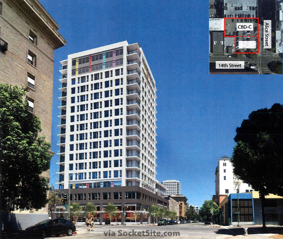
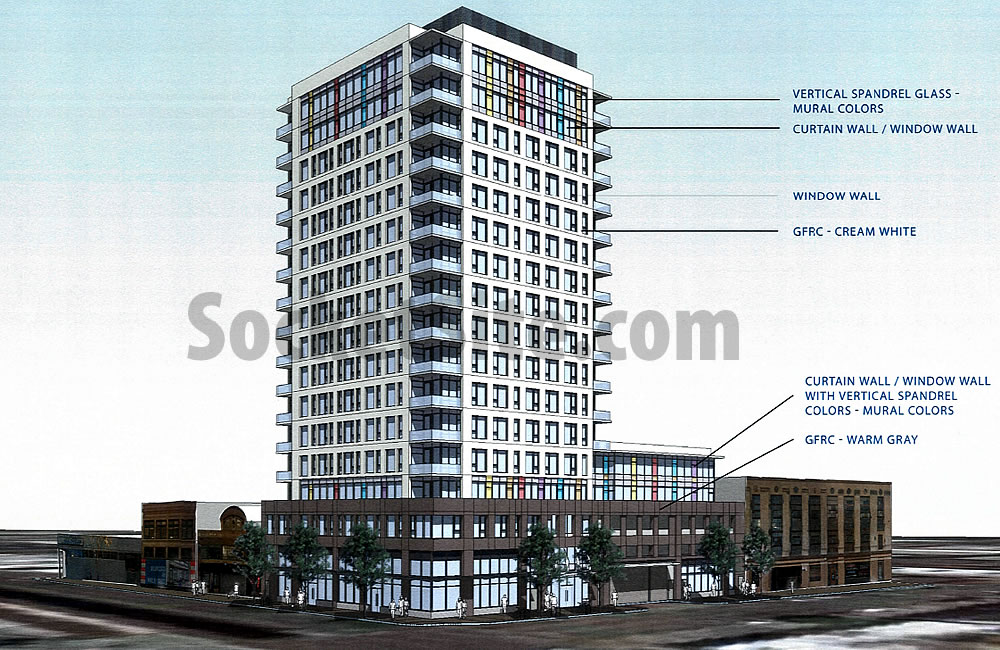
As we first reported earlier this week, the plans for a proposed 16-story Downtown Oakland tower to rise up to 175-feet in height at 250 14th Street, with 126 apartments over 3,200 square feet of retail space and a podium garage for 81 cars, are closer to reality and the development is tentatively slated to break ground by the end of the year, assuming the project is approved.
And with a refined and newly rendered design by Vancouver-based IBI Group architects, which includes a simplified tower and window pattern, recessed balconies, and a more defined base “that read better in the context with the surrounding historic buildings,” Oakland’s Planning Commission is slated to approve the Lake Merritt Station Area development this afternoon.
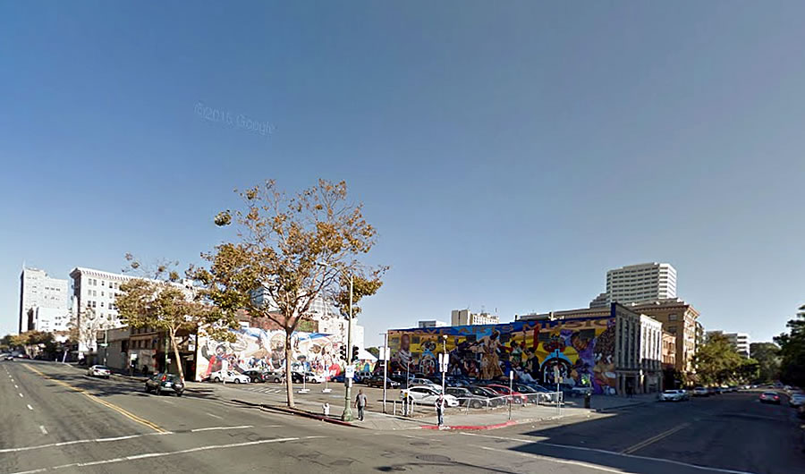
The development will result in the loss of the recently completed “Love Arts Music” mural which now adorns buildings on two sides of the project site, but in the eyes of Oakland’s Planning Department, “murals are temporary art pieces and…development should not be limited due to their presence because it could negatively impact future allowances for murals to be installed due to concerns of property owners losing their development rights.”
And while Oakland’s Planning Code requires 109 parking spaces for the 126 apartments as proposed, the City’s Planning Department is in favor of granting a permit to allow the proposed reduction in parking, as the site is within the downtown core and a few blocks from BART and numerous AC Transit lines.


I wish some of the new towers being planned in Oakland could have some drama at the top. So far everything is stubby. Come on!
The Crayola Building.
I like that name; I hope it sticks.
Better rhythm at street level, and the rendering fleshes out the tower but it’s still highrise tract housing. A nice enough background building, and if it actually happens it’ll put more people on the streets. But it’s too bad that Oakland tends to only get background buildings; our foreground is pretty vacant.
A little more creativity could leave at least one mural exposed to a retail passageway, but maybe in 50 years they’ll get revealed again and be a pleasant surprise for the future.
The content of the mural won’t stand the test of time.
We don’t get to know what stands the test of time until time has tested it; most of the late 19th century’s cheap urban dreck (looking at you, San Francisco!) is today’s irreplaceable urban treasure. In any case future tastes don’t need to find the mural’s content relevant to the future moment. It can stand (as leftovers from the past have for us) as a snapshot of a moment long past.
I fully agree with the Planning Dept stance on vacant lot murals, by the way, if only because I love cities with secrets in them.
This is exactly what the center of Oakland needs. The building looks good, not great, I will take it and twenty-teen more.
And before the complaints about the “parking podium” migrate over to this (updated) page, it should be kept in mind that the space denoted as “CBD-C” on the overhead shot formerly held a two story garage – the outline of which is still visible on the five story garage adjacent…so the feature is, in a sense, historically correct.
That doesn’t make a parking podium a good idea…
As a rule, no; and I’ve readily criticized them where they were inappropriate, but in this case – on a side street, adjacent to a parking garage – I think it does little harm… though it might benefit from the lesson it’s neighbor offers (glassing in the parking floors make them look more like a building and less like…well, parking floors).
Maybe I’ll retire over on Oakland. I like what I see
Street level is good. Mural is an eyesore & always screams “poverty is here” to me. Building is ok but very blocky – post-Brutalism.
A mural “screams poverty” to you? How lame and elitist can you get? (please don’t answer that)
To me, murals don’t scream “poverty”. They mumble “this is a declining, struggling urban neighborhood so we are going to stick a politically correct band aid on a convenient blank wall and pretend things are peachy keen.
The street level is meh. I see only three doors to the retail stuff, except I assume one of those must be the entrance to the building. The surrounding buildings often have half a dozen different storefronts in a similar-sized stretch, and it gives the streets more character. It’s also more conducive to local small businesses, while bigger retail spaces tend to attract boring national chains.
Regarding the mural, the group that operates the arts center across the street organized the mural installation with community input -just not from the actual surrounding community.
Council member Lynette Gibson McElhaney, who’s fielding a militant/nihilist backlash from her “pom-poms” support of Uber’s arrival to Oakland recently joined the fray with a council resolution to colonize/designate the area as an African American arts community. Which would be cool if not for the funny little fact it’s not presently an African American arts community.
Residents have posted flyers around the area decrying the mural and community takeover attempt. It’s nuts.
Its completely nuts. I live a few blocks from the project site. Whatever the neighborhood is, it most definitely is NOT an African American arts community. Its not even an African American community. Its the outer edge of Chinatown as it bleeds into the back-end of downtown & the Gold Coast area near the Lake.
If its the Arts Center I think it is – its the former Alice Arts Center, now called the Malonga Casquelourd Center for the Arts. The building is owned by the City and the “artist” tenants that run the center have a rather inconsistent history of even being able to pay the City rent, let alone run anything close to a modern, multidisciplinary arts center. But, as with all thing Oakland, the race politics complicates any ability to actual improve the center or demand any accountability from the center operators.
I was just at the Planning meeting. Tidbits:
1) Murals were painted months before the City sold the property. New ones might be painted at Laney College as replacements.
2) Malonga Center peeps are worried new residents will complain about noise that other surrounding older building residents have complained about.
3) Same people are concerned about parking for events despite the many surface lots in the area.
4) Nearby Chinatown entities spoke in favor of the project. Black woman in line to speak heckled that it is because Chinese people will be living there. That’s not racist right?
5) Lynn McHaleney’s new achievement of having 14th St. designated as the Black Cultural Area is a distraction from all the back room deals and lining of her pockets since she got in office. Truth!
The deisgn is not ugly, it’s just kind of clunky and sleepy. It doens’t reflect any of the postive energy and aspirtations that Oakland has.
Get rid of the parking podium…it’s a totally outdated and harmful idea no matter what perspective you examine it from (urban deisgn, sustainability, housing affordability etc.).
The podium should so beautiful and functional that someone walking on the street barely notices the tower. Or stated another way the first four stories of that building must add to the vitality, interest and livability of the neighboorhood.
And can we please get more set back for the tower sitting on the podium. Oakland has nice warm weather it would be a tradgedy to block out the sun on the street level.
Passed 6-0.
there is now a petition filed for the appeal of this project.
Development models for San Francisco are not one-size-fits-all applicable to the rest of the Bay Area.
Oakland isn’t some sort of colonial extension of SF – some mentally deficient step child that needs to be told what to do and how to plan – Oakland is its own city. If parking podiums fit their local market – if the developer expects they will sell -then they should build it.
UPDATE: Oakland Development Has Now Shed 29 Stories as Proposed