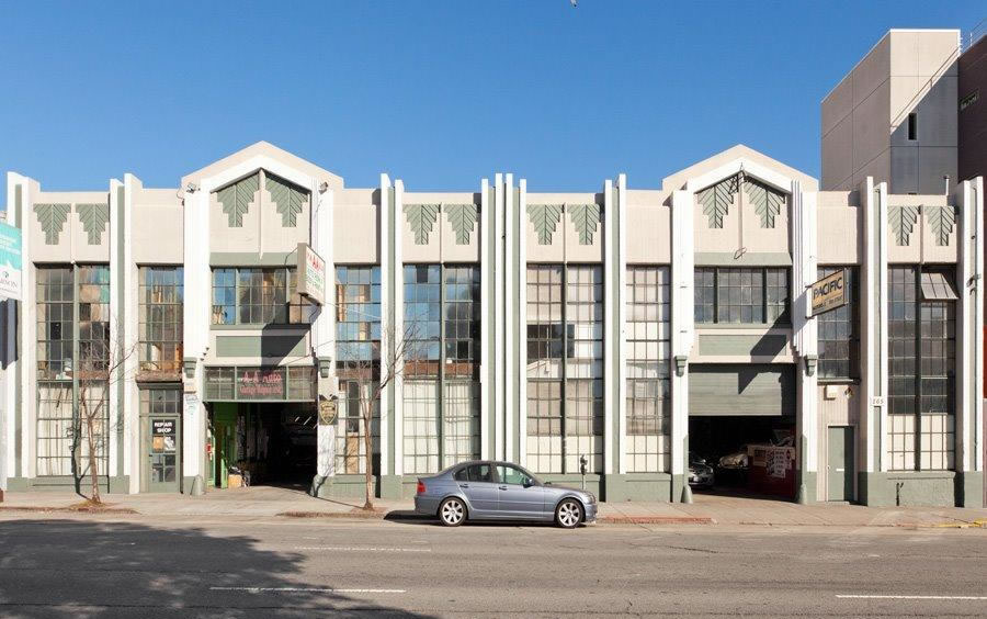
Plans to raze the Art Deco warehouse and body shop at 255-265 10th Street and build 50 residential units over parking for 50 cars and 1,000 square feet of new retail space upon the SoMa parcel which is zoned for development up to 55-feet in height were floated nine years ago but subsequently abandoned.
In 2011, a historic resource survey of the South of Market Area deemed the building, which was built in 1932, a potential historic resource, both individually and as a contributor to the Western SOMA Light Industrial and Residential Historic District.
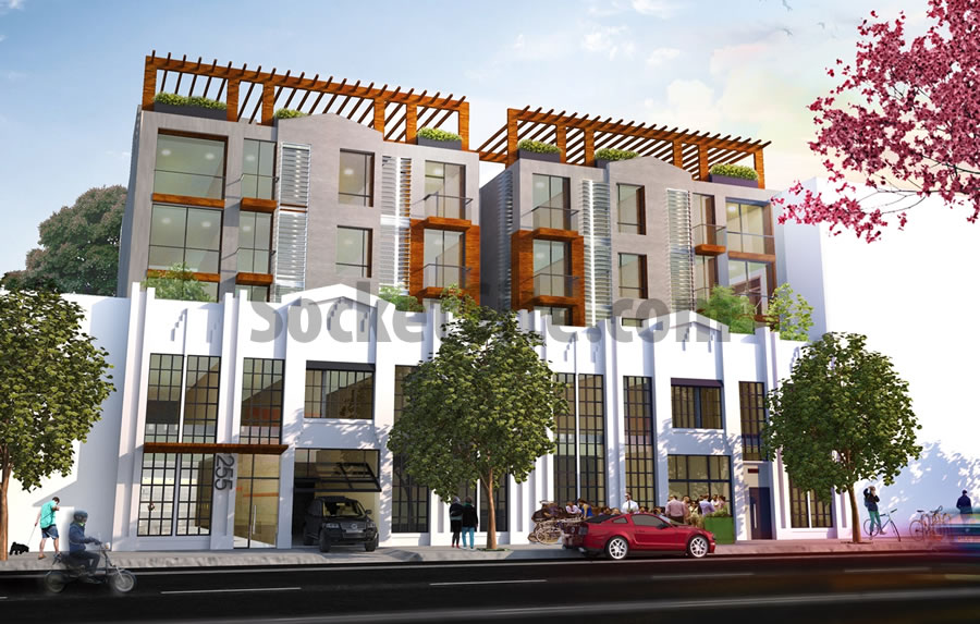
And as such, while the parcel is now on the market as a “Prime SoMa Development Site” for $6.95 million, the renderings include the existing building’s façade and the marketing materials tout “a potential mixed use development with 36-40 units plus parking and retail.”
The building is currently rented for $11,000 per month and is two blocks from Twitter, which is currently trading within pennies of an all-time low, having dropped 40 percent over the past three months with shares currently trading at $17.92, 30 percent below the $26 price at which the company went public in 2013.
Twitter has directly accounted for around 5 percent of the job growth in San Francisco over the past two years.


A lovely Art Deco building that I am very familiar with. Hope it keeps it’s facade when the property is developed.
Gotta love possibly potential contributing historic resource districts.
Actually, a pretty well designed solution above that respects and keeps the existing façade. I like it.
it’s mocking the old facade, cheapening it. I like that they keep the old but the new should not copy the old.
Quoting the existing facade’s roofline is a nice touch. The trellis on top, though, gives it an arts & crafts feeling which clashes with the art deco references.
I don’t like the trellis either– the scale feels completely off.
Of course you like it. It’s cheap and tacky.
In Washington they step back the new building so that it does not detract from the beautiful old one. Done that way, it really looks good.
This new façade is also stepped back from the original front.
A better question is why can’t the new building be beautiful?
Completely agree with Sub and Defu, and disagree with Futurist: the new portion is not “pretty well designed” — on the contrary, its more of a cartoonish/mocking pastiche. And, mh: that new portion is indeed set back, but that alone is not enough to make a strong design that sets up good dialogue between old and new architecture (which this proposal is sorely lacking)…
While I think the SS armchair architects are often too harsh on many designs that come through here, in this case I agree. This addition to the original Art Deco bldg is hella ugly. Fire that architect and start again from scratch.
This is a couple of blocks from my apartment. I think this design is admirable for echoing the original (which I hope would not end up being painted white), but what are the chances the buyer would keep it?
And again, Planning Department, please double the height limit.
Let them increase the set-back and reward them with a few more floors.
Trellis top sucks and the roofline could use refinement. Otherwise pretty good considering the alternative.
Keep the facade, rip up the western soma plan, and make this new construction 15+ floors
Keep the facade, let them build something NICE on top
If I remember correctly, the open bay on the photo’s left used to be where I took my car to be serviced by an Italian mechanic. FixItAgainTony. I even sold the car and the mechanic purchased it.
A lot going on there.
Looks like the intention is to retain the “facade” while stripping out the Art Deco details! Who approves this kind of stupidity?
It’s still there, if you look closely. The rendering has it all painted white, making the chevrons hard to see.
I hope that’s not their intent.
I suspect originally when the building was built, it was all ONE color on the façade, which is clean and classy. And I like how they are not overplaying the chevrons with color, but rather just with changing light and shadow.
Good solution.
I was sloppy. I meant I hope it’s not their intent to diminish the chevrons as they appear in the rendering — they could plaster over the “veins” in the leaf pattern for instance.
I’m all for chiaroscuro and all-white treatments.
Better than knocking it down entirely, I guess?
Even the Ferry Building revamp has critics for good reason.
I’m not sure why Twitter and their stocks are mentioned. Hard to blame them alone. The area was already planned for Disneyfying and old theaters nearby were boarded up for years.
This citizen has hopelessly conflicted thoughts about these Frankenstructures. On the one hand I despise the trepidation around knocking old buildings down; the grasping nostalgia, the futile resistance to change, and attempt to entrench an economic position .On the other hand, there’s the appalling attention to detail, lack of craftsmanship, and humorlessness of much of most developments. I say we assemble committees of young children and senior citizens to design several proposals and then randomly pick one. Unabashed creativity allied with wisdom .
I like them, but I think they should be as disparate as possible. Brick above, or Saitowitz, or Mansard. I don’t care. I think the way the new addition’s roofline “quotes” the roofline below is a lazy joke.
Is that a chopped down Lambretta on 10th Street?
“saving the facade” is the equivalent of murdering someone and cutting their face off, wearing it as a mask and telling people they’re still alive.
UPDATE: The listing for 255-265 10th Street has been withdrawn from the MLS without a reported sale.