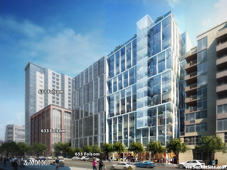
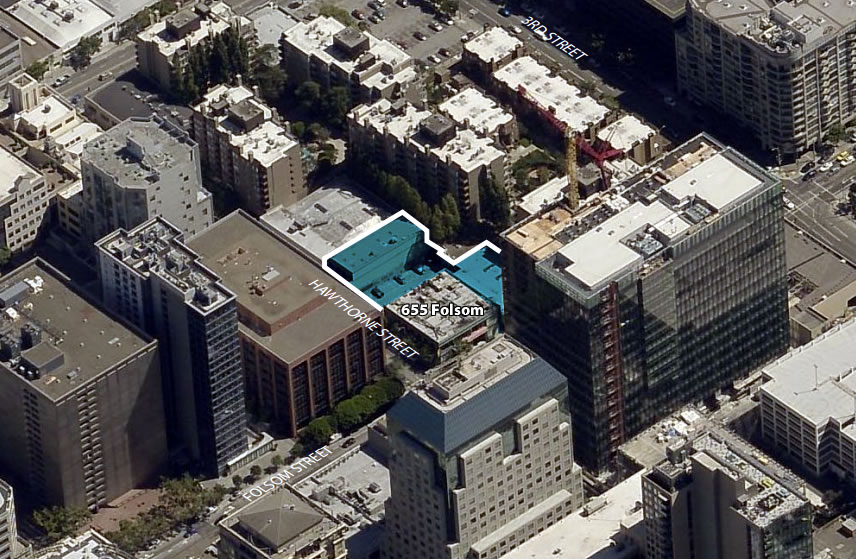
With plans to raise the roof on the corner building at 633 Folsom in the works, a plugged-in reader delivers a rendering for the proposed 240-unit building to rise up to 13 stories at 667 Folsom.
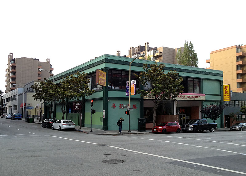
The 667 Folsom Street project, which is being designed by Handel Architects for Equity Residential, would rise up to 13 stories at 120-126 Hawthorne Street as well, wrapping around the corner parcel at 655 Folsom upon which the two-story Canton Seafood & Dim sum restaurant currently sits but for which an application to build another 13-story building has been submitted to Planning and for which a placeholder building was rendered above.


This item prompted me to take a Google Maps “walk” around the general neighborhood. I was struck at how under utilized (parking lots at the NE and SW corners) is the key intersection of 3rd/Harrison. It seems there should be residential “towers” of at least a dozen stories at each. Anyone know what the zoning height of the SOMA Plan is for them?
[Editor’s Note: Up to 200-feet in height on the NE corner (130-feet on the SW).]
Central SoMa plan (including heights in the area) are still under planning. Hopefully we see a rise to minimum 200 feet in the area.
Yeah, and how about that waste-of-space parking lot on 2nd at Dow Sreet. Doh!
[Editor’s Note: Wait for it…Preparing for San Francisco’s Central SoMa Plan and More Height.]
Thanks. Seems about fitting.
There are ambitious plans proposed by a somewhat stealthy developer up Harrison to the east which would complement such zoning.
[Editor’s Note: Planning for Central SoMa’s Upzoning and Then Some (Take Two).]
i will miss the dim sum.
If you think Canton House had good dim sum, you’ve never had good dim sum.
the Dim Sum is good, but won’t miss that interior! i like the transparency of all the glass. i’m wondering how such passes though, doesn’t new construction have to submit potential heat/energy-consumption calculations? it’s all double or triple pane i presume? curious how that works.
oh look. a staggered window pattern
I like it. varied and interesting. What problem do you have with that particular expression?
What are the chances it will end up like the rendering.
yes; not that it is bad in and of itself, but many of us are rather ready for something new. The staggered window pattern and the stacked boxes are the order of the day for wall design, and it is already becoming very dated
Glad to see that building go.
Glad to read that the one on the left is only a “placeholder”.
UPDATE: Newly Rendered, Closer to Reality and Ready for its Public Hearing