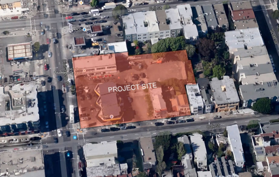
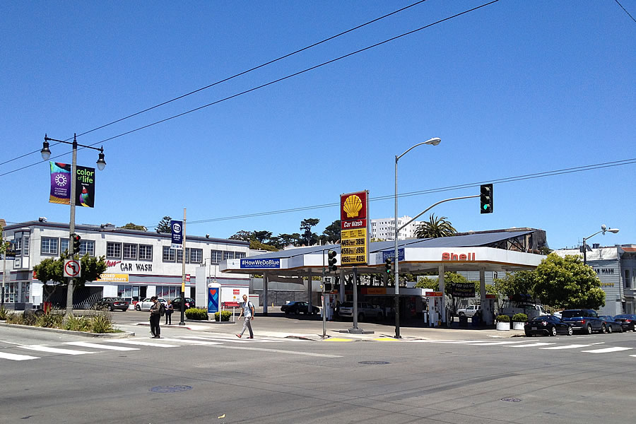
As we reported earlier this year, plans to demolish the Divsadero Touchless Carwash and Shell gas station on the northeast corner of Divsadero and Oak are in the works and designs for a six-story building with over 150 residential units and nearly 8,000 square feet of retail space have been drafted.
And we now have the early renderings and details for the project.
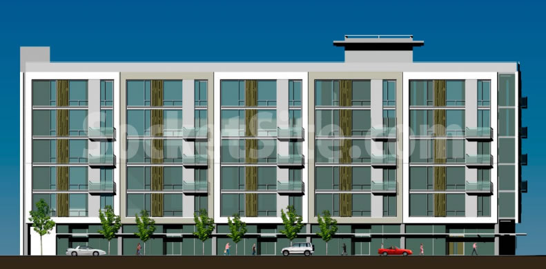
As proposed by the Genesis Real Estate Group and designed by Solomon Cordwell Buenz, the 400 Divisadero project includes 152 rental units, half of which would be one-bedrooms averaging 560 square feet, 40 percent two-bedrooms averaging 700 square feet, and the rest 400-square-foot studios.
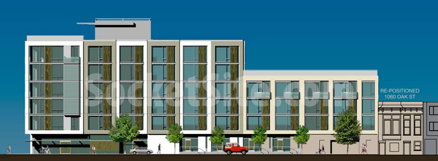
The development’s two retail spaces would front Divisadero, with the building’s lobby on the corner, with a leasing office, four walk-up units, and the garage entrance for 60 cars and 131 bikes along Oak.
The proposed project includes razing the existing residential buildings at 1048-1052 Oak and moving the two-story Victorian at 1060 Oak Street fifty feet to the east in order to provide more room for the development.
A 4,000-square-foot courtyard behind the building, 8,400 square feet of terrace on the second floor, and a 3,800-square-foot roof deck would provide open space for residents and a buffer for neighbors behind.


A truly beautiful building. I am in awe.
I’d like it a bit more if the design worked to break the massing up. It’d also be fantastic if someone attempted to build an actual set of “walk-up style” units—connected or otherwise—which would create a nice transition into the smaller scale residential structures, continuing down Oak.
A better peek materials and refinements to first pass design will help a ton.
Regardless, it’s great to see this project inching along.
Who will wash our cars?
A state-of-the-art carwash is being built on Bayshore next door to Lowes.
What is the state of the car washing art?
What’s a car?
Why do bland Mission Bay in NOPA? Snore. If you want to go modern, then do it right.
What is this?
“right” – yeah, economics has nothing to do with it after all. square footage=dollars. thus we all get boxes, whether six stories or sixty. more curves! more arbitrary angles! another saitowitz mausoleum built by sh*tty bay area contractors please! meh – its bland, but i’ll take it
This is a unbelievably bad design. I think it would be a struggle to make this anymore bland – the wood stripes are a stroke of genius – why are other architects even trying when all you need to do is add a wood stripe. A great step forward in the placeless-ness of our current sf architecture.
if you are going to destroy whats there and use that valuable land, then at least build it tall enough to make a housing dent in the are. 150 units is tiny and its very short and squat, a very suburban type condo
It’s next to 2 story flats. Be realistic
we should have a few russian hill towers sprinkled around the city. 10-20 stories never killed anyone.
I’m generally in favor of building any housing and up-zoning, but the detailing is out of scale with the neighborhood. There’s a way to keep the same building size, but break the fenestration and detail down into a finer grain that matches the neighborhood context – while being modern at the same time. Many of the newer buildings on Gough in Hayes Valley have accomplished this.
Jeez, can’t architects come up with anything original than these boring, uninspired, cookie-cutter, variations of the same monstrosity? Same as it ever was.
Architects do come up w/ ideas (some architects are truly amazing, others are terrible), but the Planning Department staff have a design guide book that they insist you follow if you want the project built.
Want to risk a project not getting approved? Hell no! To get anything built in SF unless you have your craft down a la Anne Fougeron (excellent work), the developers & architects just follow what planning wants to get the thing through. This City take 10 times longer than anywhere else.
Zoli, here is my answer to your question. Everybody here ein SF has to be an armchair designer. This is exactly what one of the main problems is with regards to SF architecture. For those who have traveled abroad and wondered why some of the fantastic architecture that other countries enjoy can’t be found here in SF ……. the answer is local armchair designers – they abound here on SocketSite – they can be found sitting on the Planning Commision – they can be found on most any neighborhood group – they can be found next door to you and will spring to action the moment you let them know you want to put an addition on your house -So Zoli, architects abroad enjoy the freedom to be artists while architects who design for SF are from the outset resigned to simply punting an initial bland design idea then waiting for all of the local “experts” to collectively bicker about design, scale and mass before agreeing to settle upon something nobody likes but that everyone is willing to tolerate. Such a shame.
Don’t you love SF? Is it boxy and bland? Yup, got to maximize square footage and get it approved. Is it simultaneously too big and too small? Yup, developers are going to build out to the largest zoned space as possible, yet this project still wont be enough supply to make any difference in housing costs.
Personally, I wish the current zoning process could allow greater flexibility in height, massing, and sizing so that architects could actually do interesting things in the city.
On this specific spot, I would enjoy seeing a slender 12-15 story tower set back far in the center of the block. Have the height along the street-level be 3-4 floors. You would have about the same square footage, but the building would be less-bulky and there could be some neat roof top terraces. But, SHADOWS OMG THE HORROR WE ARE ALL GOING TO DIE!
Change is inevitable. However, a change like that would destroy the character of this neighborhood. Towers in this area don’t fit. Yes, we need more housing in SF, but one can have density without turning San Francisco into Hong Kong. Paris, and Rome, and numerous other European cities are also very dense, without having random towers throughout the city. There is a place for towers and a neighborhood for towers. This is not the place.
Yes NOPA – and this is exactly what’s happening at 5th and Howard right now and we need more of this kind of flexibility that considers the multiple moving parts and complexities associated with projects – but look out at 5th and Howard, because just as the developers asked for height variances to offset the providing of street level pedestrian space, a tenant group is now pushing to keep the street level space but also build only the max height allowable without a variance……
It will be nice when the last gas station in San Francisco closes for good.
2035?
Yes, because gas stations are evil and gas stations are a means of contributing to the inefficiencies of getting from point A to point B, correct? Don’t forget to wear your helmet when cruising through all of those stops signs on your bicycle.
Why do all the new condo buildings look like rectangular boxes with glass windows. Are there no creative architects in the world do something unusual? And NOPA is a great place to start.
this is not NOPA. This is east of the Panhandle, EAPA
No on-site affordable housing, roof top open space, and the demolition of existing housing that is probably rent controlled. San Francisco should demand a better project — and no demolition of rent controlled housing. Once you lose one unit of rent control, you never get it back, and any “affordable” that gets built is likely more expensive and smaller.
Really? So what. Check your math on how many units are being added to the total housing stock. More supply of housing equals lower rents in the long run.
UPDATE: Major NoPa Development Redesigned, Plans Formalized