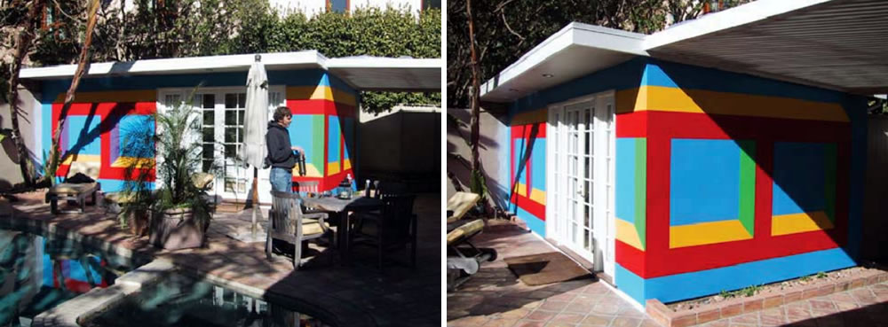
Originally conceived and drawn on a pool house in Los Angeles thirteen years ago, Wall Drawing #1012 by artist Sol Lewitt will be adapted and installed at the corner of 10th and Jessie Streets to fulfill the 1% for Public Art requirement for the new fifteen-story building at 1400 Mission Street.
The 190-unit building at 10th and Mission was developed by Tishman Speyer with the TNDC to fulfill Tishman’s inclusionary housing requirement (BMR) for the fully market-rate development known as LUMINA. Twenty (20) of the 190 Mid-Market condos will only be affordable for 20 years, while the other 170 units will remain available to households earning between 70 and 150 percent of the Area Median Income (AMI).
Tishman is paying $500,000 for the adaptation and installation of Wall Drawing #1012: Isometric Form, 202 which will span 66 linear feet of 1400 Mission’s facade along 10th and 27 linear feet along Jessie. An anti-graffiti coating will be applied to the piece for protection.
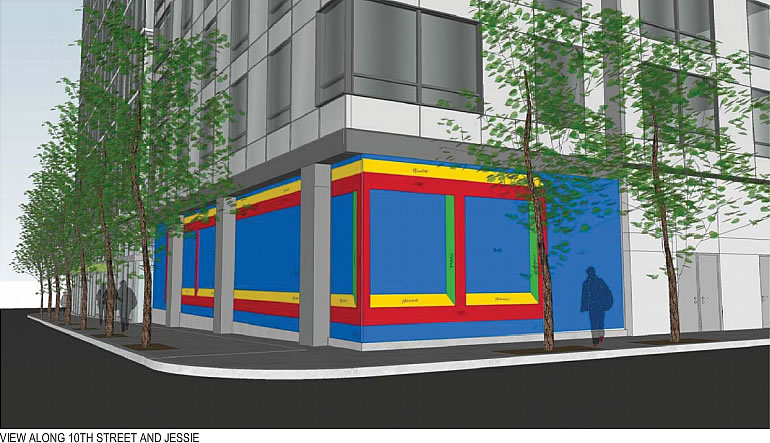
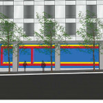
No comment about the art, but why was this building designed with a blank wall right at a corner? It seems like a waste of street presence in a dense location. If no commercial or retail then at least how about entries for ground floor residences? Or if no entries how about glazing for whatever space is on the other side of that wall?
It does strike me as a missed opportunity as well. Here is a Google street view of the proposed location, there is a concrete shear wall anchoring that corner so the structural design preempted any thoughtful consideration of the sidewalk / groundfloor experience.
You don’t know that. There may have been plenty of thoughtful consideration, with this being the best solution despite the blank wall. Or maybe you’re right; but you don’t know.
Please, every new building in San Francisco (and most of the old ones, by this point) have shear walls. Having a shear wall doesn’t mean being forced to create a brutalist pedestrian experience.
most do… but they aren’t done without “any thoughtful consideration”. You may not like where it ended up, the whole project team might not like where it ended up, but there was almost certainly thought.
Amen – that was my first thought; I don’t care how “artsy” it is, it’s ludicrous to have panel after panel of windowless wall along the sidewalk.
Not one of Lewitt’s better efforts.
Even with the anti-graffiti coating that looks like a prime blank canvas for taggers. Those coatings make it easier to get the graffiti off but there usually still a residue showing where it was removed.
There is no such thing as anti-“graffiti” coating. It is anti-“tagging” coating.
Sherwin Williams sells anti-graffiti coating by the bucket. What are you talking about?
At one window. And taggers’ paint at the next.
Hell of a business model.
Is there a difference? Can the coating itself detect a “tag” versus “graffiti” and repel one versus the other?
Unforch your average SF resident will fail to understand that this is a Sol Lewitt artwork. Conceptual art and minimalism is best left for museums and art galleries. In public spaces you often need more accessible art. Otherwise the comments will range from “its colorful” to “yeah but my 6 year old can draw that with a strait edge.” More complex and socially engaging artists could activate that space better IMO.