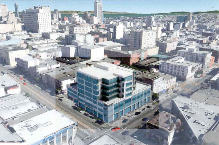
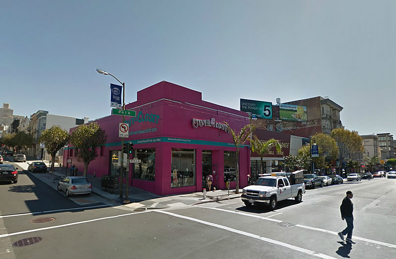
The designs for a seven-story Polk Gulch building with around 50 condos over four ground floor retail spaces to rise on the southeast corner of Polk and California are working their way through Planning. The development would result in the Polk Street Boxing Gym, Fashion Exchange and Out of The Closet Thrift Store buildings being razed.
As we noted when we first revealed the preliminary plans for the 1567 California Street project, while San Francisco’s Planning Department supports the scale of the project overall, it is pushing for more of the mass to be “shifted towards California Street as the street is wider and lined with taller buildings.”
The site is zoned for development up to 80 feet in height (as is the Crustacean site across Polk).


I live here and although I would love more height and density in my neighborhood I’m disappointed with this building. Not only is it BLAND and SHORT but it is going to totally kill the pedestrian vibe with that long sterile wall of windows.
agreed.
This building is definitely not too SHORT for that location. Totally redesign (please!) the podium component to include at least four different storefronts along each of Polk and Calif. streets; lop off the four stories above; and, add about another eight and build it SOMA.
OTOH, I’m anxiously awaiting the beautiful 12-story condo development to go up shortly a couple of blocks away uphill from the Grubstake.
Now that is a beautiful building. Work of art.
Sacasm?
That building belongs in the 70’s and on Van Ness or Harrison, not on polk. Gross.
That’s so cool the way they used the same architect that designed the current building.
It looks like an early 90’s hospital. But seriously.. can someone please tear down the Crustacean complex? It’s.. so.. hideous.
What kind of commercial space does this building have
Ah memories. I remember when it was the GAP and right next store was Buzby’s. Neighborhood is changing and not for the better IMO.
Why won’t these darn whippersnappers stay off my lawn!?!
The disappearance of a GAP as a symbol of decline?
Wow. Just wow.
I think it’s a bad rendering. The retail spaces are inapparent and that does give the impression of “long blank walls” that I think is wrong. At least I hope its wrong because Polk as it is is nothing if not a fascinating street to walk along and a building like this rendering would ruin its block. Otherwise I think it could use a finer scale of detailing for this neighborhoid because it does look institutional or too like an office building.
It looks like a really lame ice cube.
Maybe 9/10s of it are below the surface???
That is one overbearing building completely out of character with the neighborhood.
It really does look like it belongs in a suburban office park. That’s housing???
Bulky indeed.
Redesign please….but great location for a taller building.
This is going to be condos? You couldn’t pay me a million bucks to live in a 90s suburban office building, and I certainly won’t be paying a million myself to live there. Ew
I’ll take 20 more Out of the Closets on that corner before I give this POS my seal of approval.
What is with this city and building heights? Ugh. The only way to solve our housing problem is to go UP.
This is an outdated massing model. It’s not even close on the design. The current design is far more elegant and contextually responsive. This image they published must be a year old at least.
UPDATE: Polk Street Rising: The Refined Plans for a Prominent Corner Parcel