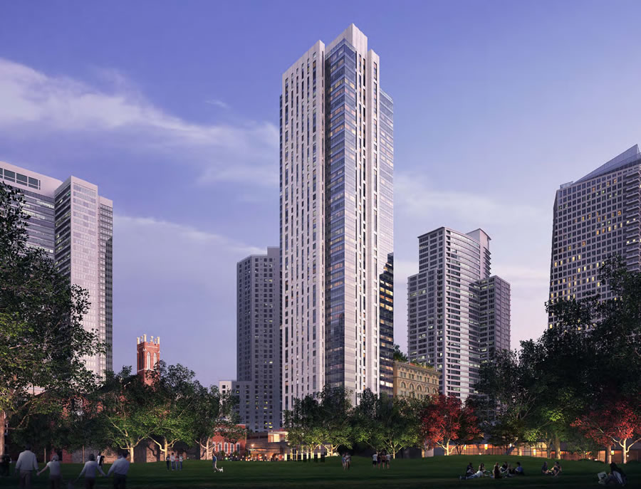
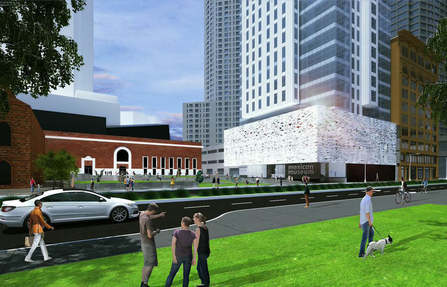
Despite a couple of lingering lawsuits over the tower’s height and design, Millennium Partners is preparing to break ground on their 706 Mission Street tower project this summer and plan for it to rise a full 510-feet, with San Francisco’s new Mexican Museum designed by Ten Arquitectos at its base.

From the Chronicle’s report:
“We have completed design drawings and released them to the general contractor,” [Millennium Partners Vice President Sean Jeffries] said. “We think we can start in July. We can’t be certain of when the court decision is going to come down so we are going to go ahead and start construction.”
A group of neighbors in the adjacent Four Seasons, an earlier Millennium development, are suing to limit the tower to 351 feet in height, an effort which so far has been rejected by the courts but is on appeal.
Designed by Handel Architects, the 190 condos in the tower will average 2,700 square feet apiece and sales are expected to commence in 2017.
Another wasted opportunity at a unique/interesting building. Shame.
it looks kind of meh, but i trust Handel
I’m just curious, I think this tower is just ok, but what counts as a great design? I only see people on here complaining about these towers, I know people like to complain, but what is the standard of excellence here?
Standard of excellence/great design? How about something like this.
Which of course doesn’t make sense for a residential tower.
And it doesn’t make sense because why?
That thing you posted is flamboyant, but does that make it better?
Yes, it makes it better, at least visually more interesting. I don’t expect everyone (or anyone) to agree with me. Just sayin’ . . .
It makes sense in Beijing.
Personally I don’t like it.
What exactly does it mean for a building to make sense?
The one thing that all people are entitled to, I concede, is their opinion.
This first twisted tower may look cool. But do you want the 50 high raises going up to all take some distinctive form?
Oh, come on. Where in any of my posts did I say “all” new buildings should look like this?
That twisty thing is so contrived…
“That twisty thing is so contrived…”
Um, yeah, it takes imagination to design/build something that’s not a box.
Hokey.
Oh goodness of all the non-box examples out there how did you end up choosing that boring thing?
It may be distinctive, but I doubt it would ever become an icon like the Transamerica building.
There are lots of people with differing opinions here. Some want every building taller. Some want every building to be a special work of art. Some want things to look brutalist (OK, not many) while others think everything should be super sleek and featureless. In other words, everybody is a critic and has their pet peeves.
Too many here don’t go as far as you have and just say “I don’t like this building just ’cause. Make it better.”
At least it will block views from the south of that godawful concrete Westin. Hate the building – it’d be a sore thumb in Omaha, let along S.F.
Even more so the Park Central Hotel (formerly the ANA and Argent) on Third. My nomination for ugliest building Downtown.
think you two are talking about the same building?
I think the design is reminiscent of the Embarcaderos while blending with the styles of the St. Regis and Paramount without directly competing for attention. It’s demure. This is very appropriate and I’m glad they’re pushing through with the height. Four Seasons be damned.
But that’s how we get stuck with the same, same, same, matchy-matchy blandness of boxy structures, one after another, when styles have to blend with existing structures. Why is the Transamerica building so iconic? Because it’s the ONLY one like it.
And as soon as someone “requires” weirdness for the sake of weirdness, the weird forms themselves become banal and trite..A city is not an architetcural theme park. People build “boxes” because they WORK.
And buildings that aren’t boxes don’t work because why? No one ever said it’s a “requirement to be weird.” Those are your words. Just throwing a few unique buildings into the mix does not make an entire city “banal and trite.” It just makes it more interesting to look at.
Actually I’m glad it isn’t unique. It’s sitting directly next to my favorite building in the whole city, St. Regis. I would feel a little threatened if this new tower were to try to be the next up and coming star of SoMA. Let it blend, and St. Regis can retain its splendor as the most unique tower in this section. Not opposed.
I agree, I like it. Vancouver’s become a city of glass towers; maybe we can become a city of white towers… that would completely jibe with the City’s historic feel, and appearance from afar. Look at the City from the Headlands, for instance, and it’s mostly a beautiful white… except that g.d. Bank of America building in all its maroon/brown mediocrity.
Looks like s fairly handsome building to me
Agree. Awful looking square block.
Is this the most recent rendering of the Mexican Museum? I remember a different one with a less “random” facade… more vertical slabs.
[Editor’s Note: The original design, as linked above.]
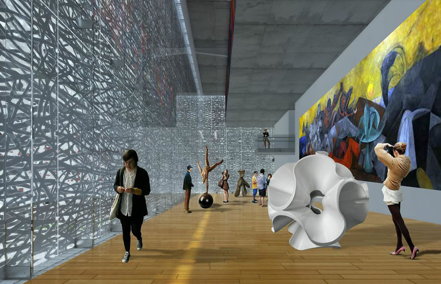
I much prefer the original, at least from the exterior. (I like the lattice and its play on the light in the renderings of the interior.)
Agree– the rendering in this post makes the museum look super dense/heavy, and the facade treatment feels tacked on. Just my opinion though.
The original base is much more attractive and inviting than the current block of whatever that is. I mean that’s already been done a few blocks over right? Not cute.
It’s also similar to the metal scrim that’s planned for the Transbay Terminal.
Another vote for the original design — base and tower.
A very classy tower. Great soaring height. I approve.
rich entitled a-holes thinking they own the f’ing views. I think it’s great that the builder will proceed. To the [people] who tried to block it…SUCKERS!!!!!
is there any irony in the fact that the inhabitants’ of a handel design are suing to stop another one?
Looks great!