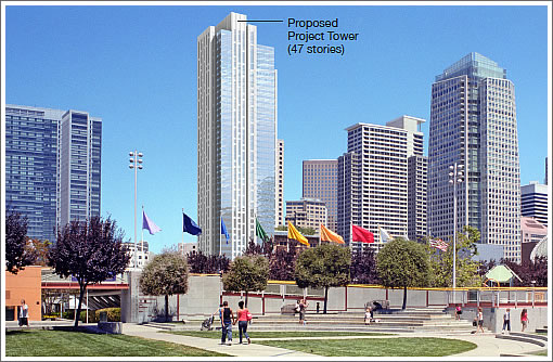
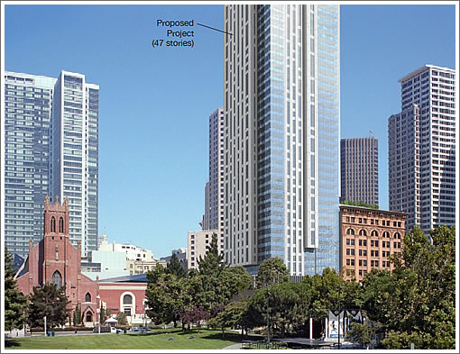
As plugged-in people know, the proposed 550-foot tower to rise at 706 Mission Street would house the Mexican Museum on floors one to four with 43 floors of residential above.
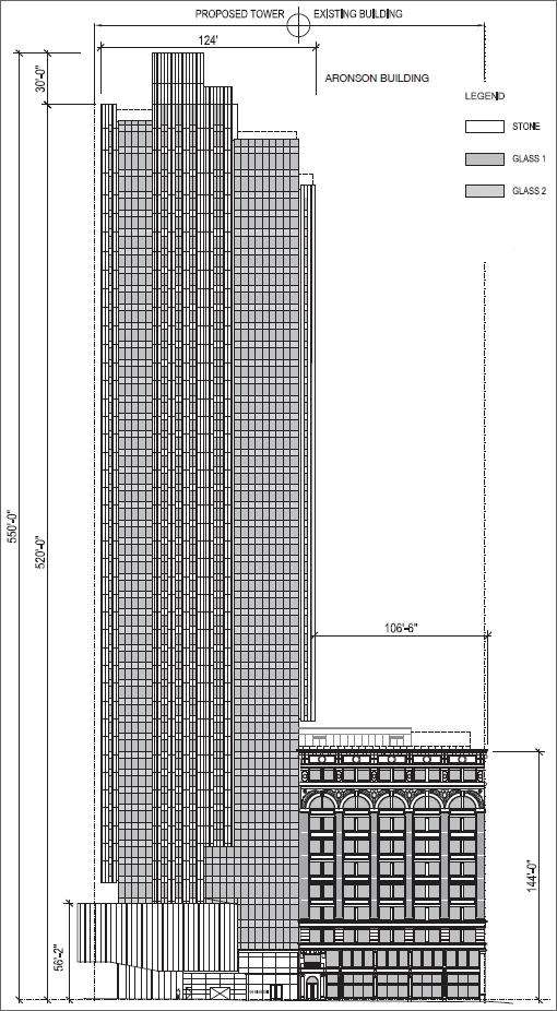
The base of the building would cantilever slightly over Jessie Square at the third and fourth floors and employ a glazed aluminum curtain wall system “articulated with vision, masonry, metal, and/or spandrel panel façade elements.”
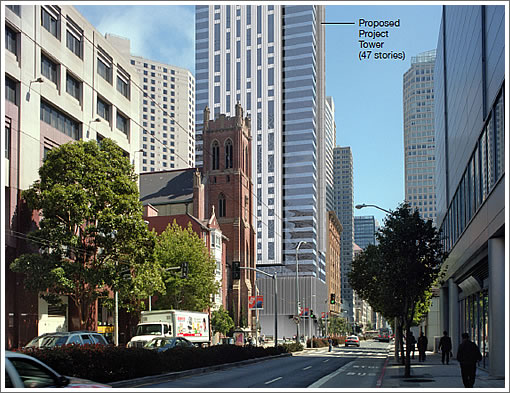
Plans for the adjacent historic Aronson Building call for new retail and restaurant space on the ground floor with museum space on the second and third floors and either residential or office space on floors four though ten.
With respect to parking, the existing Jessie Square Garage would be converted from publicly to privately-owned to provide parking for the project with 260 spaces for tower residents and 210 spaces on the upper two levels remaining available to the public.
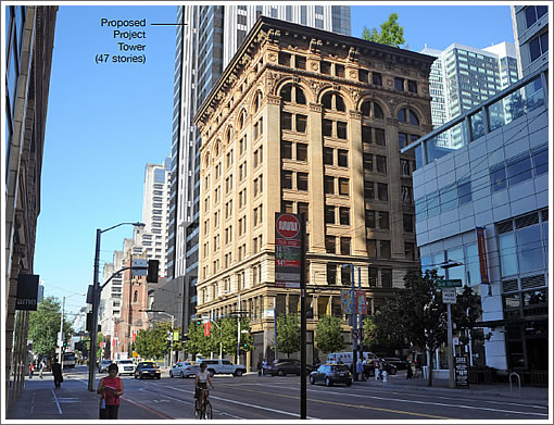
Currently zoned for 400-feet, the project will require a zoning map amendment to see its full potential versus being cut short. Assuming an amendment, a determination that new shadows cast on Union Square are not adverse will be required as well.
The shadow calculations prepared for the proposed project indicate that it would cast net new shadow on Union Square during the morning hours from early October through early November and from early February through early March. The proposed project would not cast net new shadow on Union Square after 9:30 AM on any day during the year.
On an annual basis, the proposed project would cast 337,744 sfh of net new shadow on Union Square, which would be an increase of about 0.22 percent relative to the existing annual shadow on the park. This amount of net new shadow would exceed the remaining shadow budget of 323,123 sfh of shadow that could be cast on Union Square by proposed future development projects.
Assuming amendments and approvals this year, construction of the proposed project would take 36 months, cost an estimated $170 million, and ready for occupancy in late 2015 or 2016. As always, we’ll keep you posted and plugged-in.
∙ Sneak Peek: 706 Mission Tower Design And Aronson Building Rehab [SocketSite]
∙ Sue Hestor Seeks To Stop Transit Center Tower Development Short [SocketSite]
Boooorrrring design. So typical for SF. Extremely frustrating. A city full of eclectic people . . . but full of ho-hum architecture. 🙁
Love it, but seems unlikely to survive the political gauntlet. Shades Union Square? Taller than currently allowed? Etc, etc.
Wow, no additional parking added. So much to love on this one. Design is a little meh, but the immediate area is swimming in nice buildings, IMO it’s fine to add some boring ones to make those stand out a bit more.
I like it… nice horizontal and vertical lines with a more unique “crown” plus the rehab of the Aronson building!
This Union Square shadow allowance thing is crazy.
This shadow ordinance thing is RIDICULOUS.
How many hours of fog does it take to increase shadow .22 %
Like it. The “shadow budget” is ridiculous.
Like the building proposal (agree that the design is boring). Hate the shadow allowance thing. Is 0.22% going to really make THAT much of difference in the Union Square area??
What exactly about this design makes for so many “like” or “love” posts? I cannot think of a more backward looking tower design! As was mentioned above, a city with eclectic people sure has a BORING skyline. I am all for as much new growth as possible, but can’t we at least hope for better design?
@astonished:
When the process is set up so that a SINGLE person in a city of 800+k people can halt a development then no we cannot have better design.
@astonished – most buildings in every city are boring. No reason for all to be some masterpiece. This will get lost in the skyline and won’t standout anyway, so I’m totally fine with it being boring and utilitarian.
I suspect the renderings aren’t doing this justice. The stone areas should create a really nice contrast with the windows when the light is hitting it right. The staggered windows are also a nice nod to the smaller residential unit style popping up all over the city. Overall, very classy.
No reason for all to be some masterpiece.
Not asking for all to be a masterpiece. Just one; we don’t even have that. Except for the Transamerica building, which I think the most “interesting” building in the city. There is certainly room (and opportunity now, since they’re brand-new buildings) in the city for several more new buildings to have more visual/architectural appeal/interest.
interesting = stands out = won’t get built = modified = blends in = boring = built = success!
It reminds me of a freshly opened pack of cigarettes, from back in the day.
With creativity and originality like this there’s no stopping San Francisco from becoming as visually striking or memorable as Vancouver. Oh? nothing comes to mind? Sorry, eh.
I don’t think it’s that bad. They have broken up the bulk of the building with contrasting design elements, so, in the first photo, you have a building with about the same bulk as the building on the far right, but instead it evokes a look similar to the slender silhouette of the Embarcadero Center buildings, which you can see clearly in the first photo.
It doesn’t really seem to matter anyway. The finished building always seems to be vastly different from the renderings.
What’s sort of bizarre is how it hangs over the Aronson building (shown in the drawing in the second photo).
It is impossible for this not to cast a lot of on Yerba Buena garden.
are Legorreta still the architects for this project?
“It is impossible for this not to cast a lot of on Yerba Buena garden.”
Being that the building will be directly north of the park, I doubt it will be casting a whole lot of shadows.
Quite frankly, I find it tiring that so many comments hide behind the singular word “boring”. It seems to be the most simplistic and typical comment one hears over and over again here. It says nothing about WHY you feel a building is boring..or not.
Actually, I don’t really know what “boring” means.
Don’t forget, these are just the initial digital renderings of a proposed high rise. From what I can see, at the point, the building is strongly articulated in the vertical mode, with a varied skin that offers change from different angles. I see an expression of tall vertical bands, in white material, with varying horizontal bands of a random pattern, that sharply contrast with a horizontally expressed glass curtain wall.
The building plan is broken up into various blocks, which serve to reduce the bulk of a large tower, ending up with a nice varied expression at the top.
I like what I see so far, and I think it’s an appropriate scale for that location. BTW, the building, being north of the Yerba Buena Gardens will not cast any shadows on the green space.
I have just one question. Where’s the affordable housing? There’s no mention of affordable housing! I’m shocked and appalled!
Boring means at first glance, second and third glance and however many more glances, the style is Boring. I like to keep it simple without all the empty, fluffy, filler stuff of a bunch of adjectives grouped together to describe a boring building, no matter which way one looks at it. Call it like it is: It’s nothing more than a boring vertical box.
ugh must be a lot of fun at parties.
Well, I’m calling like I see it, not “how it is”.
I’m sorry if you think my comments are “empty, fluffy, filler stuff”..but that’s not my intention nor my words. Since I’m an architect by profession, that’s how (many of us) architects talk. It’s not BS, it’s what I really mean to say.
I do think people here are intelligent, and probably have more to say than just “it’s boring”. Saying that is probably just easy.
Again, just my opinion and commentary. I’d like to hear others.
Regarding the boring controversy, I agree that the term is the written equivalent of a Siskel & Ebert thumbs up or down. It really says nothing aside from, “I don’t like it.”
A bored person might, if able to exercise his or her mind a bit, actually be able to articulate what it is that leaves them cold. Such a person might actually have a good reason for the opinion (though I doubt it).
As I say to my daughter, use words, don’t just point at things.
JHFC. You get this fantastic site, you hire a real Architect and a very capable and proven executive Architect who knows the building type inside and out, and THIS is the budget you give them. Come on – this is Norten and Handel saying ‘make it simple and call it a day; these guys are just not spending on this project’. Not a patently offensive design like so much other trash, but such a pity for such a highly visible site. So long as you settle for less, San Francisco, you’ll always BE less
SF will never have architectural masterpieces because masterpieces are the vision of a master, therefore unique and not to everyone’s taste. And in SF the people whose taste it isn’t to can stop it. So we end up with blandness no one hates and no one really likes.
If we want masterpieces, we have to change the law and tolerate lots of designs we don’t like to get the one we love.
“It is impossible for this not to cast a lot of on Yerba Buena garden.”
No, it isn’t. The building is north of Yerba Buena. At this latitude the sun always casts shadows to the north sides of buildings. So it will not significantly Shade Yerba Buena. In the morning it will shade Jesse Square surely but not later in the day when people mostly use it.
ugh must be a lot of fun at parties — I actually bring the party and am the life of the part. Just because I don’t like the same thing(s) you do, does not make me boring, but . . . whatever. I don’t really care even if it does.
For those who get it, I don’t know how much more descriptive one needs to be than a “vertical box” to describe why this building looks “boring.” It’s a box. It’s a vertical box. It’s a vertical rectangle. There. Does that do it? Did I say it’s a boring vertical box yet? I guess I’m just limited in my vocabulary.
Can’t wait to see how much $$ the shadow lawyer woman makes off this building.
But Ugh, it’s not a box. It’s 6 or 8 boxes with different textures, windows, heights, etc.
Do we need to post links to images of towers going up in other cities so that some will understand why so many S.F. towers are underwhelming?
I’ll start with some of my current favorites:
http://www.urbanfile.org/blog/2012/06/shanghai-the-shanghai-tower/
http://www.urbanfile.org/blog/2012/06/chicago-aqua/
And my current favorite:
http://www.56leonardtribeca.com/#/home
RE: Astonished’s comment: The bad joke is that The Shanghai Tower was designed by a SF architect. 56 Leonard was designed by the Swiss architects of the De Young, who got pilloried for years because they dared design something different. As has oft been noted, SF has some of the best architects in the world, all of whom do their best work elsewhere. Having recently built a downtown SF building (my first and last), I can attest you start out with great aspirations and high hopes and by the time the public and the Planning Department is finished with you, you just want to get something built.
I thought the St. Regis was the Museum Tower?
The Aronson building has always been hands-down one of my favorite buildings in SF, and when I first heard of this plan I was disappointed because projects like this one always feel like parasites latching onto something that has more character than the sum total ever will. I dislike it for that reason alone. Otherwise it fits in fine with the other new towers in the vicinity. On the issue of siting I have another observation which is that right now, that block is sort of a transition between taller buildings on the blocks to either side of it. The heights taper roughly down to the square in the center (with the Jewish Museum in the back). That effect would be lost with the addition of such a tall tower. C’est la vie.
Looking at this building reminds me of why people say you shouldn’t mix plaids and stripes… cause it looks goofy.
@astonished –
lol lol lol lol lol lol lol lol
Do we need to post pictures of the other thousand buildings being built in Shanghai that look much worse than this? Or how about for Chicago? Even in perfect Chicago they do not build every building to be an utter masterpiece put together by a world renowned architect lol.
shadow budget? what is this retardedness? oh hai SF!
I don’t really have a problem with this design. It’s not great, but it’s not terribly ugly either and it’s not in a prominent enough location for me to really care.
That being said, that building in TriBeCa is fantastic. Really like it.
It really looks like an updated version of the Embarcadero Center. It is not exciting or original, but it is less dull than the EC.
On a different note, I really don’t understand how privatizing a public parking garage is considered an appropriate way of providing parking.
Yes,another bland, filler structure…What San Francisco buildings always lack is a sense of playfulness – playfulness of proportions. They’re at best handsome, like One Bush or the Embarcaderos One-Four (though the Embaraceros handle their massing quite well). “Boring” means they don’t tell you anything new about themselves every time you visit them. You might as well look at them in photographs.
For a city that thinks so well of itself as a leader in the arts, SF has realized so few even mildly interesting buildings.
It’s boring but lets build it. There are reasons why Shanghai, Dubai and other cities have amazing buildings, and I’d rarther not be in an environment of massive bank losses subsidized by the public. Pretty architecture is low on the list of priorities; we need the space for productive work.
@Robert, If massive bank losses being subsidized by the public are the cause of good architecture, then THAT would ALSO explain why some of the recent towers being built in New York and Chicago are so imaginative as well. Let’s not forget that it is the U.S. taxpayers who are still subsidizing American banks.
As was posted earlier, the recently completed Aqua Tower in Chicago (A city currently enjoying a boom in high rise rental apartment construction)
and the Tribeca Tower in New York are examples of how other American cities can still promote good design. Part of the tower review process for downtown Chicago encourages forward thinking designs and makes accomodations and exemptions possible to tower designs that attempt to be more than a box.
anon,
Sure, every once in a while you have a great building built in a regular city. That (generally, but not always) requires the owner of the building to devote a substantial portion of their funds for some aesthetic purpose. That only happens in extremely wealthy areas or in situations where firms are willing to spend a lot on ego. That is rare, and isn’t something you can demand of firms. Of course it happens in New York. New York is an enormous parasite, built on free money. That is the whole purpose of the city.
Do you really think that the massive of trophy buildings built in Dubai, Shanghai, and HK make economic sense? No, building a trophy never makes economic sense. You do it because you have money to burn, and that almost always means someone else’s money.
Now if some wealthy patron or a corporate with a lot of shareholder wealth to squander on architecture wants to build a “forward looking” trophy building in San Francisco, then I will support it. I am all for cool art. But I don’t demand cool art when merely having office space is the most pressing need at hand. I don’t require my office space to be art. And I don’t expect firms to spend a few hundred million more in order to create art. I am happy if they just create jobs.
Or, Anon, I can alternately ask you to list for me your favorite top 20 modern buildings, and then as how many of these were
1) built by the government or heavily subsidized by the government
2) built by a firm that had a government monopoly (e.g. a state-owned oil company or a hotel owned by a royal family)
3) built by a firm that had a monopoly of some form
I suspect that you will be left with one or two buildings out of the list of 20. It’s easy building a trophy with someone else’s money, and it’s easy for us kibitzers to expect someone else to build a trophy with their own money. I am happy that someone is willing to build something that is clean, up to code, and provides good quality office or residential space.
@Robert, most of my favorite buildings that have been built or are being built tend to either be in the U.S. or Europte. I happen to admire many of the residential towers in Toronto and Vancouver. As for the U.S., a weekend trip to New York or Chicago will explain how both cities are amazing not because of a couple of “trophy” buildings, but because of an overall excellent collection of well designed buildings. I went to view the Aqua Tower in Chicago , but actually fell in love with some of the detail work on the Blue Shield building down the street as well as the landscaped plaza of the Aon building and a new structure called 340 East Randolph. My point is that while visiting the Aqua, I came to admire the entire collection of buildings around it, most of which were built in the last 20 years, all of which “talked” to each other in well planned pedestrian friendly enviroment of good design.
Oh Please, Shicago is overrated. Ever seen the Elysian?
@anon
How can you use “Vancouver” and “favorite buildings” in the same post? Their skyline is much more uninspired. SF has a fantastic skyline with quite a few boring boxes but quite a few proud, masculine structures, of which Vancouver has an abundance of the former and none of the latter.
Amazingly, it seems as though different people find different buildings interesting. Amazing stuff.
Personally, I find SF’s skyline much nice than average, and don’t particularly fetishize Chicago as some other folks here seem to.
What makes Vancouver’s skyline nice is not the individual buildings, but the collection of the downtown buildings contrasting against the backdrop of the North Shore Mountains. There are a few decent residential buildings, but the majority of them are meh.
The 0.22% of new shadow is created by this building can be mitigated by strategically installing mirrors to redirect sunlight into 0.22% of existing shadow. The facade of Tiffanys or Saks would do just fine.
Vancouver’s skyline is fantastic and you can get a fairly objective sense that is widely considered the case by just examining the premium that hotels charge for rooms with a window on the skyline-view-featuring side of the building.
Revealed preferences, and all that jazz.
My favorite San Francisco tower is the 138 story “glass tower”
http://www.thetoweringinferno.info/pics/storyboards/TowerStoryboardInBlue.jpg
from the movie Towering Inferno. I’ll be up at the top having a drink in the Promenade Room watching the fireworks below while admiring the plastic plants and live music by Maureen McGovern.
http://www.youtube.com/watch?v=uA1H4wdP5Sw
A bit of a mixed bag for me. Overall I like the massing, though I wish the Mission face wasn’t so flat. I like the fenestration in the stone surfaces and the other glass looks good too. I think the choice of stone surface will make or break this one for me. If it’s a high-quality, attractive stone it should look pretty good. If it gets value-engineered, it could end up on the disappointing side. Bottom line: a few refinements and quality materials choices could make this a very nice looking building.