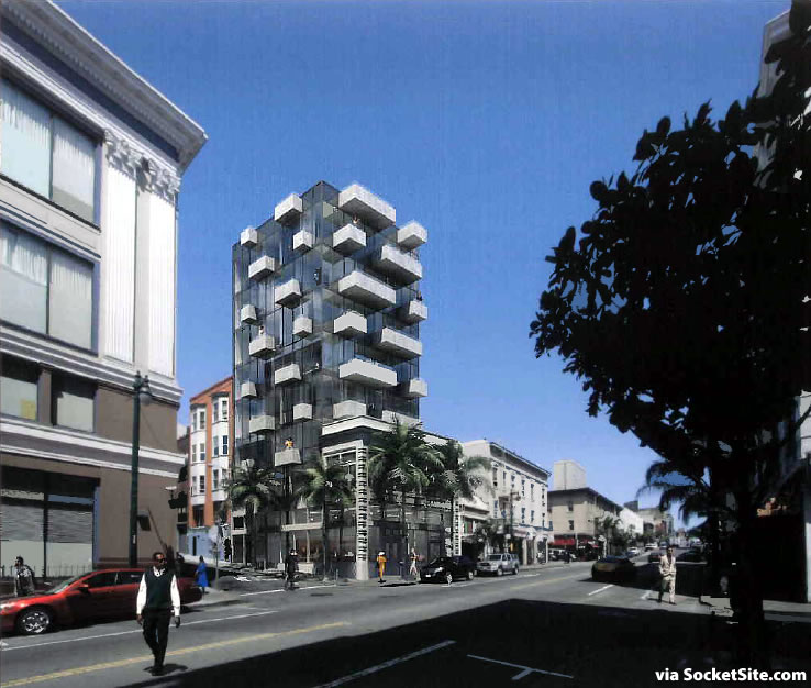
The northwest corner of Polk and Cedar could be in for a rather modern addition if a proposed building designed by Natoma Architects is approved to rise eight stories behind the existing facade on the site.
As designed, the front quarter of the historic two-story building at 1033 Polk Street would be renovated and restored and a modern six-story addition would rise to a height of 85 feet on the rear three-quarters of the site.
The addition would contain nine dwelling units — six one-bedrooms across floors three through five and three full-floor two-bedrooms on floors six, seven and eight — while the renovated portions of the existing building would maintain 1,300 square feet of retail space on the first floor and 1,875 square feet of office space on the second.
And as proposed, the balconies would serve as the required open space for the development and no off-street parking, for either autos or bikes, would be provided, but all of which are currently required by code.
I never comment on here with regards to a building looks but this one is really bad.
Interesting design, albeit I would have preferred to see a bit more of the existing retained along the Cedar elevation. Will this be the first building with balconies along it’s roof terrace?
It might be interesting if it were 75 stories and in Miami. Palms notwithstanding it looks ridiculous. But, IMO.
Overall, I like the idea of preserving parts of older buildings while expanding vertically, though I totally agree about the Cedar side. Makes the remainder of the historic building feel like too much of a veneer and less like a strong historic foundation. As for the palms, they’re already there, right?
+1; I thought the whole facade was going to be preserved. With just the Polk side, it looks silly.
Overall, I think I like the buidling, though. At least, I like the rendering – I’m wondering if this is one of those buildings that will look totally different in reality.
I always comment on here with regards to a building’s looks and ….
Stanley – how could you?
Just say no to this eyesore. We’re still reeling from the Divisadero/Ellis insult.
If it must happen don’t make a spectacle of the balconies.
I think its challenging. And refreshing in that degree. Its never easy to know what sort of impact a building or its design will have on the block until it’s seen in actuality.
20 more of these please.
Please obtain dermatology consult before building this.
This is a great place to be adding density. Glad to see it.
Ha it’s always funny to me when I’m near here to see Hemlock tavern or Castle pub amongst just a straight sea of bros. The number of bros on Polk has skyrocketed in the last five years, I wonder why Hemlock doesn’t move to Bernal Heights, or the Dogpatch or something. Castle and Hemlock are still cool bars, that largely still attract interesting people (Castle more so), but I wonder how long they can hold out.
i really really like this. we have too much of the same old stuff in SF. there needs to be some diversity in the buildings
Agreed!
I really like this! Will be a welcome addition to my hood. The palms in the rendering aren’t the kind of palms, if any, that will be in SF or this location. Reminds me of 235 Van Buren in the Loop in Chicago.
There are already palms here, not sure if the rendering shows the exact kind though, or if they plan to put in new ones or something.
yeah, they’re already there.
there’s tons of stuff like this in fidi – weird modern glass things popping out of historic structures. it might work in .1% of cases but not in any I’ve seen in SF
Beauty and ugliness is obviously in the eye of the beholder. To my eye, this shows a very handsome articulation of scale, positive and negative space; it will be very animated as the sun angle and direction change throughout the day.
BTW, the 4 palm trees are existing, planted by the City; and if you notice, there are also palms across the street (that show in photo rendering if you look closely.)
What makes the current building “historic”?
great idea! i hope they can manage some on site bike storage (it can’t be THAT space consuming). even though this arrangement isn’t IDEAL it’s awesome for SF to be adapting and building above existing buildings like this. i hope it sets a precedent. there are plenty of small/medium historic buildings with no garages.
Building looks great. But palms gotta go.
People, the palms are already existing. They are actually one of the three different street trees planted on polk in polk gulch.
I love it specifically because Joe San Francisco will be so butthurt by it. God forbid we dont have everything all matchy matchy
Folks, just for clarification, the palms in the rendering are not the same as the palms that exist there today. The palms in the rendering look more like a coconut hybrid, if there is such a thing, and are certainly way too tropical for our fair city. What exists are dingy little Queen Palms. I think the palms that exist, especially on Polk, are WAY out of place. But that’s just me.
I like the juxtaposition of the building, though. I think it’s one where the rendering will look like the finished product. It’s all in the glass. Unless they screw the glass up, it would be difficult to make this thing look much different than what we see here.
I like!
The big white building to the left is Next Door Shelter with 300+ beds. Have you gone by the area during the day and see what it is like around that block? While I am glad the city provides homeless shelter for those in need, I am just not sure about being right next to a homeless shelter.
Beautiful view of the meth clinic across the street, and the endless loitering that ensues.
Thankfully, Stanley’s always prepared to give this city some decent projects. It’s a welcome break from the lackluster uninspiring garbage designed by SCB and Architectonica.
Since this is on a corner, shouldn’t they be preserving more of the historic building than a quarter of it? Shouldn’t more of the original building wrap around the base of the entire building since two sides of the building are visible?
who thought it was a good idea to make new housing look like offices?
This is a typical comment of any modern housing, but it is not based in reality. It is just your impression of what is office like and what is residential like. This type of comment is what leads to all the really really bad buildings in SF and the rest of the bay area. Look at residential buildings all over the world, they don’t need a cheesy pitched roof to be good quality housing.
Haha, seriously. Some people seem to boil it down to: Office = Square, House = Triangle
Where did he say it needed gables and dormers? Don’t bring your own presumptions into his (or her) comments.
I think what was meant was that housing tends to be a little more personal-scale (even in high-rises), and not so much uninterrupted expanses of glass – the latter is more office-like (largely for reasons having to do with privacy, but probably also differing typical floor heights. See, for example, Jeanne Gang’s recent SoMa design; it’s a building that’s very large and tall (not supertall, but tall); but I think it clearly says “residential” not “office”.
No I think he’s right on Sierrajeff: Many comments over the years here on SS are just like that, where people want housing to “look” like housing in the most simplistic, childish sense. Their visual image of housing is very narrow, and provincial.
And provincial and narrow-minded, in fact, do reflect a lot of view points of San Franciscans. They do not like change, in any form.
No – as I mentioned in the beginning, I’ve never really taken to this blog or any other to voice my opinion on how a building looks but this just looks bad, sorry. They should just demolish the historic structure if they want to build this thing in back. The two pieces don’t have to match but they should sort of enhance each other and this does not. This looks like a new building smashed into an old one and I don’t think that was the intention of the architects.
exactly! thank you. I’m not against modern housing, I just don’t understand why people would give up privacy like that. The new building at Octavia/Market is a prime example of this trend as well.
You’re right Sierajeff, S did not say gables / dormers, but that is the type of thing that often comes out of these comments… or we get a collection of “human scaled” boxes in multiple colors… yay! It is not very specific in regards to the commentator’s objection and it provides very little direction for the architect to study. In my experience when this comment comes up, the building gets worse.
You can look at Mies’ lake shore drive residential bldgs in Chicago and his Seagram’s office bldg in Ny; they “look” fairly similar and both are brilliant and unbelievable influential buildings.
Jeanne Gang’s building is nice, but in my opinion the design is strongly influenced by the brick office building just down the street at Howard and Spear ( 201 spear). It looks like this building, but twisting. If that is true, does the 201 spear Office building look residential?
Before everyone jumps the gun and cries for preserving the Ceder Street facade did anyone actually look to see what is currently there? Its a blank wall and a garage door. It is nothing like the Polk Street side. Seems like a pretty decent compromise to me…
@ S: oh, ok: except for this building you have had no opinion on design. Got it.
While I have not always supported the work of Natoma/Saitowitz, especially the interiors of their projects (the bathtub in the closet?), I do think this firm shakes up the traditional notion of what housing should “look” like.
How a building meshes or integrates into existing context can be widely debated here. And, in reality, does any new building ever really “fit” in to the surroundings. The vitality of urban architecture often comes from the mashup of every style next to every other style, shape, form and height. I would say Manhattan is certainly a good example of this. Maybe we can learn a bit from them.
For starters, I’d suggest taking in the context of the street: a bunch of bars, a homeless shelter next door, and a fire station nearby and constant noise. What about that says, let’s build condos made entirely of glass? 😉
I am with you on this one!
I have seen some amazing uses of older facades and what not as part of new buildings…Boston, NYC, Most of Europe really good at that…
The Cedar street was is just bricks and a door now – Ick – Not worth saving IMHO
This duality is a good way to keep eye level continuity and allow for growth
LIKE
Love it, and it fits Polk….like that it’s something different!
totally.
UPDATE: Polk Street Parcel with Plans for a Modern Addition in Play