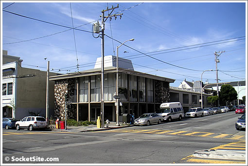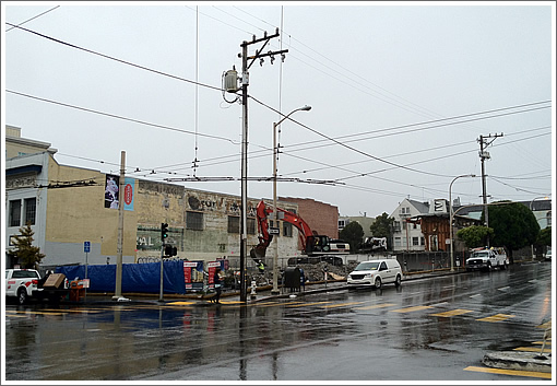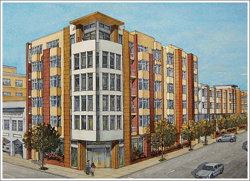


The two-story convalescent facility on the southwest corner of Bush and Divisadero Streets has been razed and they’re clearing the way for the 81 residential units over 4,000 square feet of retail and 126 parking spots to rise up to 65 feet on the site.
As for the new building, I’ve seen worse, but it’s not particularly inspired. Good location for denser housing though.
eee-gad, that design is uninspiring!
I wonder why the Divisadero stretch north of Geary didn’t get the excellent redo (medians, trees, larger/safer bus loading) that Geary to Waller received. It stops abruptly at Geary. Glad to see the above project getting underway.
Good stuff. A little heavy on the parking, but not too bad.
Dear developer/owner/contractor/architect:
Build it. Maintain the parking quantity.
Ignore the armchair design critics. An opinion is not a design critique.
I don’t mind uninspiring, but this is just ugly. The top corner reminds me of Alan Temko’s “party hat” criticism of some buildings in the ’80s.
There is currently street parking on both sides of the street. Is that going away? Also, this will be a massive boon to retail in this area and I suspect there will be many little shops benefiting from this development on Divis all the way back to California St. Anyone know floor plans?
It amazes me that not that long ago it made sense to build a two story convalescent home there.
Futurist must work for Heller Manus.
This is boring and ugly at the same time, which I give props to the architect for achieving that milestone.
I do like the density. I also kind of liked the demolished building, it had a very Japanese meets Brady Bunch spirit.
No, I don’t. But yes, Heller Manus mostly does pretty awful work; the exception being that new tall tower starting near the Transbay; the one with the x bracing, which is probably a rip-off from the Bank of China tower in Hong Kong.
But I didn’t comment on the subject property (design) here.
I simply don’t subscribe to the idea that every new building in SF, no matter size or location, need be “world class” and worth of the Pritzker Prize. Some buildings are background, some are average. Average is very subjective. Boring is very subjective.
All kinds of factors can affect the design of a project: budget, client goals, materials, type of function, architect-contractor relationship, etc.
I’m happy to see this building take over this corner; the scale is appropriate, the design is appropriate.
This is great more units are badly needed even if the architecture is not cutting edge.
Agree this could revitalize the retail/restaurants along that strip. The autobody shop next door should then sell and relocate to make room for a smaller condo building.
you’re welcome, Bi-Rite market..
The white vertical facade section on the corner kind of reminds me of the One Rincon Hill facade. Which I like a lot, btw. The boxy bay windows I don’t like as much – had they angled them somehow I’d be happy.
Anyhow, build it!
I’m with Futurist. Maybe you think it’s boring, but you’re not the one funding it. You’re never going to get everyone to agree on aesthetics. It’s a good height for the location, a huge improvement on what was there. Get it built.
The previous building was so appalling that questions of design are really irrelevant. All of Divis is changing fast and the part north of Geary should follow suit….
The truth is, SF should miss those skilled nursing beds in that old, ugly, two-story convalescent home. The number of nursing home beds in SF has plummeted in recent years, forcing friends and families to drive to Marin, the east bay, the peninsula and beyond to visit their loved ones that need a nursing home. The city needs housing, but it needs nursing home beds, too. That was 180 nursing home beds at one time.
I think it would have been fine to rebuild this as a 600+ nursing home bed building. It was just criminal to leave the site so underdeveloped.
Two questions:
Did they tear it down w/o approving the highrise?
What size will the units be?