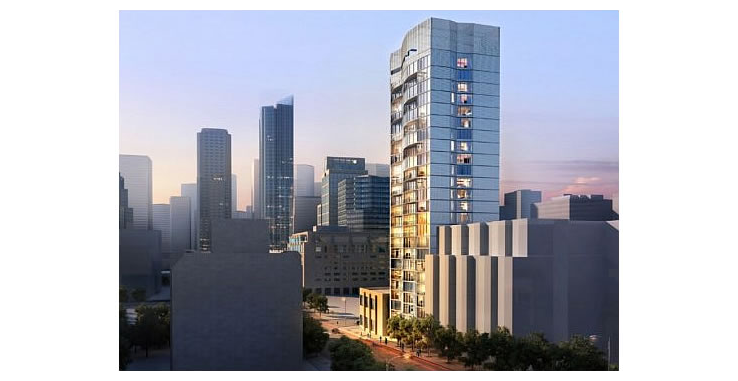
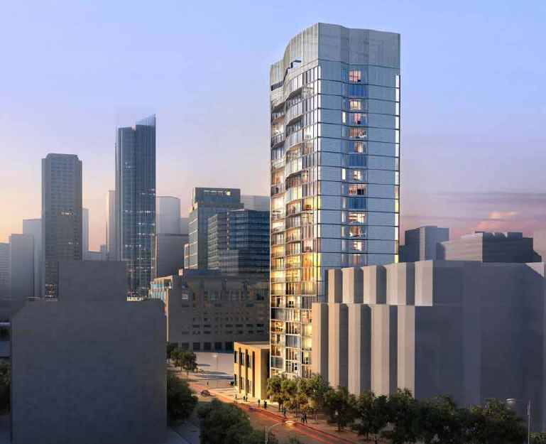
As we first reported last year, with 8 stories and 88-units at 333 Fremont Street rising next door, Crescent Heights quietly submitted plans for a twenty-five story tower with 119 dwelling units, 61 parking spaces and a 2,600 square foot roof deck to rise on the Rincon Hill parcel at 325 Fremont Street which they purchased for $4.85 million in early 2012.
As plugged-in people know, plans for a 200-foot, twenty-two story building with 59 dwelling units at 325 Fremont were first approved over a decade ago, a plan which was revised in 2004 to yield 70 units but which never broke ground. In 2005, the Rincon Hill Plan was certified and the 325 Freemont Street site was up-zoned to a 250-foot height limit.
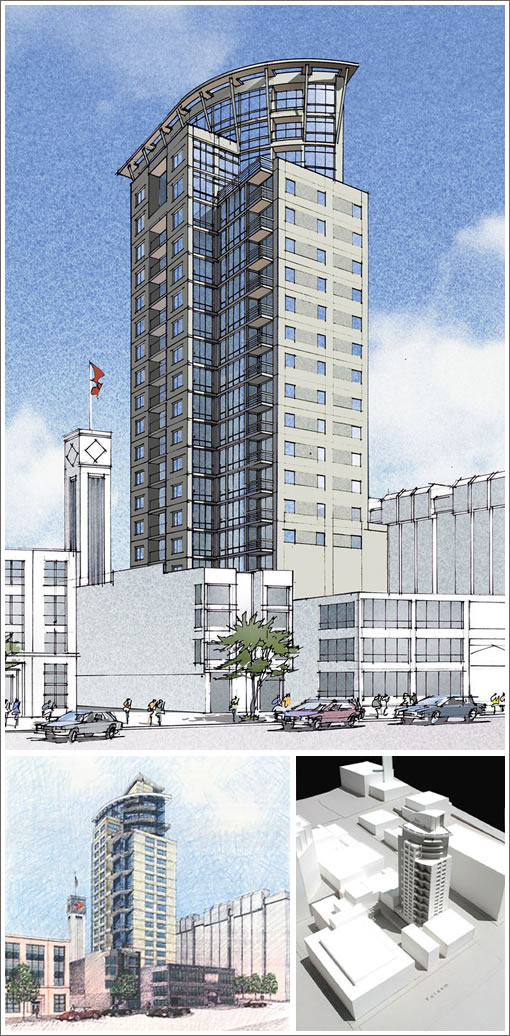
Crescent Heights’ plans for their 250-foot tower at 325 Fremont Street as designed by Handel Architects and rendered above have yet to be approved. As the previously approved designs for a 200-foot tower by Baum Thornley Architects had appeared:


They only paid $4.85 mil for the lot? Dang, that’s cheap. Wonder how long ago they brought it.
Nice, this design is much better than the previous one.
Decent design, but I’m really confused as to why we have such a low height limit on this parcel.
Can we have an official Handel Architects Appreciation Day? They have saved this city countless eyesores.
Seems Crescent and Tishman are going head to head with all their planned developments.
@anon: The city planners have this idea that they want to see the hills emphasized rather than flattened in the skyline by putting the tallest buildings on the highest land. So in the Rincon Hill area, the maximum height limits are on top of the hill–One Rincon Hill. Down the slope the limits get lower as at 325 Fremont.
Don’t ask me why they don’t add 200 feet or so everywhere. I can’t answer that–probably would shade some park in North Beach or something.
I sort of liked the old design–call it “interesting”. But I think I like the new one better–cal lit less busy.
“I sort of liked the old design–call it “interesting”. But I think I like the new one better–call it less busy.” -BTinSF
Yeah, I kind of liked the old design too. Though not too much…It certainly wasn’t great, but it was OK in my opinion, largely because there’s not anything else like it in SF. But this new design is much better in every way.