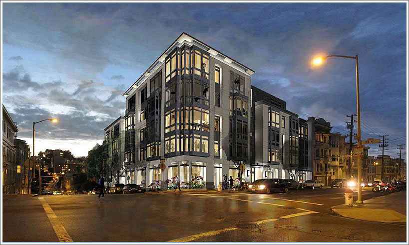
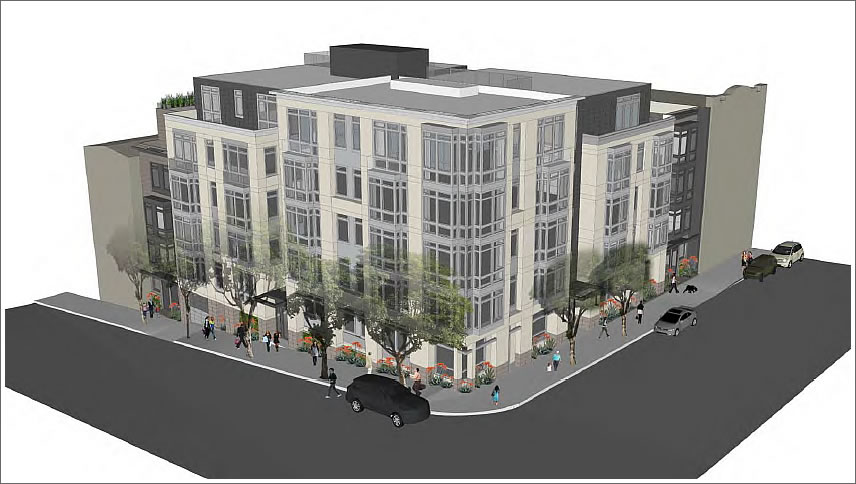
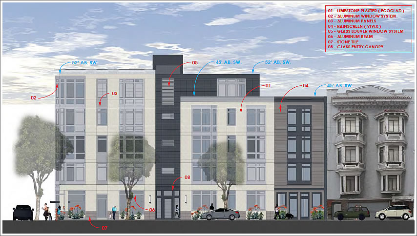
As we first reported yesterday, the rejected design for the proposed development to replace the First St. John’s United Methodist Church at the corner of Larkin and Clay has been reworked, reducing its height by a floor, introducing additional setbacks, and integrating new materials and finishes on the facade.
The details for the revised design, click any of the images to enlarge:
Once again, the revised design for 1601 Larkin will be informally presented to San Francisco’s Planning Commission today and the project sponsors are currently planning to pursue a formal approval for the project early next year.
∙ Sponsors Of The 1601 Larkin Street Development Try, Try Again [SocketSite]
∙ 1601 Larkin: Planning’s Flip-Flop And Expected Disapproval Today [SocketSite]


Why does Planning bother to have zoning codes when they won’t approve designs that comply with them?
If the nice details don’t get VE’d out, it should be a respectable – though forgettable – addition to the city-scape.
Neither design is very interesting.
Where is the excitement? All these new housing projects have a cookie-cutter quality that is downright boring. Has anyone driven along Market Street lately? There are about 8 new condo/apt developments going up that seem do have been conceived, designed and approved by the same comrades.
The “cookie cutter, everything looks the same” complaint is not thoughtful or useful. You could say all Victorians look the same, all midcentury towers look the same. Most buildings will look similar to other things built at the same time. You want the architectural language to change every two months? Or every architect to reinvent the world with every project?
(The james above is not me.)
I often don’t mind things looking similar however this is a painfully blank & dull stretch of Larkin — this area is low vibration and even depressing and can — here — use a dose of ingenuity. Building after building — the facades are shingled or stucced over and together is sad. Stanley would have given this morose area a needed boost.
Before the church this site was probably the same density as this; we just go around and around cautiously, conservatively, safely — and miss opportunities to become.
So, basically, it’s one story shorter than the previous one?
It’s still out of context with the neighborhood. Looks like it belongs in SOMA. And why is it under discussion again? Isn’t a year supposed to lapse after Planning Commission has rejected a proposal?
Anyway, I hope the diocese lawsuit against SF gains some traction and the city learns a bit about how we should follow our own zoning guidelines.
This has been delayed again and again by nAYbors whose sole goal is to make sure that nothing changes anywhere ever.
You know Grover Norquist and his unelected stranglehold on the republican party? SF has legions of Grover Norquists who have no intention other than making sure nothing changes.
Only in SF do they make them shorten every damn building. Would being one story taller than the neighbors really be such a problem?
Might be nice to have a little covered outdoor feature on the top at the corner. Maybe give a nod to the top of the old church…?
Nice to see someone from planning actually reads this blog. So here’s my question: The Planning Department here is infamous for fetishizing every last minute detail, often sub-block by sub-block and house to house, while also foisting zoning schemes that more often that not result in juxtaposition of utterly incompatible uses — residential on one side of a narrow street, industrial on another, for instance. But then in its forest/trees classic clunkiness, it doesn’t make any effort to address one of the most egregious and despised building tropes in SF: Bringing new construction up to the lot line and thereby ruingin the esthetics and streetscape of often historic buildings to either side. Why not just make a rule that lot line should be compatible with adjacent structures and be done with it. That would put a stop to this awful practice of burying our best buildings inside alcoves sandwiched between ugly lot line buildings. Why not, planning? Why not, say you?
wait, i know that there’s a ‘community space’ on the ground floor, what does that consist of? even though this is a depressing downgrade from saitowitz, hopefully we end up with some ground floor retail.
An architect acquaintance says that there are a number of creative inventive architects locally. It is the money people who do not want expensive design, and they are always pushing down the price which pushes down the architectural quality. Value engineering is a euphemism for making buildings cheaper and less beautiful.
The new design is equally banal.
The SF Planning Dept. should be completely OUT of the design commentary business. Their role should be to strictly deal with the metrics of planning and construction: that of zoning height, setbacks, bulk, floor area ratio, parking, and similar dimensional criteria.
Some interesting comments here. I agree that a fair amount of new residential construction leaves a lot to be desired for the senses…very bland from an architectural standpoint, cheap construction methods, uninspiring floorplans. Personally, I wouldn’t want to rent them much less own them. BUT, SF needs more housing. As we well know from other topics on here western SOMA is a waste of potential and Mission Bay has serious limitations. Park Merced seems to be on the right track for creating more density and height in its grand plan, but throughout the rest of the city we have to rely on infill projects to capture reasonable height based on the neighborhood dynamics. Whereas a 20-story megabuilding on the church site would certainly be out of place, an 8-story structure with setbacks isn’t such a bad idea.
Better than the previous one, for sure, much more in scale with the neighborhood. I personally think the design is decent.
SF needs to get used to the reality that housing density will only get higher over time. Even out in the neighborhoods where there are no high-rises, we have to get used to the idea that the dominance of 2 and 3 story apartment buildings will slowly but surely give way to 4 and 5 story buildings in time. It’s inevitable.
interesting. the 1st design was too short for this area, and to fix it, they make this one even shorter for this neighborhood, 7-8 floors would’ve been perfect.
basic comments… should be taller,.. should have more parking.
otherwise, it is not stunning by any means, but OK. Welcome to san diego